A Tool For Investors in Stock Market
How to give investors confidence, How to observe the chart patterns, chart reading, chart analysis
Course: [ Profitable Chart Patterns in Stock markets : Chapter 1. A TOOL FOR INVESTORS ]
"investors’ confidence” went up sharply in the Fifties. And obviously, the psychology of the market —that is, the sum of the attitudes of all potential buyers and sellers—is a crucial factor determining prices. It’s no use being "right” about a stock, if the market is "wrong.”
A TOOL FOR INVESTORS
What makes
one stock sell at $ 5 0 a share and another at $100?
And what
makes the market pay $ 5 0 a share for stock at one time—and $100 at another?
Well, there
are a company’s earnings, dividends, net worth, the outlook for its future
business, the outlook for the economy as a whole, the general behaviour of the
stock market . . . countless factors.
If a
diligent investor could learn them all, and balance them properly, he should be
able to predict the price of a stock—or so it would seem. Yet, assuming he had
a pretty accurate idea of how the earnings of International Business Machines
would rise over the last decade, how could he anticipate that I.B.M. would sell
as low as 12 times its annual profit in the late Nineteen Forties and at 60
times earnings in the late Fifties?
Obviously, "investors’ confidence” went up
sharply in the Fifties. And obviously, the psychology of the market —that is,
the sum of the attitudes of all potential buyers and sellers—is a crucial
factor determining prices. It’s no use being "right” about a stock,
if the market is "wrong.” How often does the market go down
following an announcement of good news, and up when the outlook seems dark! Put
another way, "a stock is worth only what
investors are willing to pay for it.”
Thus, to
predict the action of a stock, it would be ideal to have all the hard, economic
facts, plus an accurate insight into the minds of the public. That recalls the
sad old jest, "If I had some ham, I’d fix
me some ham and eggs, if I had some eggs.” The fact is, nobody can
know everything that may affect the price of a stock—not even the vaunted "insider.” To be sure, it’s an
enormous advantage to have advance knowledge about earnings, dividends, stock
splits, mergers, oil discoveries or new products. But to profit by such
knowledge, the insider—and his sisters and his cousins and his aunts—must buy
stock. In so doing, he increases the demand for the stock, just as when he is
ready to sell, he increases the supply. In either case, his action must
register itself in the marketplace, where the alert investor may observe the
signal.
Now while,
as we have just noted, nobody can learn all the factors that may determine the
price of a stock, in the last analysis all these factors meet in the market and
affect the interplay of supply and demand, which does set the price. No matter
what the news may be concerning a company, it will affect the price of its
stock only when it tips the scale in favor of either supply or demand. If, at a
given point, the demand for a stock (orders to buy) is greater than the supply
(orders to sell), the price must go up. If supply exceeds demand, the price
must go down.
Charts
provide a record of this interplay of supply and demand—a history at-a-glance
of the trading in a stock, or group of stocks, showing how many shares were
traded, at what price and when.
The purpose
of "chart reading” or "chart analysis” is to determine the
probable strength of demand versus pressure of supply at various price levels,
and thus to predict the probable direction in which a stock will move, and where
it will probably stop.
The clues
are provided by the history of a stock’s price movements, as recorded on a
chart. In the market, history does repeat itself—often. On the charts, price
fluctuations tend, with remarkable consistency, to fall into a number of
patterns, each of which signifies a relationship between buying and selling
pressures. Some patterns, or "formations,”
indicate that demand is greater than supply, others suggest that supply
is greater than demand, and still others imply that they are likely to remain
in balance for some time.
Before going
any further, let us be clear and emphatic about this: there is no infallible
system for predicting stock prices. If there were, the inventor of the system
would eventually own all the stock in the market. Rather than being infallible,
charts are often misleading or misunderstood—so much so, that we try to point
this out throughout this book and we also have included a chapter on the
pitfalls of chart reading at the end of this book.
Fortunately,
it’s not necessary to be right all of the time to make money in the stock
market. It’s only necessary to be right more often than you are wrong. This principle
is well known to gamblers, who say "the
house never loses.” Actually, the house often loses—at least often
enough to keep the customers coming back—but that mathematical edge assures
that the house will win in the long run. How can one find such an edge in the
stock market? Certainly, sound, thorough information about a company, its
industry and the economy are valuable. But a knowledge of the stock’s chart
action, and a familiarity with chart patterns, will help the investor decide
when to buy and when to sell.
Now, a look
at how the chart is made. (Experienced chart readers may skip the rest of this
chapter, but we’d be delighted to have them stay along.) The charts used in
this book—and most widely used in price forecasting—are called Vertical Line
Charts, the kind that newspapers use to depict the stock averages. There are
many other kinds and variations—composed of lines, bars, steps or other
symbols, plotted on logarithmic, square root or arithmetic scale. Some analysts
use oscillators, moving averages, ratios or "points
and figures.” Each of these has its merits and its function, but all
take a lot of time to keep up, and their interpretation is generally highly
complicated.
By contrast,
the Vertical Line Chart may easily be kept and understood by anybody, in a
minimum of time. It presents at a glance the most pertinent information—the
highest, lowest and closing prices and the number of shares traded in a given
period. It is also the most time-tested method, having grown in use since the
turn of the century. Vertical Line Charts showing the course of leading stocks
and market averages for many years are available to the investor through
various chart publications. They provide ready-made, up-to-date charts of
leading stocks, and he can easily build and maintain his own charts for the
stocks he is interested in.
The chart is
built to show either daily, weekly, monthly or even yearly price fluctuations.
The same patterns can be recognized in any of these, and they may be used with
equal effect in forecasting—but the daily chart will often signal a turn more
quickly, and so most of the illustrations in this book are daily charts. Weekly
and monthly ones are handy, however, for studying long-range trends, and
examples appear at the end of the chapters that follow.
In any case,
the price information is entered on graph paper of the ordinary kind, with even
horizontal and vertical rules. The up-and-down scale, printed on the sides,
measures prices; the scale along the top or bottom indicates the time it
happened—the day, week, month or year, as the case may be. From the stock
market table, as published in the newspapers, or reported on the ticker, the
chart-maker enters a dot to mark the highest price at which the stock was
traded that day, and another dot to mark the low. A vertical line drawn between
these dots shows the price range for the day. A short, thin crossline will mark
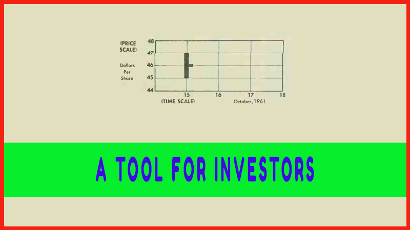
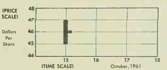
the price of the last transaction of the day. For example, a stock that was
traded Oct. 15 at prices ranging from $45 to $47 a share, with the last trade
at $46, will appear as follows:
Weekly,
monthly or yearly charts are, of course, drawn in the same way, with each line
corresponding to the price action for such a period.
Space is
provided at the bottom of the chart to add an important piece of information:
the number of shares (or volume) traded during each period. This is recorded as
a vertical bar extending up from zero to the correct figure, in accordance with
a scale along the side. (In news-paper market tables, the volume is given in
hundreds of shares, or "round lots,” unless otherwise indicated.)
The
convenience—indeed the necessity—of charts may now be seen by considering the
daily market action of General Motors stock from Sept. 1 5 to Oct. 15, 1961,
first on a table of figures—
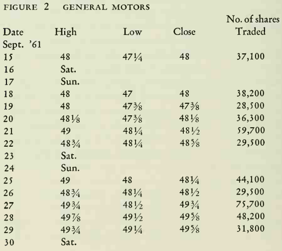
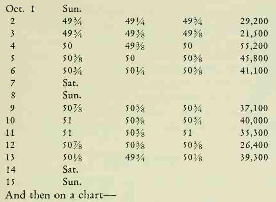
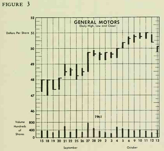
The first
vertical line shows that, on Sept. 15, prices paid for G.M. ranged from a high
of 48 to a low of 47.1/4, closing at 48 (horizontal dash);
the line at the bottom shows that 37,100 shares of G.M. were traded that day.
The same
procedure was followed for each day through Oct. 15. (It will be noted that
space for week-ends is eliminated to provide continuity.)
These data
may be condensed, for the purpose of examining long-term trends, into a weekly
range chart, as follows:

Profitable Chart Patterns in Stock markets : Chapter 1. A TOOL FOR INVESTORS : Tag: Candlestick Pattern Trading, Stock Markets : How to give investors confidence, How to observe the chart patterns, chart reading, chart analysis - A Tool For Investors in Stock Market