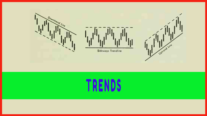
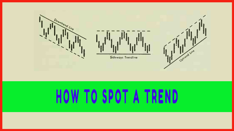
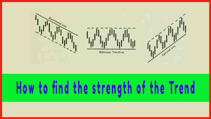
Market Tactics
buy at the bottom and sell at the top, How to trade Uptrend, How to trade down trend, sideways, sell on the news, How to draw trendline
Course: [ Profitable Chart Patterns in Stock markets : Chapter 2. Trends ]
New stock purchases can be made and previous investments should be held. Any break in a trendline flashes the amber caution light, especially if the break is on increased volume. New purchases should be deferred, and existing stockholdings should be re-examined.
MARKET TACTICS
Like a
traffic light, the chart advises the knowledgeable investor when to go ahead,
slow down or stop. As long as an established upward trendline is intact, the
traffic signal is bright green. New stock purchases can be made and previous
investments should be held. Any break in a trendline flashes the amber caution
light, especially if the break is on increased volume. New purchases should be
deferred, and existing stockholdings should be re-examined. The longer the
trendline has held, the more significant will be the eventual breaking of this
line as a "bear” signal. Finally, evidence that a downtrend is
developing flashes the red light, indicating that it’s time to sell and cash in
on profits, or take other defensive measures to avoid losses. (Brokers are
familiar with such defensive steps as selling short "against the box,”
and buying "puts and calls,” which need not be discussed here.)
Assuming
that one has decided to buy or sell a stock, he may gain an advantage of as
much as several dollars a share by being familiar with the trend channel
through which the stock has been fluctuating. He would buy at the bottom of the
channel, and sell at the top. And of course, the break of a trendline or the
return move to a trendline may represent highly favorable buying or selling
opportunities.
To "buy
at the bottom and sell at the top” of major price moves is of course the
unattainable dream of all investors. To try for the last eighth of a point is
unwise, and unnecessary. The investor should use imagination at all times, and
avoid being bound by hard and fast rules, or fascinated by a formula that
offers too precise a forecast of prices. But the trendline is the first and
most significant picture to be looked for in any systematic approach to chart
reading.
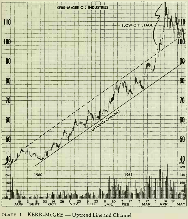
The chart
above shows how Kerr-McGee Oil tripled in value in less than seven months. For
the first six months, prices adhered remarkably close to an imaginary uptrend
line (heavy line) and within the confines of a relatively narrow channel
(outlined by the dotted line drawn parallel to trendline). Further examination
will reveal that the trendline was well established within the first month of
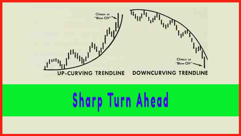
the advance. In April, 1961, prices broke through the upside of the channel and
accelerated into a blow-off or climax phase of development. This type of action
often marks a temporary or major top. The vertical part of the rise was
attributed to anticipation of a 2 for 1 stock split, which became effective May
31. By early 1962, prices were still well below the highs recorded on this
chart.
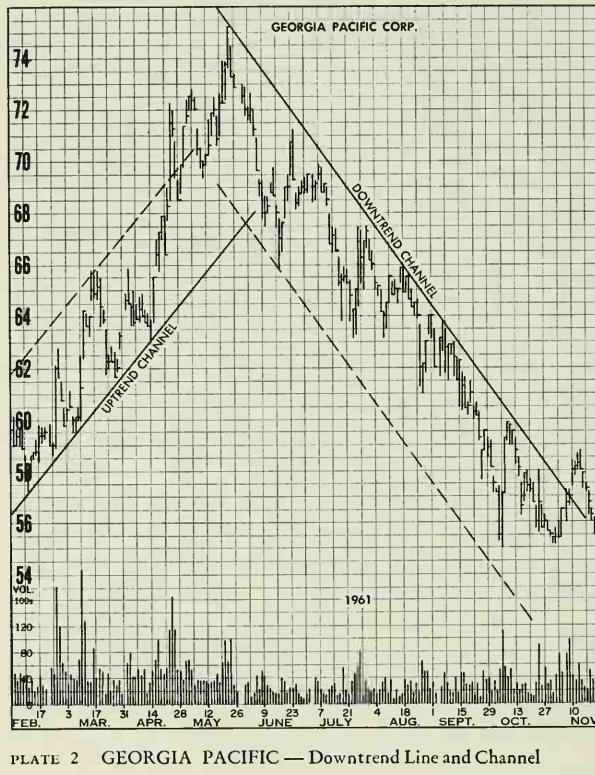
Note how
prices broke through the upper limit of the uptrend channel at the end of April
and, as in the Kerr-McGee chart on the preceding page, this proved to be the
start of a "blow-off” which signaled the end of an upswing. Price
movements on the downswing stage appeared to be glued to the trendline except
for occasional sharp reactions and rallies which served to outline the over-all
channel development. This situation proved rather ideal for market tactics based
on buying stocks as they hit the lower rims of channels and selling as they
approach the upper limits. After the long downtrend line was finally broken by
the rally of the first week in November, prices "pulled back"
to the trendline at the end of November. Also note how the volume pattern
changed in November—increasing on rallies and decreasing on declines.
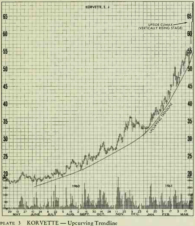
The
uptrend which got under way in July and August was preceded by a sideways price
movement of several months’ duration. The curving was gradual until January, of
1961, when Korvette started to curve sharply higher and by the end of Match
entered a "blow-off” stage, characterized by a vertical price rise,
which marks either a temporary or major turn. As explained in Chapter 2,
the curving uptrend line usually leads to this type of market action, but
pinpointing the end of the vertically rising stage is extremely difficult,
since it can carry a considerable distance in a very short time. In the case
above, the high on the last day charted (68![]() ) proved to be a temporary top.
Prices reacted all the way back to 47% in June, 1961, before again turning up
to an eventual 1961 high of $129.
) proved to be a temporary top.
Prices reacted all the way back to 47% in June, 1961, before again turning up
to an eventual 1961 high of $129.
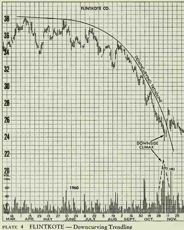
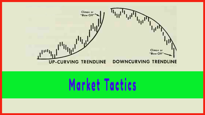
The curving downtrend line starts off the same way as the uptrend variety. There is a very gradual curving along the top of the formation and this becomes steeper as the move progresses. As in the chart above, volume remains relatively stable until the decline is well under way and then begins to pick up as the climax stage is reached. The upcurving trendline on the Korvette chart (plate 3) climaxed with very sharp moves but not unusually high volume. In Flintkote, the climax occurred on exceptionally high volume, but day-to-day price moves were not unusual. Climaxes are marked by either wide price moves or exceptional volume or both.
Profitable Chart Patterns in Stock markets : Chapter 2. Trends : Tag: Candlestick Pattern Trading, Stock Markets : buy at the bottom and sell at the top, How to trade Uptrend, How to trade down trend, sideways, sell on the news, How to draw trendline - Market Tactics