Candlestick Pattern Trading Ultimate Beginners Guide
candlestick chart trading strategies, candlestick patterns trading guide, candlestick patterns trading strategy, candlestick pattern trading books,
Course: [ The Candlestick and Pivot Point Trading Triggers : Chapter 7. Candle Charts and Top Reversal Patterns ]
Candlestick charting is an extremely pronounced and effective method for tracking and examining the four most important price points: the open, the high, the low, and the close. Using candlestick charting helps me visually to better compare current price activity in relation to past price points of interest.
Candle Charts
Candlestick
charting is an extremely pronounced and effective method for tracking and
examining the four most important price points: the open, the high, the low,
and the close. Using candlestick charting helps me visually to better compare current
price activity in relation to past price points of interest. The advantage of
using candlestick charting in place of bar charting is that you can use the
same techniques and analysis that you do with bar charts and have the diversity
and unique signals that candlesticks generate. As you learn this method of
charting, you will come to see how it is a great barometer of human emotion,
namely, fear and greed.
In
addition, this is a simple, yet certainly more specialized format of charting.
It has gained in popularity in the United States and is currently followed by
more and more analysts. My first book covered most of the top formations, and I
want to review what I believe are the more frequent and reliable patterns. This
chapter will show some statistical evidence that there are certain patterns
that develop over and over again. Candlestick charting is extremely easy to
learn; and once you remember the sequence of events that form a trending market
condition, the candles will certainly be your best tool in spotting market
reversals at tops and bottoms. Having that information will certainly stack the
odds in your favor for making money consistently in the markets as an
independent trader.
CANDLESTICK CHARTING
Candlestick
charting gives a detailed depiction of a price graph with almost a
three-dimensional effect. What stands out most is that a chartist can see
patterns more clearly and distinctly than with other types of charts. There are
over 60 candle patterns that form to create certain setups. This book will
focus on only a few select patterns and, what matters most, the triggers that
initiate a call to action.
If you
are not familiar with candlestick formations, I am going over the foundation of
how to construct a candle and what it represents. If you wish to become an
expert at each of the patterns, several authors have written great books on the
subject. One is Steve Nison, who introduced the Western world to candles. (In
my first book, on page 44, I wrote about how he discovered candles.) Others are
Steve Bigalow and Greg Morris.
For the
expert, this section will be a great review. Since each market has a different
trading characteristic, such as volatility or price moves, certain candlestick
patterns vary and may occur more or less frequently. Each candlestick pictured
has a different characteristic that represents the difference or the distance
between the high, the low, the open, and the close. Candlestick charting
techniques can be used from data for whatever time period you use: hourly,
daily, weekly, or monthly. Candlestick charts lend themselves to pattern
recognition and trendline support, resistance, and channel lines. Candles also
help to corroborate other forms of technical analysis, especially pivot point
analysis.
I want to
explain the basics, and then I want to show you specific patterns so you can
see for yourself how to utilize them. I will also show a few examples of the
more popular named candle formations. Moreover, I will explain the psychology
of what is behind creating the pattern as it relates to the open, the high, the
low, and the close of a given time period. Armed with the knowledge of which
patterns have a higher frequency of occurring and with the understanding of
what they symbolize, you should be able to trade the markets from recognizing
them; and when patterns do develop, you should be able to instinctively act on
the signals, thereby increasing your ability to make money as a trader.
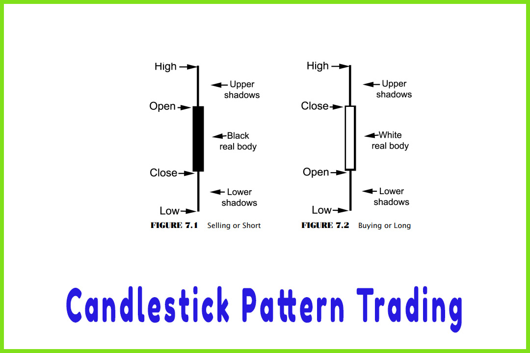
The
components of a candlestick are derived from the open, the high, the low, and
the close. In Figure 7.1, we see a dark candle (in a color charting software
package, it would be a red candle). This signifies that this particular time
period’s close is below the open. It does not indicate whether the market
closed higher or lower than the previous time period did. The computer code for
this sequence would be C < O—the close is less than the open. We can also
assign a negative (-) value or reading to help determine the relative strength
of a trend.
In Figure
7.2, the white, or hollow, candle signifies that the concluded time period
shows that the close is above the open (in a charting software package, you
would universally see this as a green candle). Keep in mind that you can adjust
almost any parameter in any software package to your liking.
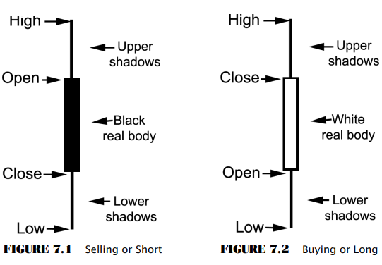
Therefore,
you may want the candle to be white. The point is that the color of a “lower close
than open” candle should be
different from the color of the “higher close than open” candle. The computer code for this sequence would
be C > O—the close is greater than the open. We can also assign a positive
(+) value or reading to help determine the relative strength of a trend by how
many more positive, or “higher close than open,” candles exist.
The three main components of candle
charts that we need to identify are:
- Relationship
between Open and Close (Candle Bodies).
With the real candle body colored and representing a negative or a positive
reading, we can see what is dominating the market.
In
uptrends, or bullish market conditions, we see buying come in on the open; and
as we learned from the stochastics indicator, the market should settle closer
to the highs. It should also close above the open; and that is why in bullish
market conditions, we see hollow, white, or green candles. This is why I assign
it a positive (+) reading. How much the bulls are dominating the market is
reflected by the length or the distance between the open and the close. If the
market opens on the low and has a large range where it closes at the high of
the session, that signifies that the bulls are in strong control. However, if
the market has a wide-range session and the market price closes back near where
it opened—say, in the middle of the range—that is not a sign that bulls
dominate the market for that particular time period.
In a
bearish market condition, or a strong downtrend, we would see dark- or red colored
real body candles. This represents sellers entering the market on the open and
dominating the session right into the close of that time period. If the market
opens on the high and prices decline where the close is at or near the low,
this shows that the bears are firmly in control. This is why I assign a
negative (-) reading. The distance factors between the open and the close are
illustrated in a much more defined way in candle charts than in bar charts due
to the shape and color coordination of the candles.
- Shadows
and Correlations to Candle Body.
The distance of a low and/or a high in relation to the real body as created by
the open and the close can really illustrate the market’s denial of a support
or a resistance level. Long shadows, tails, or wicks, as they are called, that
form after a long downtrend indicate a potential that the trend has exhausted
itself and that demand is increasing or supply is dwindling. Shadows, tails, or
wicks formed at the tops of real bodies, especially after a long price advance,
indicate that demand is drying up and supply is increasing. The overall size of
shadows is important to watch in relation to a real body and can be easily
identified.
- Size
or Length of the Overall Candle.
Now this is one that is hard to miss using the color-coded method of candle
charts. A long candle that opens at the bottom and closes at the high, which
would be an abnormal occurrence, has significant meaning. After a long
downtrend, seeing this formation indicates that a major trend reversal is
taking place. After a long uptrend, seeing an unusually long candle that closes
above the open (a positive value) would indicate that an exhaustion or blow- off-top
condition may exist.
The
reverse is true in down trades. After a long price decline, a tall red- or dark
colored candle, which represents the market close below the open (a negative
assigned value), may indicate that a capitulation or an exhaustion bottom has
formed. After a long uptrend or price advance, if that same candle was formed,
it might indicate that a major trend reversal is occurring.
The Candlestick and Pivot Point Trading Triggers : Chapter 7. Candle Charts and Top Reversal Patterns : Tag: Candlestick Pattern Trading, Forex, Pivot Point : candlestick chart trading strategies, candlestick patterns trading guide, candlestick patterns trading strategy, candlestick pattern trading books, - Candlestick Pattern Trading Ultimate Beginners Guide