Chart Patterns - Visual Confirmation of Price Movement
Double Top, Double Bottom, Head and Shoulders Top, Head and Shoulder Bottom, Triangles, Short Term and Intraday Patterns
Course: [ Simplified Support and Resistance : Chapter 4. Chart Patterns - Visual Confirmation of Price Movement ]
Chart patterns are visual representations of what is taking place in a stock's price movement. Technicians seek out price stability for the purpose of establishing the SR (support and resistance) levels that define trading range. All price patterns can be classified either as continuation or reversal patterns.
Chart Patterns: Visual Confirmation of Price Movement
Chart
patterns are visual representations of what is taking place in a stock's price
movement. Technicians seek out price stability for the purpose of establishing
the SR (support and resistance) levels that define trading range. All price
patterns can be classified either as continuation or reversal patterns. A
continuation reinforces the existing trend and may be characterized by pausing
in price activity, followed by a return to a previous pattern. Reversal
patterns provide strong signals that price movement is about to head in an
opposite direction, or that an existing trading range is about to be broken and
reestablished at a higher or lower level.
In
highly volatile stocks, there are no apparent SR levels, because price movement
is both erratic and unpredictable. It is erratic because there is no trading
range to speak of; and it is unpredictable because no one knows what is going
to happen next. For the chartist, the highly volatile stock is most troubling.
As long as there is no SR level, it is also impossible to identify breakout
signals, or to make any kind of predictions.
A
similar problem exists in low-volatility stocks. If the trading range is well
established and movement is generally horizontal, the relatively small price
fluctuations provide only one kind of signal: a lack of any change whatsoever.
The chartist has nothing to do because no apparent or real change is on the
verge of occurring.
In
between these two extremes is a rather broad range of stocks, neither entirely
volatile nor stable. They are subject to the types of trading range
"rules" that make SR analysis interesting; occasional trading ranges
keep the chartist actively involved in watching for breakout signals and SR
tests; and the trading range itself is dynamic in one direction or the other,
or to a degree, moving in alternating waves. This middle range of stocks is far
more interesting to the chartist (and to most other analysts) than the
extremes. Remember, on the extremes, analysis is either meaningless or
impossible, and the chartist can only wait for something to change. However, as
long as a stock's activity is dormant or overly volatile, future change cannot
be anticipated with any scientific certainty.
An
interesting stock exhibits movement. That movement can be studied and
quantified using analysis of chart patterns, and changes in trading range and
SR can then be made. For example, a stock may over the course of six months
move from $45 up to $60, and then trade sideways between $55 and $60. The $55
level would become support and the $60 level would become resistance once price
levels off. However, that is a relatively narrow trading range, so the
applicable chart pattern should consider the likely effect of the original $45
per share level. That could be considered as initial support, while also recognizing
that the trading range has narrowed in more recent sessions. This is a common
pattern, but the narrowing is not necessarily permanent. The recent horizontal
trading pattern could be merely a short-term price consolidation, meaning that
the market is marking time awaiting further news that could propel the price of
the stock upwards, or it could be a reversal pattern, signifying the end of the
previous up trend and the beginning of a new down trend.
The Double Top
The
double top shows two price peaks (tests) that are separated by a declining
point or range. The initial peak in price often is accompanied by heavy volume,
as participants react to bullish news and bid prices higher. The market peaks
and retraces a portion of the last move. This pullback will often be
accompanied by relatively light volume as the retracement represents profit
taking off the high. The price next returns to the original up trend but as it
nears the previous peak, buying interest proves not strong enough to push
prices to new highs.
This
inability to break out above resistance is recognized early during the assault
on the old high by comparing the volume of the second run to the volume of the
first run. If the volume is lighter, it indicates that fewer buyers are joining
in on the rally. The signal that indicates when the double top formation is
complete comes when prices break down through the support level established
between the
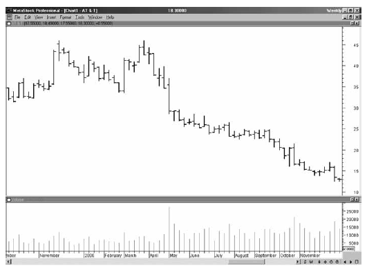
Figure 4-1
two
peaks. Often, volume will increase dramatically as this occurs, representing
the possibility of a major shift in trader expectations.
Figure
4-1, a weekly chart of AT&T, shows a double top with a price break at the
support point between the two price peaks. Volume expanded noticeably,
confirming the top formation.
The Double Bottom
The
double bottom is characterized by two price troughs that are separated by a
price peak. As the price falls to form the first low, volume often is relatively
high, at times exceptionally high. However, in the typical double bottom,
sellers are unable to break through the support level and a retracement of the
decline follows. The price rallies, due to a combination of short covering and
bargain hunting. A popular interpretation of the retracement is that the bad
news that caused the first price decline is discounted by the point of the
second leg, and the market then advances as buyers take up well-priced shares.
Figure
4-2 shows a double bottom on a weekly chart from American Express. The large
volume occurred as the price reached its bottom. A healthy level of support
appeared as the double bottom unfolded.
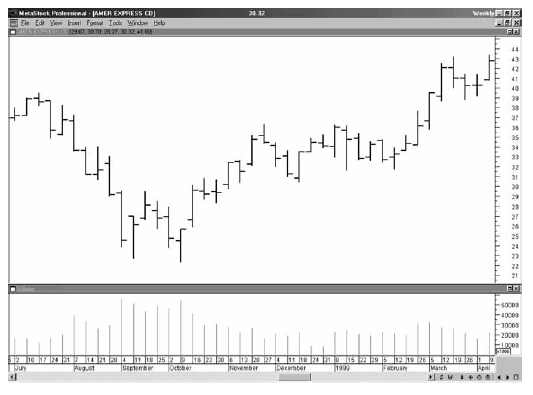
Figure 4-2
The Head and Shoulders Top
The
head and shoulder top is so named for the shape of the chart pattern. It
involves a center high level (the head) with lower plateau levels preceding and
following (left and right shoulders). Also called an 'M' because of its shape,
the head and shoulders is one of the most reliable of all chart patterns. The
volume characteristics commonly involve a peak during the left shoulder or at
the head, and much lower volume during the right shoulder trading period. The
trading area in between each shoulder and the head is often called the
neckline. Penetration of the neckline following completion of the pattern
signals that the top is complete and a downward price trend is likely to
follow. Volume may expand as the price breaks down through the neckline. The
price may also retrace and test the neckline in subsequent movements. The head
and shoulder top may establish a new resistance point at (or below) the
neckline, and a new trading range could become established at or below that
level.
Figure
4-3 shows a complex head and shoulders top that developed in IBM. It is complex
because the two shoulders show multiple tests of the resistance level. After
the neckline at $110 was broken, the price dropped to below $90.
The Head and Shoulder Bottom
The
inverse of the head and shoulders top, this pattern marks the end to a
previously downward trend. The pattern consists of three price bottom levels
with the center (the head) trading lower than the left and right shoulders. A
breakout above the
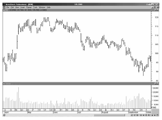
Figure 4-3
neckline
is a sign that a new support level is likely figure 4-3 to be established there
as part of a new, higher trading range. This pattern is also referred to as 'W'
due to its distinctive shape.
Figure
4-4 shows that the head and shoulders pattern can represent both a bottom as
well as a continuation pattern. The first head and shoulders bottom occurred in
March, then proceeded to rally, followed by a price decline in April, and
finally another smaller head and shoulders bottom formation. This indicated
strong support, and the prices advanced once again.
As
a general observation, the head and shoulders formation is a strong signal that
is either bearish
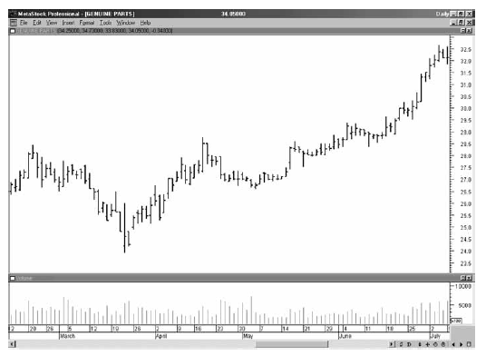
Figure 4-4
(top
pattern) or bullish (bottom pattern). The repeated test of the SR levels is met
with weakness and an inability to break through, and then is followed by a
strong price movement in the opposite direction.
The
importance of head and shoulder formations is in the way that resistance (top
pattern) and support (bottom pattern) are tested, and in the forecasting
advantage that these patterns provide. Head and shoulders is one of the more
popular methods for anticipating breakout of SR. The triple signal attempt at
breakout, with each one failing, provides confirmation that, in fact, prices
are going to head in the opposite direction.
Triangles
The
triangle pattern, so called for its shape, is one continuation pattern closely
associated with the establishment of a new SR and trading range; or, the
triangle may precede a period of increased volatility.
Triangles
may be symmetrical, descending or ascending. The symmetrical triangle, also
called the coil, has a rising support line and a falling resistance line. The
two lines converge near the middle of the initial range. The volume will often
peak at the end of the trend just as or right before the triangle pattern
starts to unfold. As the market moves sideways, the volume will continue to
recede. If the volume is higher on the support side, this suggests that the
market is likely to break through on the upside. On the other hand, if the
heaviest volume appears when the prices are trading near resistance, and the
price bars close near the lower end of the bar's range, a downside breakout can
be anticipated. The symmetrical triangle typically indicates that, at least for
the moment, buying and selling interests are balanced against one another.
Figure
4-5 shows Johnson & Johnson (JNJ) trading sideways as a symmetrical
triangle. Volume declined during the triangle and then expanded as the price
broke out.
The
descending triangle has a falling resistance line and a horizontal support
line. As the market moves sideways, the prices fail to achieve higher levels;
yet, the support line holds. The volume characteristics are important to
analyze along with the emerging triangle pattern, since the combination of
price and volume are required to properly anticipate the
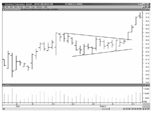
Figure 4-5
next
price move direction. Despite the observation that support is holding
throughout the development of the triangle, if the volume is heavier on the failed
attempts to move through resistance, then support may collapse. In that
instance, the inability of price to move through resistance even with heavy
volume indicates that buyers are too scarce to create a breakout. The
descending triangle is usually a bearish price pattern and, when confirmed with
other information, can be used to anticipate a weakening price trend.
Figure
4-6 shows a descending triangle for Yahoo! (YHOO). The test of support saw a
price rally with expanded volume. However, during the week of August 10, the
price closed at the low for the
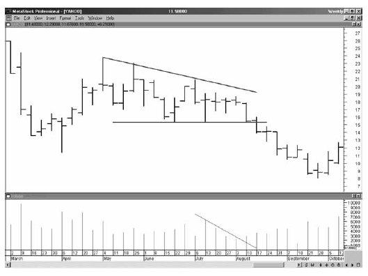
Figure 4-6
week
and the volume broke the down-trend line, figure 4-6 which anticipated a
breakout below support.
The
ascending triangle is composed of a rising support line and a horizontal
resistance line. In this pattern, buyers are coming into the stock, creating
higher and higher prices, while sellers hold at a fixed price level. Volume is
essential to determining the significance to this price pattern. Heavy volume
at resistance indicates weakening buyer activity and a possible downside
breakout. If the volume is rising when price is at or near support, that may
point to an impending breakout above resistance. The ascending triangle pattern
is usually considered bullish and can be useful in anticipating an upward price
trend.
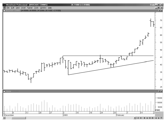
Figure 4-7
Figure
4-7, Brocade Communications (BRCD),traced
out an ascending triangle before resuming another up leg in the trend.
One
useful technique for trading a triangle is to plot the trend lines to the point
they cross, and then determine the 50-66% range from the point where the
triangle begins to the point where it ends. This 50-66% zone is the typical
area that prices will exit the triangle. If the price stays within the confines
of the triangle past this exit zone, the breakout will not develop into a
longer-term trend.
Triangles
are likely to serve only as short-term price indicators. They can anticipate SR
breakouts, of course, and that is ultimately their usefulness. They should not
be viewed for price patterns alone,
however.
An expected breakout should be confirmed by volume trends as explained above.
If the corresponding volume changes are not found, then the triangle could be a
short-term aberration or merely a coincidental and random pattern. When triangles
are short-term in nature, they are more properly classified as flags.
Short Term and Intraday Patterns
Flags
and short-term triangles are quick consolidation periods with tight boundaries
of support and resistance that occur within existing trends. A flag is so named
because the trading action has parallel support and resistance trend lines that
are either horizontal or slope downward. Figure 4-8 is a
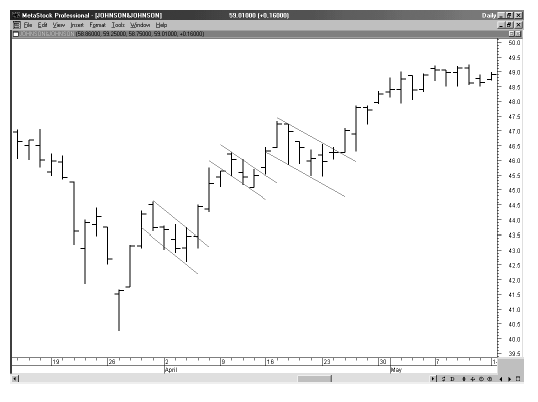
Figure 4-8
30-minute
bar chart of Johnson & Johnson showing a series of flags during the up
trend.
The
value of identifying flags often is in specifically distinguishing them as
pausing in the established trend rather than as a sign of newly emerging
trends. The short-term flag tends to slope in a direction opposite the trend.
Thus, if prices are inching upward, the flag will have a downward shape, with a
tendency for prices to climb upon completion of the flag's pattern.
A
pennant looks like the triangle, but is usually shorter-term in duration,
usually lasting no longer than a week or two. The pennant is a type of slowdown
or pause in the price trend and usually is followed by a resumption of the
previously established price movement direction.
Short
term triangles, or pennants, often occur as brief pauses in a steep up or down
trend, but may be more pronounced due to the rapid and volatile nature of that
steep price change. Figure 4-9 shows CMGI Inc. (CMGI) with a number of short-term triangles during a larger down
trend.
The
classic chart patterns may occur not only in long-term trend patterns, but also
in short-term daily price patterns or Intra-day trading patterns. The technical
analyst faces the challenge of trying to distinguish between patterns that
represent emerging new trends, and those that are only false starts. This is
the great challenge, of course, because as trends emerge, it is more difficult
to interpret them than it is to look back and identify what happened in the
past. However, this does not
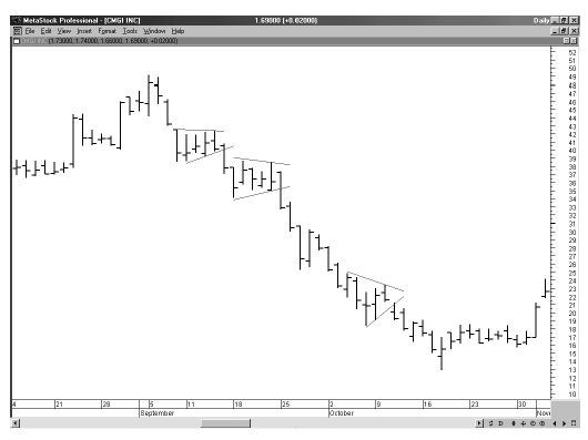
Figure 4-9
mean
that seemingly brief or short-term patterns can be ignored; they may be the
beginning of important reversals. Many price swings on stocks begin from
Intra-day chart patterns. Figure 4-10 is the 30-minute chart of AT&T,
showing a double top formed before the price fell from $20 to below $18. Figure
4-11 shows trading the 30-minute chart for Microsoft (MSFT), which formed a symmetrical
triangle as a reversal pattern.
Gaps
A
gap is a space in between price range from one day to the next. For example, if
a stock trades today between $18 and $21 per share, but opens tomorrow at $23,
a two-point gap occurred.
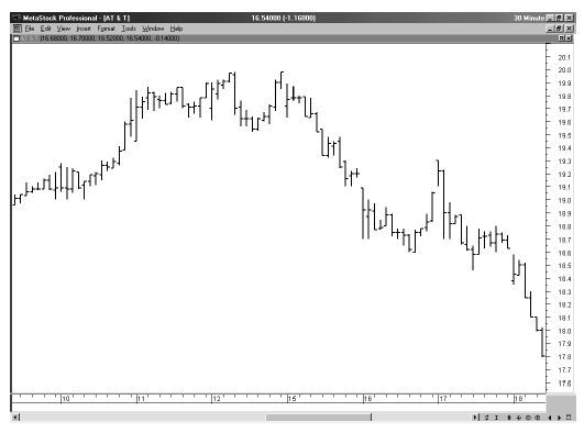
Figure 4-10
Gaps
can be interpreted in three different ways. A breakaway gap signals a strong
market move. For example, if the gap occurs above the neckline of a head and
shoulders bottom, that could strongly confirm the head and shoulders trend.
A
second interpretation is called the runaway gap, which occurs within an
established trend, normally one in which prices are rising or falling strongly.
The third type of gap, an exhaustion gap, is likely to occur at the end of a
strong price trend and could indicate that the trend is about to end out. For
example, if prices have been climbing rapidly and strongly, an exhaustion gap
may signal that prices are about to top. This type of gap may be
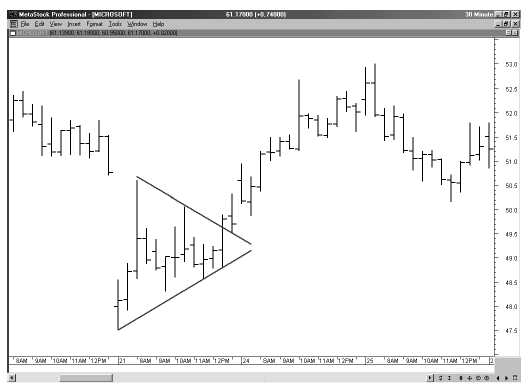
Figure 4-11
followed
shortly by a breakaway gap heading in the opposite direction. Together, this
pattern, often called an island reversal, is a sign that prices are going to
head in the opposite direction.
Summary
Chart
patterns may serve as indicators that continue or reverse established SR and
trading ranges. It is not a simple matter to distinguish short-term or false
starts from the stronger and more permanent changes in price direction. The key
is to study volume trends along with those price patterns. The two together are
more likely to anticipate breakout or confirm the current SR range.
In
order to more thoroughly understand the nature of SR and why price may breakout
and establish a new trading range, the study of interim patterns is a useful
exercise. As prices test SR levels, volume trends confirm what the price
pattern appears to imply; however, every technician also needs to remember that
there is a random element to short term price movement. Not every pattern is
significant. It is prudent to always watch volume as well, and to ensure that
the elements of price movement—SR tests, price spikes at top or bottom, head
and shoulders patterns, and triangles—are interpreted properly, and are not
misunderstood in error. The value in price movement patterns is always confirmed
when SR is tested and either holds or is broken.
With
that observation in mind, how can you best use price patterns to take advantage
of extremely short-term changes? The next chapter shows how swing trading puts
these valuable patterns to work.
Simplified Support and Resistance : Chapter 4. Chart Patterns - Visual Confirmation of Price Movement : Tag: Support and Resistance, Forex : Double Top, Double Bottom, Head and Shoulders Top, Head and Shoulder Bottom, Triangles, Short Term and Intraday Patterns - Chart Patterns - Visual Confirmation of Price Movement