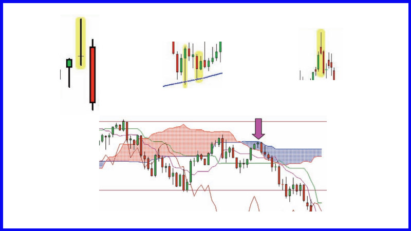
Combining Candles with Momentum
Support and resistance, Moving averages, Trend lines, Parabolic SAR, MACD
Course: [ Uses of Candlestick Charts : Chapter 6. The Real World - Practical Application ]
When I spend a good amount of time with a group of trainees the thing I try to impress upon them is that they are all individuals and that they’re all going to find different things that work well for them as individuals from the huge array of technical tools available.
Combining candles with momentum studies
When I
spend a good amount of time with a group of trainees the thing I try to impress
upon them is that they are all individuals and that they’re all going to find different
things that work well for them as individuals from the huge array of technical
tools available. I’m even happy to concede that they might choose not to use
technicals at all, although I say this through gritted teeth!
Work out your favoured canvas
My best
suggestion is to work out what your favourite canvas is. Some swear by Market
Profile charts, some see Point & Figure as the cleanest and clearest way of
viewing the markets and gleaning signals. Some will firmly stick to bar charts
even after reading this book, I guess (astonishing!)
Whatever
you decide, there’s more to do once this decision has been reached. We’ve
talked about waiting for confirmation before taking a reversal signal in the
previous chapter, but there are other methods that can be employed for
confirmation purposes. A reliable moving average, a trend line, or a signal
from an indicator like Stochastics or RSI are the sort of thing that you can
incorporate into your decision making process.
It comes
back to the analogy I used earlier: if you wake up one morning and decide to
buy a red jumper do you go to the high street and buy the very first red jumper
you clap your eyes on, or do you have a few more criteria you want to satisfy?
On something as simple as buying a pullover you’ve got more than one condition,
and you need to have layers of conditions that need satisfying before jumping
into a trade.
Over the
following pages you will see the same chart reproduced several times, each time
with a different method of confirmation used. I have accompanied each chart
with a brief explanation of the method. This is by no means a definitive
discussion, more a precis of each method, with enough to help you decide
whether it’s something you might attempt to incorporate into your strategy.
Figure 6-13: Eurex Bobl futures
(adjusted active continuation); daily candlestick chart; 11 February 2008 - 23
April 2008
We have
shown this chart before. We talked about it in Chapter 3 (Figure 3-22). The
candle at the very top of this chart is a Rickshaw Man. As you can see this
pattern appeared on the day the market retested the high from a few days
earlier. At the time that the market got above that previous high, the bulls
were in charge and looking good for it. But they dropped the ball, and prices
ended up back where they started. The market started selling off from the very
next day as the bears picked up the ball and started running back up the other
end with it!
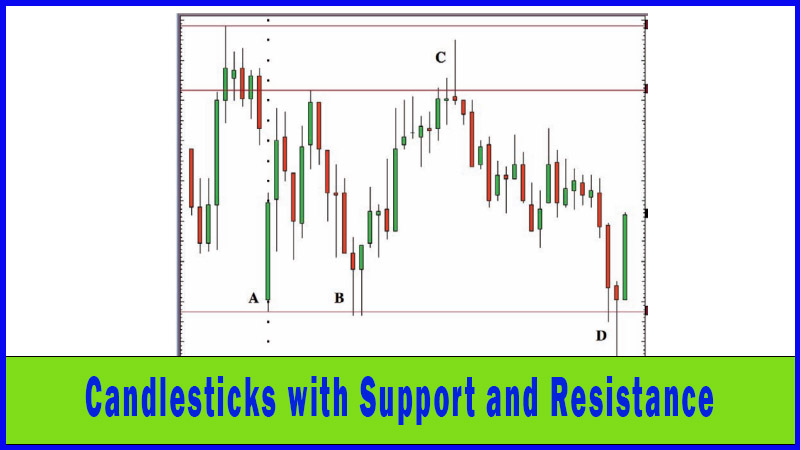
Support and resistance
This is a
recap of the previous section but it fits in nicely with what I’m trying to do
in this section, so here goes!
Support
occurs when a market that is selling off reaches a level where the buyers
return to the fray sufficiently to turn things around. Using the basic laws of
supply and demand we know that a market that is selling off is the result of
more sellers than buyers. Supply is outstripping demand. But the moment when
price reverses and the market starts to go up is where the balance between
buyers and sellers changes.
It is
often noted that markets change from downwards to upwards at similar levels to
previously, so chartists look back at the historic prices to see where previous
turning points occurred.
Resistance
is the opposite to support: a high price where the balance between buyers and sellers
shifts back in favour of the sellers. In an uptrending market the bulls, or
buyers, are dominating. The top of a move is when the sellers take over, where
demand no longer outstrips supply, causing a top in price. Previous highs are
well watched levels when a market is rising. These levels are the moments at
which market conditions changed previously, where the balance of power changed
from bulls to bears. It’s obvious why they are classed as so important.
To take
support and resistance one very simple step further, many chartists and traders
look for a clearly defined trend whenever they fire up a chart. Charles Dow
first mooted the simple idea that an uptrend is a series of higher highs and
higher lows, whereas a downtrend is comprised of lower highs and lower lows.
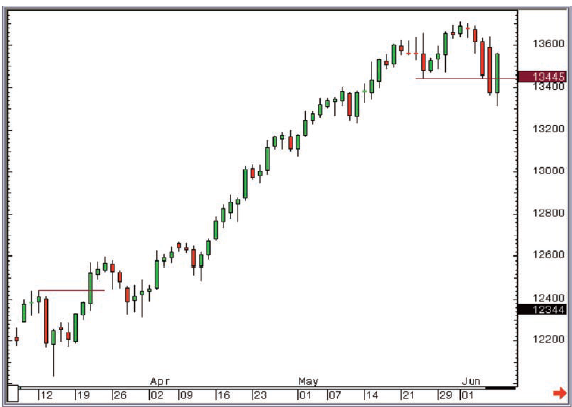
Figure 6-14: CME Group mini-Dow futures
(unadjusted active continuation); daily candlestick chart with support and
resistance lines; 7 March 2007 - 8 June 2007
Using
this basic assumption on the preceding chart, you can see where the uptrend
started (hence giving us a buy signal), and where the market broke a previous
higher low to stop the long trade out. On this occasion the lower lows and
lower highs were not really clearly defined when we got out of the trade, but things
had started to look messy and the price had broken an important support, thus
triggering liquidation of the long position.
Moving averages
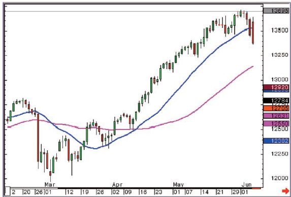
Figure 6-15: CME Group mini-Dow futures
(unadjusted active continuation); daily candlestick chart with 20 and 50-day
simple moving averages; 7 March 2007 - 7 June 2007
Many
traders and analysts use a moving average line as a reference for market
direction, as it smoothes the data set. Sometimes candlesticks can be a tad
confusing and trends can be difficult to define. A moving average takes the
average value of a set amount of data (usually closes) and plots them as a
line. They are called moving averages because the lines move with the market. A
10-day moving average adds up the last ten days of data and divides the total
by ten. Obviously as a new candlestick is added to the right hand side of the
chart we lose one from 11 days before from our calculation. Hence the line
moves with the movement of the candlesticks.
The
preceding chart - Figure 6-15 - is a daily candle chart with 20-day and 50-day
simple moving averages applied. Note particularly how the 20-day line reacts
more quickly to the price trend changing than the 50-day average.
Also see
how on several occasions we saw a pullback in the uptrend that got prices down
to the 20-day average line.
So if
after the Evening Star in early March and the Hammer in mid-March (the bottom
left hand side of the chart - there should be no need to highlight them by
now), you ask for a break of the 20-day moving average to confirm, you got your
confirmation on 20 March and bought at 12,381. If you subsequently used the
same 20-day moving average line as a trailing stop you would have been at most
66 ticks offside on 30 March, and you would have sold out for a profit of 1080
points on the close on the 6 June.
A simple
rule of thumb if you want to apply moving averages to candlesticks is to use
your eyes, and find the average line (by playing around with different period
settings) that acts as good support in a rising market (i.e, any pullbacks in
the uptrend find a bottom at or around the moving average line), and good
resistance (i.e, it caps upside advances) in a falling market. Then you want to
see that it gives clear signals when the market crosses the line.
This all
sounds easy but it isn’t, and a lot of patience and time is required to find
the line that does the best job for you. One of the biggest problems with
moving averages is that they become rather unreliable during trendless or
sideways markets, so this is something to watch out for and guard against when
you’re backtesting.
Trend lines
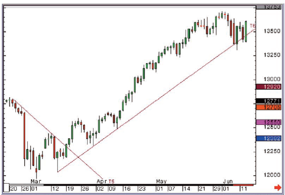
Figure 6-16: CME Group mini-Dow futures
(unadjusted active continuation); daily candlestick chart with trend lines; 7
March 2007 - 8 June 2007
Trend lines
are straight lines that define trends. It is amazing how many times the market
moves higher or lower with a consistently steady velocity that can be tracked
by a straight line.
An
uptrend line is a straight line that joins a series of higher lows in a market
that is travelling higher. You draw them below the price action, sloping higher
from left to right. You can use them to define the move and keep you in a long
trade. You can put a trailing stop below a trend line, and your stop order will
move higher as the market moves higher.
A
downtrend line is a straight line that sits above a downtrending market,
joining successive lower highs.
I always
apply a “rule of three” to the drawing of trend lines. I want to see three
lower highs joined together before classing a line as a hard and fast downtrend
line.
A move up
to a downtrend line where a bearish reversal pattern is posted is a good start
for a short trade set up. Once in the trade, as long as the market moves back
down, away from the line, you can use the line as a reference for a trailing
stop.
If you
have three higher lows that can be joined with a straight line you have a valid
uptrend support line and you should be looking to buy dips to this line,
especially if the market displays bullish candlesticks when hitting the line.
Using the
same chart as before we can see that in this case the short-term downtrend line
was broken after the candlestick reversal patterns, but just prior to our
moving average buy signal. The exit was a few days later than the moving
average sell signal, but at similar levels. The main message was that the
trailing stop using the trend line kept you in the trade for a good while.
Parabolic SAR
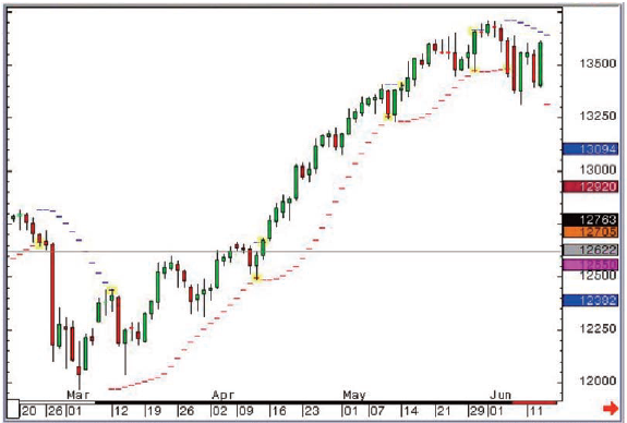
Figure 6-17: CME Group mini-Dow futures
(unadjusted active continuation); daily candlestick chart with Parabolic SAR; 7
March 2007 - 8 June 2007
This is a
study devised by Welles Wilder and introduced in his 1978 book New Concepts in
Technical Trading Systems. It relies on a trailing stop that gets closer to the
action as the trend progresses. As you can see, trades are triggered when
prices move through the dashes in one direction or the other.
It is an
“always in” trading tool, which means you are either short or long at all
times. SAR stands for Stop and Reverse, i.e, you stop out the previous position,
and simultaneously move to the opposite tack. I don’t tend to use it quite so
literally. I find it can be good to keep you in a strong trend for as long as
possible. It is another effective tool for stop placement, and for giving trend
beginning and trend ending signals, but as with a moving average it can be a
rather unreliable tool during sideways markets.
Once
again we’ve kept the same chart for this as the previous examples of moving
averages and trend lines. We got an earlier signal, and this would have
actually seen you quite a bit offside before things came good. In this instance
the SAR dashes didn’t do the best job for us, although you can see how they can
have value in strongly trending conditions.
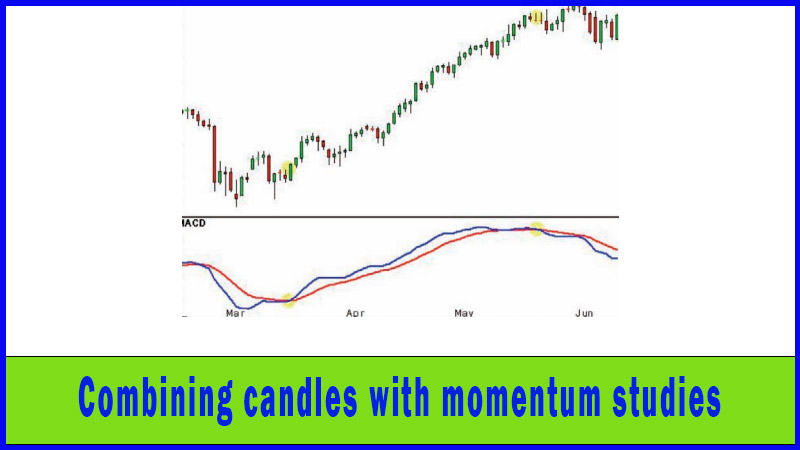
MACD
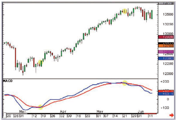
Figure 6-18: CME Group mini-Dow futures
(unadjusted active continuation); daily candlestick chart with MACD (12,26,9);
7 March 2007 - 8 June 2007
MACD
stands for moving average convergence/divergence and is a momentum study that
gives clear-cut buy and sell signals with the crossing of two lines, one of
which is a moving average of the other. The faster base line (the blue line in
this example) tracks the difference between two moving averages (the default
being the 12 and 26 day exponential moving averages). Longer-term traders find
this a robust, reliable momentum study. Once you’ve seen a candlestick reversal
pattern you want to add weight to the argument for a reversal, and a
corresponding signal from something like MACD is a good example of the sort of
thing you may want to add into your check box system.
You can
see once more that after our reversal patterns we get a buy signal from the
crossing of the MACD lines, and once the market starts to fall over so do the
lines, leading to a sell signal which came slightly earlier than those seen so
far from trend lines, moving averages and the like.
RSI
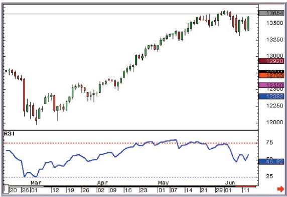
Figure 6-19: CME Group mini-Dow futures
(unadjusted active continuation); daily candlestick chart with RSI (14 day); 7
March 2007 - 8 June 2007
This is a
momentum study dealing with the ratio of up days to down days over a set time
period. It is constructed only using one line, which generally moves in the
same direction as the market. Many traders look for Divergence set ups, where the
indicator goes in one direction and the market in another; these can work
extremely well combined with candlestick analysis, with one signal confirming
the other. One of my favourite momentum studies, and well worth reading up on
(once again this was introduced by J Welles Wilder in New Concepts in Technical Trading Systems)!
As you
can see, throughout most of May the market kept heading higher but the RSI had
topped out a lot earlier, and didn’t subsequently emulate this high. Even a
month later in July, the indicator failed to follow when the Dow rallied to new
highs before finally topping out and cracking nastily lower as the 2007
sub-prime crisis bit hard.
Stochastics
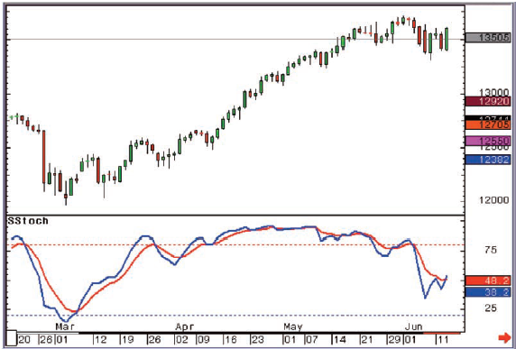
Figure 6-20: CME Group mini-Dow futures
(unadjusted active continuation); daily candlestick chart with Slow Stochastics
(10,3,3); 7 March 2007 - 8 June 2007
The
Stochastic Oscillator has a similar interpretation to MACD and RSI. This
short-term momentum study employs two lines, with the crossing of the lines
giving definitive buy and sell signals. Once again you can use something like a
Stochastics signal as confirmation for any candlestick reversal pattern.
A classic
buy signal is the lines coming out of oversold (ie, from below a reading of 20)
then crossing, with the blue line piercing through the red line. As you can see
this gave a pretty early signal in this instance, hard on the heels of the
Morning Star formation, but as with the Parabolic SAR discussed earlier there
was a fair bit of draw down after the signal was given before the Hammer was
posted and the market got going to the upside once more.
The other
thing this chart shows well is how unreliable signals can be from a short-term
momentum study when a market is in a solid trend, but as with the RSI a
divergence setup came to the rescue to try and make sense of things. If this
had caused you to liquidate longs you would have missed the last month of the
bull move, but you would not have been long when things started selling off
hard soon after that.
So what to use?
One thing
that the past few pages may have had you thinking is that across all the
different methods discussed we ended up with pretty similar confirmation
signals, and pretty similar exits. I did this deliberately, with a familiar and
constant chart; to try and get you thinking. This won’t always be the case, and
there will be certain indicators or methods that work better for you than
others. Your job is to discover what works best for you on your charts, taking
into account your time frame and your style of trading.
In other
words, you need to work it out and decide!
Tick the boxes
I
encourage the idea of producing, at least in the early days, a grid where you
need to tick say four boxes before pulling the trigger. Below is an example:
Conditions
for a buy signal
Established long/medium term uptrend Y/N
Retracement sell off seen on light
volume Y/N
Bullish candlestick reversal pattern
after pullback Y/N
Now rallying, and breaks first strong
resistance Y/N
Buy signal from Slow Stochastics Y/N
Pick up in volume as buyers return Y/N
If most
of the answers are “Yes,” then you have a compelling argument that the selling
is done and you should be getting long...
After a
while this way of systemizing your trading decisions will become second nature,
but even then if you find yourself starting to make undisciplined “hope”
trades, you can go back to using this sort of grid in order to force yourself
to justify your decisions.
Once you're in, stay in!
One other
idea I would also like to try and encourage you to think about is that you will
probably need something else to keep you in a winning trade for as long as
possible, but which will get you out in a timely fashion. It’s an easy trap to
fall into to use the same thing for entry and exit, but I don’t think that’s
necessarily the way forward.
Obviously
using the example grid on the previous page, you could argue that you get out
of a long position once you tick all the boxes that are saying you should sell,
but I’m not sure it’s as simple as that. I like to find a way to use a trailing
stop once you’re in a trade, and obvious candidates to achieve this result are
moving averages, trend lines, or one of my favourites: Welles Wilder’s
Parabolic SAR.
I also
like using Marabuzo lines for this, as you can see from Figure 6-21. At the
bottom is a Hammer on a strong support. The market then starts to move higher
in an obvious uptrend, and we were able to stay bullish all the way up in this
one, and use Marabuzo lines as a reference to stay with the bulls every time
they appeared. The trend was extremely strong during this period, and the lines
all pretty much held like a dream. Sweet!
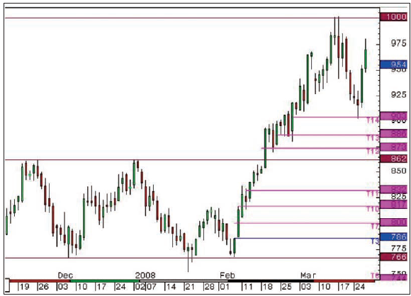
Figure 6-21: ICE Gas Oil futures
(unadjusted active continuation); daily candlestick chart; 14 November 2007 - 27
March 2008
There’s a
load more on this chart as well, though. Have you spotted the variation on an
Evening Star at key resistance at the start of January? Or the Hammer on
support towards the end of January? How about the Inverted Hammer that was
confirmed the following day just a few weeks later? Not the strongest of
patterns, until the market gapped higher the next day. Then the market got
through the previous resistance and posted a nice big reaction day in
mid-February. There was no stopping the market then, not until prices got up to
the psychologically important $1000 mark. The day this level was hit a Shooting
Star was posted. Then traders sold off, but only to a Marabuzo line, where a
small bodied candlestick was posted upon hitting this key support.
I could
point all of these out to you, but we’re at the end of the book, and I’m rather
hoping you’re finding them yourself now!
Chapter summary
A lot of
time and energy is spent on momentum indicators these days, among both
professional and beginner traders. I always beg newcomers not to get too bogged
down with these, and to make sure they don’t have too many indicators all
running alongside each other, as they will often be telling you the same thing.
“Paralysis
by analysis” is a phrase that springs to mind.
But even
saying that, an indicator can be an integral element of a trading system, and
there’s nothing more important than having a system.
I’m a big
believer that candlesticks can be incorporated into any trading system, and can
enhance your system, for example by providing an earlier “heads up” indication
of trend change.
Uses of Candlestick Charts : Chapter 6. The Real World - Practical Application : Tag: Candlestick Pattern Trading, Forex : Support and resistance, Moving averages, Trend lines, Parabolic SAR, MACD - Combining Candles with Momentum