Different Time Frames
multiple time frames trading, multiple time frames in technical analysis, multiple time frame ichimoku, multiple time frames day trading
Course: [ Uses of Candlestick Charts : Chapter 6. The Real World - Practical Application ]
In this book we have discussed the common candlestick patterns by mostly viewing daily charts, where each candlestick represents a day’s data.
Different time frames
Discovering your time frame: longer-term traders and money managers
“So what
time frame charts should I use, then?” is a question I am often asked. My answer
is always the same: “You need to work that out for yourself.”
So far in
this book we have discussed the common candlestick patterns by mostly viewing
daily charts, where each candlestick represents a day’s data.
We have
seen a few examples of weekly charts, like the chart for Euro/USD with all the
Hammers on it (Figure 3-3).
Daily and
weekly candlestick charts can be used for making investment decisions with a
time horizon of anything from two weeks upwards. When I say “time horizon” I
mean the time frame for holding a position. Long-term buy and hold fund
managers use longer- term charts; there’s no point in them looking at intra-day
charts as the apparent volatility could spook them into making rash decisions.
They need a view of the bigger picture, and weekly charts do exactly this.
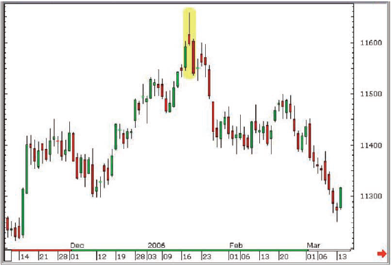
Figure 6-2a: LIFFE Long Gilt (adjusted
continuation); daily candlestick chart; 9 November 2005 - 14 March 2006,
showing 17, 18 and 19 January 2006 Evening Star
Many money managers use longer-term moving averages, the most common being the 50-day and 200-day averages, and I would suggest overlaying candlesticks onto these, looking for times when reversal patterns appear after a pullback to a reliable moving average line.
Figure 6-1: S&P 500 futures
(unadjusted continuation); daily candlestick chart; 31 March 2004 - 23 June
2004, showing a Hammer on 12 May and a Bullish Harami on 17 and 18 May, both on
the 200-day moving average line
As well
as this I would suggest longer-term investors might look out for situations
where there are candlestick reversal patterns appearing on weekly and daily
charts at the same time. Opposite is a great example of this kind of thing,
occurring at a top in the Long Gilt.
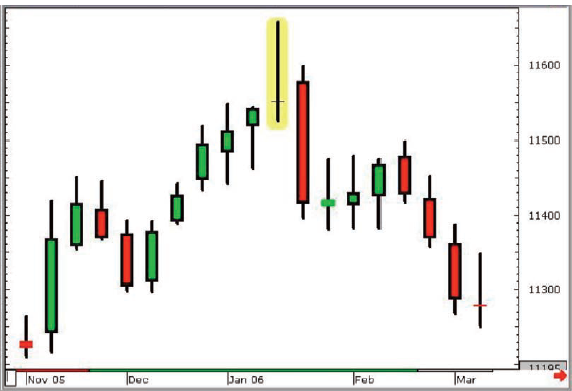
Figure 6-2b: LIFFE Long Gilt (adjusted
continuation); weekly candlestick chart; 9 November 2005 - 14 March 2006,
showing Long Legged Doji for the week of 16-20 January 2006
Most of
the time that I see technical analysis being used by long-term money managers
it is as a filtering process. You apply a set of conditions to a list of stocks
or markets and ask a computer to give you a list of constituents of said list
that tick all of your conditions. It is fairly simple these days to add pattern
recognition into this sort of programme, so that you can make candlesticks a
part of the process.
Say you
have a filtering process that looks for stocks on the LSE that are below their
10- day moving average but have just hit their 200-day average. This may
produce a list of, say, 50 stocks a day. If this is too many, then you need
another parameter to narrow the search. How about stocks that at the same time
post a candlestick reversal pattern? This is all very simplistic, but this is
an introductory book, so I’m merely trying to provide a bit of food for
thought. What you would then have is a list of stocks that have been selling
off in the short term but are now hitting key long-term support and showing
signs of reversing.
Ichimoku Charts
There is
an increasing following for Ichimoku charts in longer-term decision making.
It’s a very simple box to tick to ask that something is above the Ichimoku
Cloud on the weekly and daily charts before a buy signal is classed as
confirmed. My STA colleague Nicole Elliott has written a fine book on the
subject and in the UK we’re also lucky enough to have another strong exponent
of the subject (again, an active member of the STA) in David Linton.
Ichimoku
charts are overlaid on a candlestick chart - the two go hand in hand.
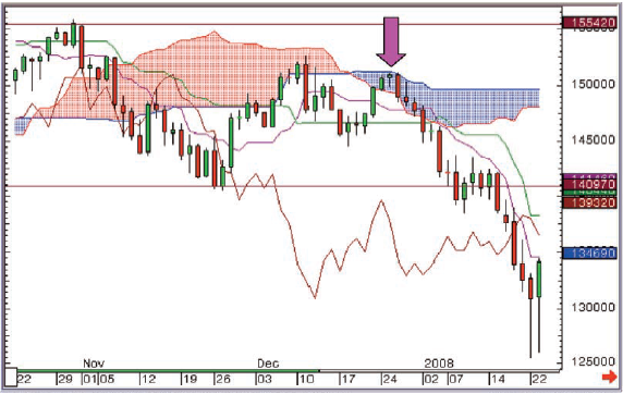
Figure 6-3: S&P 500 futures
(unadjusted continuation); daily candlestick chart overlaid with Ichimoku; 22
October 2007 - 23 January 2008
At the
end of December an Evening Star with a Hanging Man for a middle candle was
posted (highlighted with the purple down arrow). This was seen within the
cloud, with the top of the cloud capping upside on the pattern. A few days
later when the market sold off through the bottom of the cloud the downside
accelerated dramatically.
Discovering your time frame: shorter-term time frame traders
Daily
charts can be used by all participants to keep a firm grip on the market’s
overall direction, and any suspected changes, from longer-term players right
down to intra-day traders who are executing many trades per day. It’s this
group I want to talk about now because they can (and many actively do) use
candlestick charts of all different time frames, down to 1 -minute intervals if
they’re trading products that are liquid enough (although I’m not a big fan of
going this short-term, personally - I don’t like to view anything less than a
10-minute chart).
If you
are a day trader wanting to use short-term candlestick charts as the basis, or
even as just one element of your trading strategy, then I would like first of
all to stress one very important thing: Make
viewing the daily and weekly charts for the instrument(s) you’re trading a
compulsory part of your daily routine.
Warning!
I’ve seen
many traders get so involved in the short-term price action that they forget
the bigger picture. Candle charts, even daily and weekly charts, are dynamic,
and can change without you even realising it. A potential reversal pattern can
creep up on you, believe me!
Seeing
the bigger picture can also help you to trade in the direction of the
prevailing trend, and you should find making money easier if you’re not trying
to battle against the crowd every time you put a trade on. “The trend is your
friend” is an old adage that’s used in technical analysis and trader circles,
and it’s often greeted with a groan, but it’s so much easier to make money in a
falling market by going short than trying to pick the bottom.
But back
to the short-term time frames: look at the two charts on the following pages.
Both show similar-looking down moves followed by similar-looking up moves after
the appearance of similar-looking Hammers, wouldn’t you agree? Except Figure
6-4 is a daily candlestick chart, showing 35 days worth of data with a price
range of $13.50, whereas Figure 6-5 is a 10-minute chart showing around eight
hours worth of price action over a 79 tick range.
The
Hammer in Figure 6-4 therefore took a whole day to form. In other words, over
the course of an entire session the market sold off from 87.38 to 85.00 then
rallied again, all the way back up to a high of 88.86, closing the day just shy
of this high at 88.25.
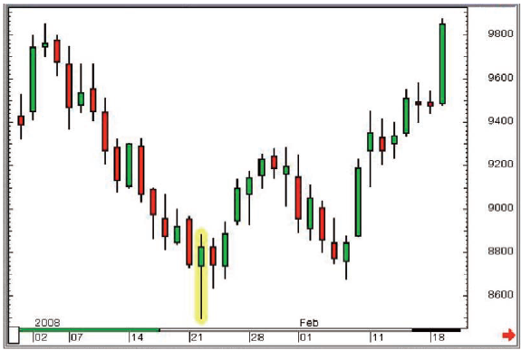
Figure 6-4: ICE Brent Crude Oil futures
(all sessions, unadjusted continuation); daily candlestick chart; 31 December
2007 - 19 February 2008
This
turned out to be the low of this move and over the course of the next 20
candlesticks (ie, 20 working days) the market rallied $10.
Figure
6-5 has a Hammer at the bottom as well, except this is a 10-minute chart. More
or less exactly the same thing happened over this 10-minute period as happened
on the Hammer day in Chart 6-4: the market sold off and then rallied, closing
strongly. The message is the same; there was a period of time where the market
sold off then recovered - a sign that the buyers had returned to the fray
because the price looked cheap.
The range
on this 10-minute period was 17 ticks. The market sold off from 113.77 to
113.63 then rallied to print 113.80 before ending the 10-minute period at
113.78. The following 20 candles (representing 3 hours and 20 minutes of trade)
saw the market rally steadily, adding 29 ticks.
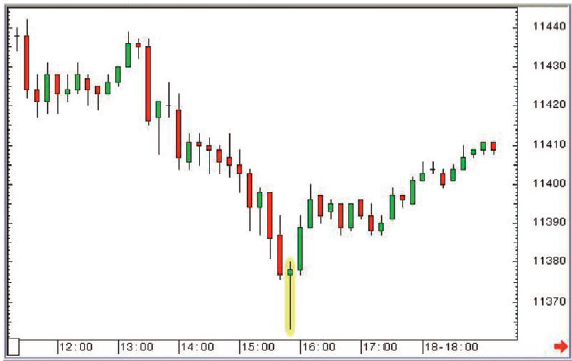
Figure 6-5: Eurex Bund futures;
10-minute candlestick chart; 18 April 2008, 11.20am to 7.20pm
It
doesn’t matter what the time frame is, the message is the same: the market has
witnessed some selling off, but found support and then rallied - the market may
have found a bottom.
Now we’re
getting down to the real crux of the whole thing. Candlesticks tell you where
the market has been. From this you can make assumptions as to the state of mind
of the market as a whole. You can make up your mind as to whether the bulls are
feeling confident or whether they’re recovering from a good beating. You can
decide whether the bulls are running the show and whether they’re comfortable
in doing so. You can tell when the cracks are appearing, when things may be
changing. It doesn’t matter whether this is with respect to short-term time
frames or long-term, because the two way pull, the tug-of- war, is dealing with
the same issues: fear, greed, emotion, elation, euphoria, crowd psychology, etc.
Candlesticks
can be an extremely potent ally for short-term time frame traders, and in the
many years I’ve been advising traders on market direction using candlesticks
I’ve almost always done so using 10-minute and 60-minute candle charts for
short-term turning points, and daily and weekly charts to keep tabs on overall
direction.
Emotion
The key,
then, is to work out your time frame. One of the biggest challenges facing any
trader is working out the time frame that works for them. We are all
individuals, and on that basis will all have different ways of dealing with
things. Trading is an emotional game, there’s no getting away from it. This is
where technical analysis can help, and in particular candlestick analysis,
because the signals provided can reduce the emotion in your decision making
process, whether for trade entry or trade management/exit strategy. I have
heard people say that technical analysis can remove the emotion from trading
but this is wrong. The vast majority of people cannot remove emotion from
trading, but you need to try and find a way to manage it so that the old evil
pairing of fear and greed do not take over your decision making. As soon as
they take over, you’re on a slippery slope.
But
there’s no point in a day trader using the weekly chart for signals, and by the
same token a fund manager has little use for 10-minute charts. I often think
that there is a real opportunity for voice brokers with a technical leaning.
Longer-term money managers could come up with the ideas, then leave it to the
broker to time the entry of the trade using short-term technicals.
Applying flexibility when viewing short-term time frame charts
In the
early chapters of this book I covered some of the more popular candlestick
reversal patterns, and with each one I presented a box that summarised the
rules that need to be satisfied for each particular pattern. Now I’m going to
suggest that there are times when the rules need to be, let’s say, massaged!
If you
are viewing intra-day candlestick charts for liquid products such as, say,
S&P 500 futures, do you get gaps between the candles; gaps that are needed
to form patterns like Dark Cloud Cover, Stars or Engulfing candles? The answer
is no, in the main. Most candlesticks will start exactly at (or at worst a tick
away from) the same price as the close of the last candle on intra-day charts,
as there is literally a nanosecond between one candle ending and the next one
starting. Just because one 10-minute period is over and another is beginning doesn’t
mean we’re suddenly going to see a big jump (or fall) in price. This needs to
be factored into the equation.
Look at
the following chart. It shows a couple of bottoms on a short-term chart, both
of which were very effective, and both of which would have been called Piercing
Patterns had there been a gap lower on the first trade of the second candle.
But this isn’t going to happen in reality on a short-term intra-day chart - the
real message is in the strength of the rally on the second candle. We need to
adopt a flexible approach to where these candles start life, or we will be
missing the patterns, and the message that they’re conveying.
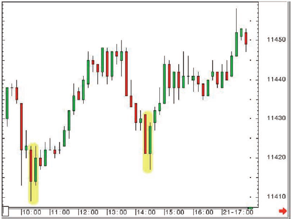
Figure 6-6: Eurex March 2003 Bund
futures; 10-minute candlestick chart; 21 January 2003, 9.30am - 6.00pm
Going through the time frames for trade placement and management
Those
looking to put on longer-term trades but searching for the best possible entry,
and later on exit, can start with short-term time frames then move up through
the time frames until they’ve got a position on and are looking at a chart that
suits the time frame of the trade.
Quite
often something like a 10-minute or 30-minute chart can be used to gauge the
market’s sentiment in the short-term. You may have a big line to buy, but you
can see clearly on the short-term charts that the market is coming off, and
that there’s some strong support just below. You could wait and see if the
market reacts to the strong support then jump in as and when bullish reversals
appear on the short-term charts at these levels. The fact is you already know
you want to buy, you’re just asking the chart to show you the best time to do
so. If the short-term chart has got you into a trade you can then switch to a
longer-term chart to run the trade.
Why do you
need to jump to a longer time frame? Because the same short-term chart that
gave you those early clues to get in can also spook you to jump out of your
position too early. Viewing a 60-minute or daily chart is far less exciting
than looking at a 10-minute chart, even though it’s tracking the same prices.
As with
many things in charting and trading, it’s all about the messages that get sent
to the brain. A less exciting chart means less chance that you’ll trigger some
sort of panic mechanism and jump out of your trade early.
If you’re
in a position for a few days and it’s starting to work out well the ideal
scenario is to use the weekly chart for stop placement, and to run the thing
for as long as possible.
Stop orders
Placement
of stops (and subsequently moving stops to protect a profit) is essential for
successful trading, and a candlestick chart is as good a canvas as any for this
exercise. I also have a lot of time for Point & Figure charts and Ichimoku
charts with respect to the running of trailing stops, but that’s for another
time!
We’ve
spoken about gaps and Marabuzo lines as strong support levels during uptrends
and great references as resistance in a market that’s heading lower. These
could also be incorporated into your stop strategy.
Different time frames all showing reversal patterns = alert!
Earlier
we looked at the idea of spotting reversal patterns on weekly and (at the same
time) daily charts. This exercise can be just as effective with short-term time
frames. Many short-term traders in the futures markets use 10-minute or
15-minute charts, whereas longer-term players will tend to be watching
longer-term charts - hourly charts at least. 1 get very excited when 1 see
candlestick reversal patterns on short-term (say 10-minute) charts that appear
at the same time as reversal patterns on the 30-minute or hourly charts. This
means that different types of trader are all getting the same message from
their candlestick charts, and if everyone starts to pull in the same direction
you should start to see a definite one way reaction.
And this
sort of situation is not unusual, as 1’ll try to explain below. Take a
combination of three candlesticks on a 10-minute chart that have the look and
feel of a Morning Star.
As we’ve
discussed it’s very unlikely that the gaps to form a textbook Morning Star will
appear on the 10-minute chart, so we need to exercise some flexibility. You can
see opposite that the three candles highlighted are a large filled candle, a
small-bodied candle flagging indecision, then a big open candle to confirm the
turnaround. So the idea of a Morning Star is clear, 1 hope you agree. Also, in
this example the middle candle was a rather neat Doji.
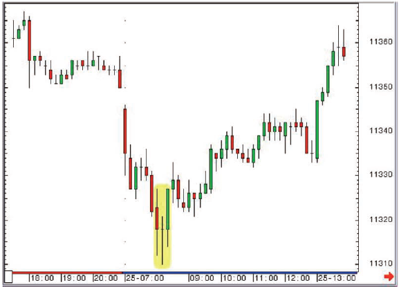
Figure 6-7: Bund futures (June 2008);
10-minute candlestick chart; 24 April 2008, 5.30pm until 25 April 2008, 2pm
Remember
because it is an intra-day chart we’re exercising some of that flexibility
talked about earlier.
Now let’s
look at the 30-minute chart (Figure 6-8). You can see a clear Hammer
candlestick. Whatever the time frame being viewed the trader is looking at a
powerful reversal, because the price action has taken on a “V” shaped direction
of travel. The buyers are back!
Figure 6-8: Bund futures (June 2008);
30-minute candlestick chart; 24 April 2008, 5.30pm until 25 April 2008, 2pm
This is
another gentle introduction to the idea of merging or blending candles, as
Nison calls it. If you have a series of candlesticks that look like they should
be a reversal but there’s no firm name to attach to them, try moulding them
together. You may just find you’re staring at a potent pattern like a Hammer or
a Shooting Star!
The three
candles that form an Evening Star on a 10-minute chart, when combined together,
will likely give you a Shooting Star, which is what will be showing up on the
30- minute chart. For a reminder of what I’m talking about here refer back to
Figure 4-14.
Which
neatly brings us back to our “going through the time frames” idea. Say you’ve
bought something on the back of a Doji on the 10-minute chart. This Doji turned
out to be the middle candle of a flexible Morning Star, which blends to form
another Hammer on the 30-minute chart. All the time frames are screaming the
same thing, and if you’ve moved up to the 30-minute chart from the 10-minute
you will still be confident that a bottom is in place due to the Doji on your
chart.
Uses of Candlestick Charts : Chapter 6. The Real World - Practical Application : Tag: Candlestick Pattern Trading, Forex : multiple time frames trading, multiple time frames in technical analysis, multiple time frame ichimoku, multiple time frames day trading - Different Time Frames