Constructing the Candlestick Lines - How to Read Candlestick Chart
Single candlestick patterns, Types of candlesticks, Powerful candlestick patterns, Types of candlesticks, Candlestick chart analysis, Bearish candlestick patterns
Course: [ JAPANESE CANDLESTICK CHART AND TECHNIQUES : Chapter 1: Basics of Candlestick Chart ]
Prices seem to jump off the page on the candle chart. It presents a stereoscopic view of the market as it pushes the flat, two-dimensional bar chart into almost a three-dimensional aspect.
CONSTRUCTING THE CANDLESTICK LINES
“Without oars you cannot cross in a boat.”
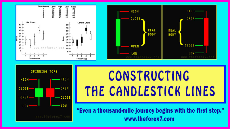
Candle charts use the same open, high, low, and
close data as the traditional Western bar chart. With this in mind, a bar chart
is shown in Exhibit 1.1. Exhibit 1.2 is a candle chart of the same price
information as the bar chart.
Prices seem to jump off the page on the candle
chart. It presents a stereoscopic view of the market as it pushes the flat,
two-dimensional bar chart into almost a three-dimensional aspect. Candle charts
are visually stimulating. Exhibit 1.3 shows how the same data looks on a bar
chart and then a candle chart.

Exhibit 1.1. Bar Chart

Exhibit 1.2. Candle Chart

Exhibit 1.3. Bar Chart and Candle Chart
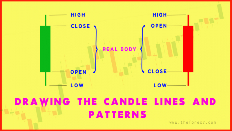
DRAWING THE CANDLE LINES
The rectangular sections of the candle line
Exhibits 1.4 to 1.6. are called the real body. The real body represents the
range between the sessions open and close. When the real body is black (i.e.,
filled), it means the close of the session was lower than the open. If the real
body is white
(i.e., empty), It shows the close was higher than the open.
The thin lines above and below the real body are
the shadows (these names are almost lyrical- the real body and the shadows of
these real bodies.) the shadows above the real body is called the upper
shadow and the shadow below the real body is the lower shadow.
Accordingly, the peak of the upper shadow is the high of the session and the
bottom of the lower shadow is the low of the session.
If a candle line has no upper shadow, it is said to
have a shaven head. A candle line with no lower shadow has a shaven bottom.

Exhibit 1.4. Green Candle Line

Exhibit 1.5. Red Candle Line

Exhibit 1.6. Spinning Tops
We see why these are named candle or candlestick
charts; the individual lines often look like candles with their wicks. As
mentioned in the Introduction, we will use the terms candles and candlesticks
interchangeably throughout the rest of the book.

Exhibit 1.7. Examples of Doji
The Japanese say the real body is "the
essence of the price movement." This reflects a central concept about
the power of the real bodies: By looking at the height and colour of the real
body, we get an immediate visual clue whether it's the bulls or bears who are
in control.
As such, candle charts will make market analysis
faster and more efficient. Using the long white candle in Exhibit 1.4 as an
example, who is in charge? The bulls or bears? Obviously, it's the bulls since
on that session the market opened near its low and closed near its high.
Likewise, a long black candle (Exhibit 1.5) is a visual representation that, at
least for that session, the bears were in control since the market opened near
its high and closed near the session lows.
Candle lines can be drawn using any time frame—from
intraday to daily to weekly charts. For example, a white candle, as shown in
Exhibit 1.4, if based on a daily chart, would mean that the bottom of the real
body is the first trade of the day (remember, a white real body signifies the
open is at the bottom of the real body) and the top of the real body is the
day's close. The intraday peak and trough are the tip of the upper shadow and
the bottom of the lower shadow, respectively.
Similarly, a five-minute black candle line tells us
that the open of that five-minute period is at the top of the black real body
and the close is at its bottom. The high and low of that five-minute session
will define the upper and lower shadows.
A practical application of the real body is using
its size as a barometer of the market's momentum.
While a long white and black candle shows the
action is onesided, we get a clue that the prior momentum may be losing force
as the real body becomes smaller. The Japanese term for a small real body
(black or white) is a spinning top. Exhibit 1.6 shows examples of spinning
tops. The lines illustrated in Exhibit 1.6 have upper and lower shadows, but
the sizes of the shadows are not important. It is the small size of the real
body that makes these spinning tops.
Spinning tops are components of candle formations
including morning and evening stars, harami, hammers, and others that will be
discussed at length in the appropriate sections.
Notice something about the real bodies in Exhibit 1.7?
There aren't any! These lines are named doji (the plural of doji is also doji)
and they represent a session when the open and close are the same (or very
close to one another). Doji have implications as a reversal signal. We will
look at this aspect later in this chapter and in greater detail in Chapter 8.
In Exhibit 1.8, during the week of April 1 a
descent began near 315 via a series of black candles. As the decline ensued the
real bodies increased in length, reflecting increasing bearish momentum. The
emergence of the spinning top on April 7 changed the technical picture from one
in which the bears had complete control to a market where the bears were losing
domination. Since the small real body was only one session's activity, it
should be viewed as a tentative clue. Nonetheless, it was the first sign of a
potential reversal. This represents a major advantage of candle charts: They
will often let you spot potential market turns as quickly as one session.

Exhibit 1.8. Semi-Conductor Index – Daily (Spinning
Top)
While the April 7 spinning top was a candle signal,
it also helped confirm a traditional western technical analysis tool—
specifically, a rising support line constructed by connecting the March 10 and
March 23 lows. Thus, we have two signals, the support line and spinning top,
reinforcing support near 285. This concept of combining Eastern and Western
techniques will be the focus of Part 2.
Another example of a spinning top hinting of a turn
is the point where the decline from 315 began—the April 2 spinning top
(remember, the colour of the small real body is not important) that followed a
tall white candle (at which time the bulls were in control).
One of the fascinating aspects of the candles is
that they can send out warning signals not evident on bar charts. For example,
look at the prior chart in Exhibit 1.2 and the rally the week of January 18.
Notice the two candles lines as the stock approached the $60 level. If this was
a bar chart, this stock would look healthy since it was making higher highs,
higher lows, and even higher closes. However, the candle lines give us a
different perspective. To wit, those small real bodies are hinting that the
bulls do not have full control. Also, note that the high during the week of
January 18 was also near a resistance area. As such, the small real bodies, via
the candles, were confirming that resistance area.1
As we've seen, the Japanese place great emphasis on
the relationship between the open and close because they are the two most
emotionally charged points of the trading day. The Japanese have a proverb: "The
first hour of the morning is the rudder of the day." Likewise, the
opening is the rudder for the trading session. It furnishes the first clue
about that day's direction. It is a time when all the news and rumours from
overnight are filtered and then joined into one point in time.
The more anxious the trader, the earlier he or she
wants to trade. Therefore, on the open, shorts may be scrambling for cover,
potential longs may want to emphatically buy, hedgers may need to take a new or
get out of an old position, and so forth.
After the flurry of activity on the open, potential
buyers and sellers now have a benchmark. There are frequent analogies to
trading the market and fighting a battle. In this sense, the open provides an
early view of the battlefield and a provisional indication of friendly and
opposing troops.
The other pivotal price point is the close. We can
thus expect heavy emotional involvement into how the market closes. The close
is also a critical price point for many technicians. They may wait for a close
to confirm a breakout from a significant chart point. Margin calls in the
futures markets are also based on the close. Many computer trading systems (for
example, moving average systems) are calculated from closes.
Typical of the military analogies used by candle
chart analysis is the way the Japanese refer to unusually big orders on the
open or close. If a large buy or sell order is pushed into the market at or
near the close, with the intention of affecting the close, the Japanese call
this action a "night attack." If this is done on the open, it
is called, not surprisingly, a "morning attack."
CANDLE TERMINOLOGY AND MARKET EMOTION
Technical analysis is the only way to measure the
emotional component of the market. We know that many times an ounce of emotion
can be worth a pound of facts. How else to explain a sudden shift in the market
without a change in the fundamentals?
A fascinating attribute to candle charts is that
the names of the candle patterns are a colourful mechanism describing the
emotional health of the market at the time these patterns are formed. After
hearing the expression "dark-cloud cover," would you think the
market is in an emotionally healthy state? Of course not! As we will see later,
this is a bearish pattern and the name clearly conveys the unhealthy state of
the market.
There are many patterns and ideas in this book, and the descriptive names employed by the Japanese not only make candle charting fun, but easier to remember if the patterns are bullish or bearish. For example, in Chapter 5 you will learn about the "evening star" and the "morning star." Without knowing what these patterns look like or what they imply for the market, just by hearing their names, which do you think is bullish and which is bearish? The evening star (the nickname for the planet Venus), which comes out before darkness sets in, sounds like the bearish signal—and so it is! The morning star, then, is bullish since the morning star (the planet Mercury) appears just before sunrise.
JAPANESE CANDLESTICK CHART AND TECHNIQUES : Chapter 1: Basics of Candlestick Chart : Tag: Candlestick Pattern Trading, Forex : Single candlestick patterns, Types of candlesticks, Powerful candlestick patterns, Types of candlesticks, Candlestick chart analysis, Bearish candlestick patterns - Constructing the Candlestick Lines - How to Read Candlestick Chart