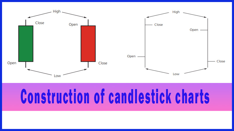
Construction of candlestick charts
Powerful candlestick patterns, Candlestick technical analysis, Bullish and Bearish candlestick patterns, Candlestick chart analysis, Parts of a candlestick, Best candlestick patterns, Bullish candlest
Course: [ Uses of Candlestick Charts : Chapter 1. What Are Candlesticks ]
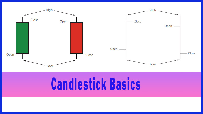
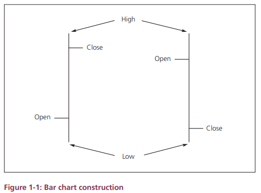
Until the late 1980s the Western world used bar charts as the standard method for charting the markets. A bar chart displays price on the vertical axis and time along the horizontal axis; each bar represents a set time period (e.g., a day or a week or a month). For the moment we’ll stick to daily charts.
Candlesticks versus traditional bar charts
Until the
late 1980s the Western world used bar charts as the standard method for
charting the markets. A bar chart displays price on the vertical axis and time
along the horizontal axis; each bar represents a set time period (e.g., a day
or a week or a month). For the moment we’ll stick to daily charts. The four
pieces of data used in a bar chart are: the day’s open, high, low and close.
Figure 1-1 shows how these four levels are displayed.
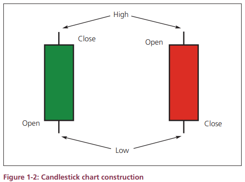
Candlestick
charts use the same price levels as bar charts (ie, open, high, low, close),
but they display the data in a different way - as can be seen in the following figure.
By
comparing the bar charts and candlesticks you can see that the principles -
they both present in a graphical format the essential price data (open, high,
for a given period.
Let’s look
at an actual example.
The figure
below shows a standard bar chart, while the following figure is the same chart
but this time using candlesticks instead of bars.
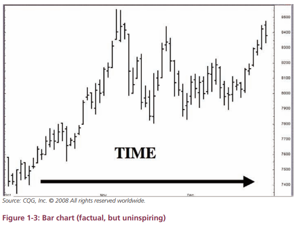
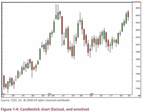
By
comparing the preceding two charts, you can see that the shape of the charts is
the same. (The two charts actually show the price behaviour of gold at the end
of 2007 - but it is not important to know that at this stage.)
Although
the overall shape of the charts is the same, the candlestick chart is easier to
read because the candles do a much better job of clearly distinguishing the
exact relationship between the four prices for each period. For example, it is
easy to see whether a period was bullish or bearish (by the colour).
Summary
The
information carried in bar and candlestick charts is the same, but the design
of the latter makes it easier to spot patterns that can be significant to a
trader or analyst.
The anatomy of the candles
Let’s have
a closer look at the colour scheme used in the candlestick charts. A closer
inspection of Figure 1-4 shows that the candlesticks are different colours
depending on whether the market closed above or below the open. The fat bit in
the middle is the difference between the open and the close, and is called the
real body of the candlestick.
A
candlestick with a green real body is created on a day when the market closed
higher than where it opened. In other words price moved higher over the course
of the day. This means, if you use the basic principles of supply and demand,
there were more buyers than sellers. To put it into the market parlance that I
will use from now on, the bulls won the day.
A
candlestick with a red real body is the result of a day where the market closed
below the level at which it opened. This means the sellers outweighed the
buyers, or there was more supply than demand, resulting in price moving lower.
In market terms it was a bearish day.
So we now
know that the difference between the open and the close is called the real
body, and that its colour depends on whether it was a bullish or bearish day,
from open to close.
I would
stress at this point that the colour of a candlestick is nothing to do with
where a market closes in relation to the previous day’s close. This is a common
mistake that many people make because on quote boards prices are often
displayed either as red or green depending on whether the market is higher or
lower compared to the previous close.
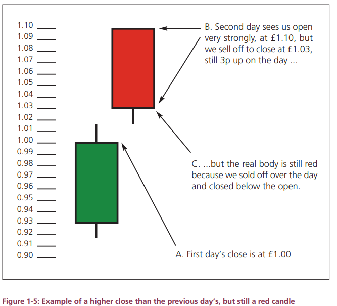
If, for
example, a stock closed at £1.00 yesterday, then opened today at £1.10, but by
afternoon trade had sold off to close at £1.03, it would still be up 3 pence on
the day. However, the candlestick’s real body would be big and red because the
stock opened at £1.10 then closed at £1.03.
I have
illustrated this in Figure 1-5 below.
Let’s
finish off this walk through the construction by adding some terminology into
the equation.
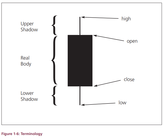
The figure
below shows the other terminology you need to be aware of with respect to the
different elements of an individual candlestick.
Figure
1-6: Terminology
The difference
between the top of the real body and the high of the day is the upper shadow
(sometimes called the upper wick).
The
difference between the bottom of the real body and the low of the day is the
lower shadow (or lower wick).
Another way
to think about it is that there’s a line all the way down the middle of a
candlestick representing the day’s range. The Japanese call this the kage or the shadow line.
It is
important to be happy with these terms as I will continually use them
throughout the rest of the book.
The charts
I will use throughout this book, for the sake of continuity, are all taken from
a charting system called CQG. Their favoured colour scheme, and the one I’ve
grown used to using in my daily routine, is green (for bullish) and red (for
bearish) candles, as illustrated so far in this book.
Different
charting systems have different default settings, although with most half
decent systems you can change the candles to whatever suits you. Just make sure
you know which way round they are!
In fact -
and confusingly - the Japanese traditionally used red candles for up days and
black candles for down days, red being a lucky colour in Japan.
A general
rule of thumb that will usually see you right is that solid blocks are down
days, whereas real bodies that are light of colour are bullish candles.
This may
also help you in case you come across candlestick charts in black and white
only.
Again there
is a custom that is generally accepted in candlestick analysis, and I will use
this for the rest of the book, just to try and keep things standardised:
Open < Close = bullish = light in
colour = open real body
Open > Close = bearish = dark in
colour = filled real body
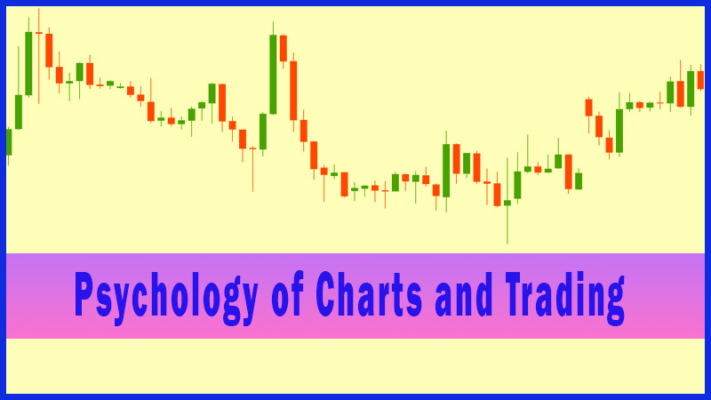
It is
people that set price, and people who form the chart. In other words technical
analysis is quite simply a study of human behaviour - or psychology to you and
me.
And this is
what I do with candlesticks: I dig into the psychology of each of the patterns
that make up candlestick analysis. There are many different patterns, all with
different shapes. In the coming chapters we’re going to go through the
different patterns, work out what movement in price formed these shapes, and
then translate that into the psychology of the market at each step of the
formation of the pattern. What was the market thinking that resulted in these
particular patterns? And why does this often translate into a reversal or
continuation of the trend?
An easy way
to think about the market is as if it’s a battle between the buyers and the
sellers. Just split it into two distinct groups of traders: the bulls and the
bears. Obviously this is quite a generalisation, but it can be a very effective
way of analysing market movements - maybe because it personalises it.
This is the
crux of the whole book, in my opinion. I have tried to help you understand the
construction of the different patterns that appear in candlestick charts in
order that you can deduce what is happening in the market for yourself. While
reading this book, hopefully you will have “a light-bulb moment” and realise
what candlesticks can do for you, no matter what you’re trying to gain from
your charts. I am hoping you will see how candlesticks can help you to answer
some of the rather confusing questions I have already posed about market
psychology and the minute-by-minute changes in sentiment. Market psychology
underpins candlestick analysis, and I have thrown it in at this early stage to
get you thinking in this way!
Uses of Candlestick Charts : Chapter 1. What Are Candlesticks : Tag: Candlestick Trading, Forex : Powerful candlestick patterns, Candlestick technical analysis, Bullish and Bearish candlestick patterns, Candlestick chart analysis, Parts of a candlestick, Best candlestick patterns, Bullish candlest - Construction of candlestick charts