Trendlines with Candlestick Analysis
Candlestick analysis, Candlestick chart, Gap down Doji, Hammer signal, Best candlestick pattern, Trendline analysis
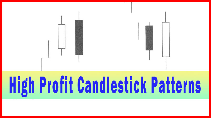
Course: [ How To make High Profit In Candlestick Patterns : Chapter 4. Candlesticks with Technical Patterns ]
Trend Lines are visually apparent levels where support or resistance has been occurring. Technical analysis is built upon the premise of identifying trends. They are one of the most important tools for both identifying a trend and confirming the existence of that trend.
Using Trendlines with Candlestick Analysis
One
of the most commonly used indicators is the trend line. Trend Lines are
visually apparent levels where support or resistance has been occurring. Technical
analysis is built upon the premise of identifying trends. They are one of the
most important tools for both identifying a trend and confirming the existence
of that trend. They are the simplest indicators to place on a chart. When
analyzing any chart, the eye can usually distinguish an area where a line could
be drawn across the bottoms or the tops.
The
basis of a trendline is that it is formed when connecting at least two points.
The more points that fall upon that line, whether actually drawn or visually
evaluated, the greater the confirmation that the trend is being affected by
that trendline. Many of the principles that are applied to other support and
resistance indicators can also be applied to trendlines.
Many
technical analysts require that a trend line be confirmed by at least three
points touching that line. A rising trend line is identified with successively
higher low-price points. The rising slope is now considered a support level.
The Bulls are in control, providing demand every time prices come back to test
the trendline. As long as the prices remain above the up trending trendline,
the uptrend is considered intact.
As
illustrated in Fig. 7, the March crude oil chart, a Bearish Engulfing signal
appeared when the stochastics still indicated more upside potential. The
trendline drawn from the top of the October high through the recent top at the
January high can now be viewed as an important resistance. The candlestick
“sell” signal provides an ‘alert’ for selling to appear at this level when the
stochastics indicated that there was still more upside to this trend.
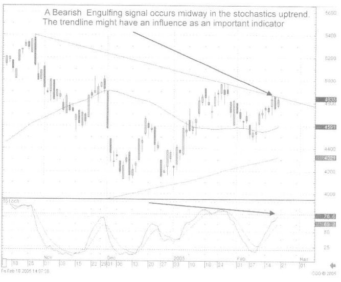
Fig.
7, the March crude oil
Had
this trendline not been acknowledged prior to the Bearish Engulfing signal
appearing, going bade to analyze the chart after the Bearish Engulfing signal
appeared provides an additional technical parameter for evaluating what the
price of crude oil may do from this point. This is a case of using the
trend-line to add credence to a candlestick signal.
This
falling trendline acts as the resistance level. The Bears are in control,
stepping up their selling every time the price comes up to the resistance area.
As long as prices remain below the declining trendline, the downtrend is considered
to be in effect.
The
use of computers has refined the use of trendlines in recent years. The
accuracy of drawing trendlines on a computer screen is much greater than using
a pencil and a ruler on a printed chart. The width of the pencil lead versus a
slight change of angle of a manually drawn line could dramatically alter a
trend lines relevance. Today’s computer generated charts can establish a trend
line using the exact tops and bottoms of price moves. This would become very
important for those investors that were anticipating a breakout of a trendline
support or resistance level.
The
strength of a trend becomes a function of how many times prices bounce back up
above the trendline. As mentioned, a trendline can start by drawing a line
between two points and extending that line into the future. If that trend is to
continue, then future prices should support or resist at that line. That
becomes the primary basis for trend analysis. The candlestick signals dramatically
increase the evaluation potential at the support or resistance line. Where most
investors are “anticipating” a result at that trendline, the candlestick
analyst can get an immediately clear picture of what investor sentiment is
doing at the trendline. This not only provides valuable investment information,
it provides that information much earlier than what other investors are able to
glean from the trading at that level.
The
disadvantage of using trendline analysis on its own is the different
interpretations of which trendline is most relevant. Establishing that a
trendline can be formed by two, three, and more points being used to develop a trendline,
there is the possibility that different combinations of those points can create
a short-term trend, medium-term trend, or long-term trend. The question now
becomes which trendline is providing the correct analysis for support and resistance.
Utilizing the candlestick signals assists in recognizing which trend-line is
the prominent trendline.
Developing
a trading strategy utilizing the candlestick signals at the trend lines becomes
much more decisive. If a trendline is anticipated to be acting as a support,
and that is being confirmed by a candlestick buy signal, purchasing the trading
entity at that level produces a couple quick distinctions. The candlestick
signal allows the investor to enter a trade at a highly opportune time. It also
provides a logical stop loss strategy. If the buy signal occurs on a trendline,
implying that the uptrend is going to continue from that point, then prices
immediately coming back down through the trendline, the support level, alerts
the investor to close out the position immediately. This should not be a
difficult concept. If the indicators that had been working previously appear to
work once again but immediately reverse and fail, then a major support level
has been breached, immediately indicating the buying that showed support is not
present where it is supposed to be seen.
Fig.
8, The Hansen Natural Corp. chart illustrates an ascending trendline. After two
or three times of coming back to a level that appears to be in a straight line,
the eye can start to visually detect what would appear to be a trendline
forming.
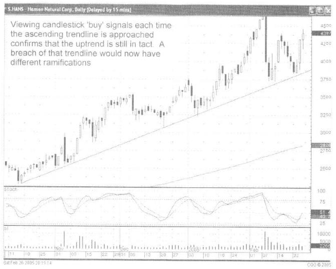
Fig.
8, The Hansen Natural Corp
Drawing
a line from those points now becomes a potential target for each pullback that
occurs. Being that the visual analysis is easy for most investors to perceive,
a trendline becomes an important technical factor. As viewed in the Hansen
Natural chart, any future pullbacks to the trendline become an obvious spot to
watch for candlestick signals. Having the mental image of where support might
occur and being able to visually recognize candlestick buy signals allows the
candlestick analyst to make better decisions for entering a trade.
Trendlines
can be developed by using points in the past that all appear to be lining up.
If a number of points line up from two different time frames or more, the chart
might have different trendlines that could be relevant. Which one of those
trendlines should be heeded? The candlestick signals make the answer very easy.
If there is more than one trendline to be considered, then the candlestick
signals will help identify which trendline has importance. This is just a simple
function of seeing where a candlestick “buy’ signal has formed. Fig, 9, The
General Cable Corp. chart illustrates a couple of trendlines that have been
created from previous bottoms. Which trendline will work effectively for the
period we are looking at right now? The signals will tell you which trendline
should be currently considered.
As
seen in the General Cable Corp. chart, during an expanded time frame, there are
two trendlines that appear to act as support levels.
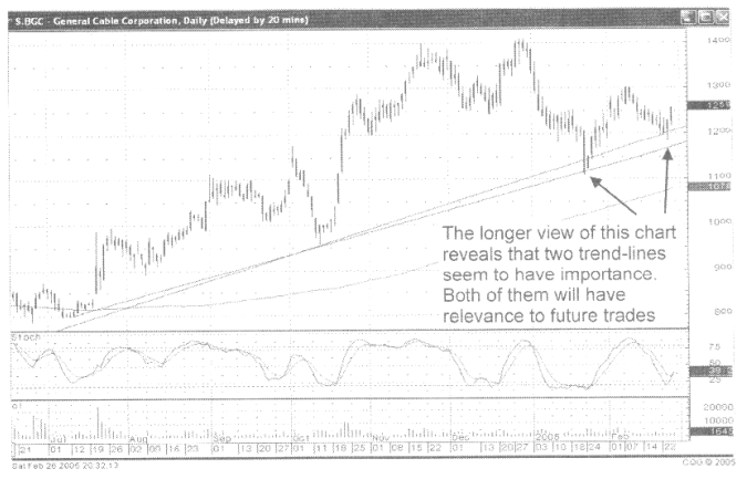
Fig,
9, The General Cable Corp. long-term chart
Once
the long-term chart, Fig.10, has established important trendlines, the analysis
of what to do currently is better visualized by shortening the timeframe of the
chart. This better illustrates what is currently occurring in the price pattern.
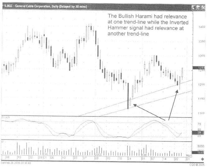
Fig, 10, The General Cable Corp. Short-term chart
Making
the chart bigger for better visualization, it can be clearly seen which
trendline is affecting the current price. In this case, the Inverted Hammer is
being confirmed at the upper trendline.
This
may seem very elementary, but it is what is occurring at trendline levels that
are being observed by many investors. The candlestick signals confirm
immediately what is happening at an observed level.
Trendlines
also become important factors when acting as resistance levels. Fig. 11, The
Magnum Hunter Resources chart provides a simple illustration of what occurs
every time prices approached a specific trendline. It became apparent that
every time a peek was reached in June, July, and August, candlestick sell
signals appeared. Mid-September revealed candlestick formations that did not
show weakness at the trendline. This becomes important information for the
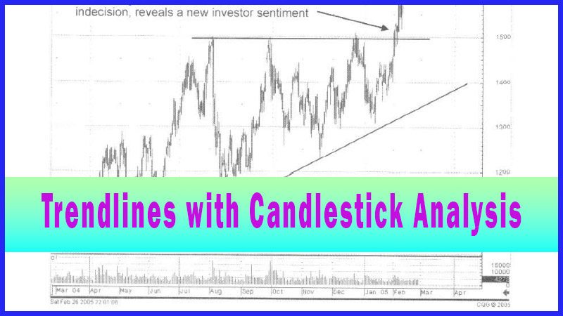
candlestick investor. The fact that a bullish candle formation breaches what
had obviously been a resistance trendline reveals that there is new investor
sentiment.
A
bullish breakthrough as revealed by the candle formations demonstrates that the
trendline resistance has now become a non-factor. If this position was
purchased, based on bullish candle signals forming at important moving averages,
the decision process should be to take profits at the obvious resistance level.
That decision now becomes different once the resistance level is broken. Simply
stated, the lack of a candlestick ‘sell’ signal where a ‘sell’ signal is expected
provides a new evaluation.
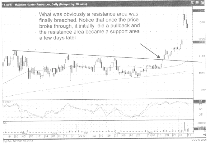
Fig.
11 Magnum Hunter Resources
If
trendlines are creating obvious formations, such as pennant formations or
ascending triangles, etc., then a breakout from those patterns can be better
analyzed when viewing the candlestick formations. This is not a complex procedure.
This is using the simple visual analysis of investor sentiment at previous
levels that would indicate buying and selling.
Fig.
12 The DJ Orthopedics Inc. chart illustrates a Triangle formation that is
breached to the upside. When viewing the longer term chart, it becomes relatively
clear- that there is a triangle pattern forming. If those trendlines are
brought forward into a shorter term chart, the analysis is easy to formulate
once one of those trendlines is breached.

Fig.
12 DJ Orthopedics Inc. long term chart
In
the short-term chart Fig. 13 (following page), it becomes apparent with the
large bullish candle that the trendline is now no longer a resistance level.
The fact that the Bulls pushed through that trendline with great force reveals
important information. That information now creates a new evaluation of what
the trend might be for the future of this stock. Although a sell signal was created
the day after the break through, with a Bearish Harami, a pullback stopped at
what had been the resistance trendline, with it now becoming a support level.
The fact that the trading was now above descending trendline should bring a
different evaluation into this stock. The candlestick signals are still the most
relevant factors for trading decisions, but the overall trend analysis will
have changed.
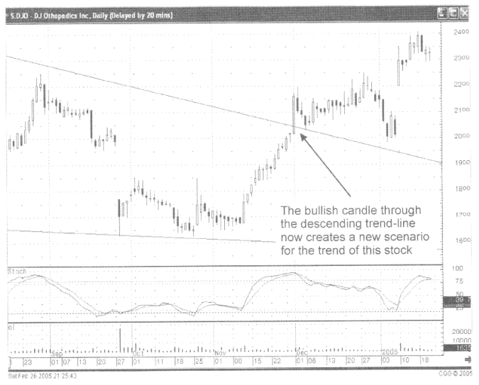
Fig.
13 DJ Orthopedics Inc. Short term chart
Keep
in mind, when everybody is watching to see what will happen at important
technical levels, the candlestick analyst has the advantage of immediately
seeing what the investor sentiment is doing at those levels.
Fig.14,
The Phelps Dodge Corp. chart reveals a bullish candle that broke out through
what had been a resistance trendline. The bullish candle of the previous day,
followed by a bullish candle with a gap up becomes very revealing. What is the
future of the price of this stock? Who knows! But the evaluation of this price
move now becomes different, knowing that a trend line resistance congestion
area has now been broken.
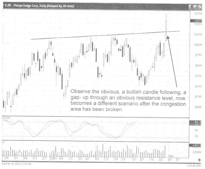
Fig.14,
The Phelps Dodge Corp.
Trendlines
can be used to analyze what candlestick signals “might” be occurring in the
near future. As seen in Fig. 5-15, the Wamaco Group Co. chart, the price move
has become extended up to one of the obvious trend lines. The price closed
remarkably close to that trendline on a big bullish candle day. This alerts the
candlestick investor to a couple of possibilities. Seeing strength, the
following day should reveal that the next trendline might be the target. A
weaker open on the following day may reveal this trendline as the resistance
level. A Bearish Harami would signify that the buying had stopped. This,
occurring at that trendline, would be more confirmation to take profits.
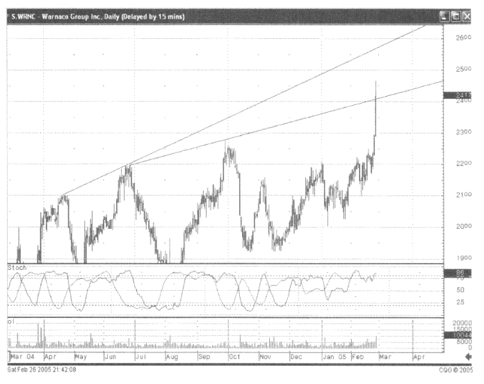
Fig.
15 Wamaco Group Corp.
An
ascending triangle chart, as seen in Fig. 16, the KCS Energy Inc. chart
provides important information. The trendlines being drawn across the top and
the bottom of the trading pattern should reveal the simple patterns in which
that this stock characteristically trades. Once that trading pattern has been
breached, a new evaluation can be made for the price movement. Having the
advantage of knowing that the trend is now in a new stage of development, in
this case a bullish move, the use of candlestick signals becomes more effective.
They can be used knowing that an uptrend is in progress. The potential of the
trend should continue until a definite candlestick ‘sell’ signal appears. Or a
pullback could occur, testing the recent resistance level. Having the knowledge
of what could potentially happen after a breakout allows the use of candlestick
signals to enhance the probabilities of being in the correct direction of the
trade. This is nothing more than putting the probabilities more into the investors
favor.
Fig.
16, the KCS Energy Inc. chart Long Term
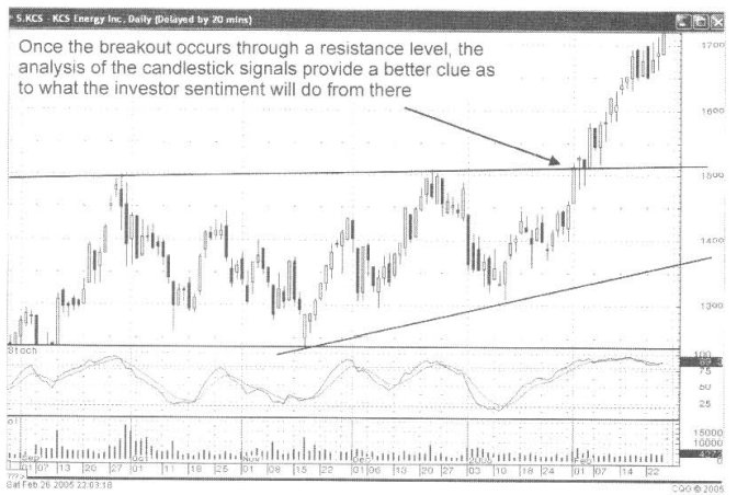
Fig.
17, the KCS Energy Inc. chart Short Term
How To make High Profit In Candlestick Patterns : Chapter 4. Candlesticks with Technical Patterns : Tag: Candlestick Pattern Trading, Forex : Candlestick analysis, Candlestick chart, Gap down Doji, Hammer signal, Best candlestick pattern, Trendline analysis - Trendlines with Candlestick Analysis