Single Candle Patterns
Single candlestick patterns, Types of candlesticks, Powerful candlestick patterns, Types of candlesticks, Candlestick chart analysis, Bearish candlestick patterns
Course: [ Uses of Candlestick Charts : Chapter 3. Single Reversal Patterns ]
Having spent a good deal of time exploring the intricacies of the Hammer I hope you’re now happy with the idea that a candlestick can be broken down into its component parts to work out the direction of travel that it represents.
Single Candle Patterns - Shooting Star, Hanging Man, Inverted Hammer
Having
spent a good deal of time exploring the intricacies of the Hammer I hope you’re
now happy with the idea that a candlestick can be broken down into its
component parts to work out the direction of travel that it represents. Armed
with this we can now move on to several new patterns and quickly get a grasp of
how they’re formed and why they suggest a reversal.
The
Hammer belongs to a family totalling 4 patterns, all with similar
characteristics, ie, small real bodies at one extreme of the pattern, leaving
one shadow much longer than the other.
The next
such pattern that we’ll dissect and study is the Shooting Star.
Shooting Star
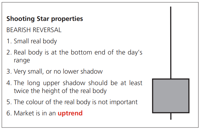
Construction/getting inside the pattern
As you
can see this is pretty much the opposite of the Hammer. This time the long
upper shadow is at the top end of the day’s range, and the real body is near
the bottom. Also, we’re looking for this pattern in a rising market as opposed
to a downtrend.
So let’s
think about the price action that goes into the construction of a Shooting
Star. Let’s do the same thing as we did with the Hammer, and look at a live
market example. Below is a daily candlestick chart for gold in May 2006 when
highs not seen since the early 1980s were hit.
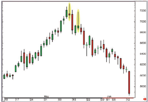
Figure 3-9: CBOT 100 oz Gold futures;
daily (all sessions) candlestick continuation chart (no adjustment for
roll-over); 10 April 2006 to 13 June 2006, showing Shooting Star Candlesticks
on 12 May 2006 and 17 May 2006
As you
can see there are actually two Shooting Star patterns on this chart, the one
that defined the absolute top of the move, then another just 3 days later. The
one we’ll zoom in on is the first one, the high of the move. Let’s look at a
15-minute chart for that day.
Psychology
I often
talk about charts and the markets using sporting analogies, many of these using
my beloved football, or soccer to those living anywhere other than the UK.
This
session was akin to a match that was pretty quiet and predictable in the first
half, and honours went to the team in green, who trotted in 1-0 up at half
time. Incidentally the team in green had won 5 of their last 6 matches, so no
one was that surprised that they were winning this one, especially as the reds
were near the bottom of the league.
But in
football sometimes things change. Manchester United aren’t going to be the best
team in the land forever, thank heavens!
The red
team’s manager says something at half-time, and the second half starts with a
bang. Over the next 45 minutes we are treated to the best display of football
in living memory, with goals galore, and by the end of the game the reds win
5-4.
Whose
fans go home happier? Which team is likely to feel better going into the next
game? Generally the team that dominates the second half of a match will finish
the stronger and win the match. It is exactly the same with a day in the life
of the markets. If the bulls win the first half, but the bears win the second
half, and the bears keep their pressure on until the end, we’ll likely post a
candlestick with a long upper shadow; often a Shooting Star.
Can you
see how even a single candlestick can be an extremely effective reader of price
action over a particular time period?
I may
seem like a stuck record at the moment, but by making sure you get used to the
idea of thinking about the direction of travel that goes into the construction
of a particular shaped candlestick, you will breeze through the rest of this
book, and candlesticks will immediately become a strong ally in your trading or
reading of the markets.
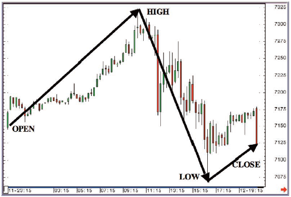
Figure 3-10: CBOT 100 oz Gold futures;
15-minute candlestick chart (all sessions); 12 May 2006
On the
intra-day chart in Figure 3-10 we have plotted the four pieces of data that
make up the Shooting Star on the daily candlestick chart: that day’s open,
high, low and close. As you can see, the direction of travel on the day was
upwards in the early part of the session, followed by weakness in the second
half, culminating in a weak close.
This is
the opposite of the Hammer. Instead of a “V” shaped direction of travel we see
an arc or “A” shaped movement.
The bulls
are in charge going into the session, remember that. So when the market starts
to rally in morning trade no one is surprised. The bulls continue on their
happy way while the bears continue to get beaten up.
But at
732.3 the balance between buyers and sellers changes and the buyers are
suddenly not dominating. The second half of the session, as evidenced by the
wild assortment of candlesticks, was a ding-dong affair.
Examples
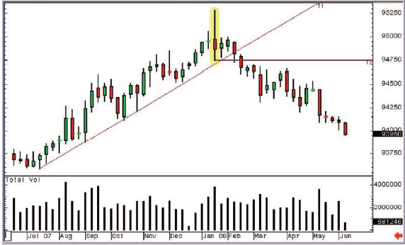
Figure 3-11: LIFFE June 2008 Short
Sterling futures; weekly candlestick chart; 18 June 2007 - 9 June 2008
You can
see from the chart that the top of this move was defined by a Shooting Star in
the week of 21 January 2008 - 25 January 2008. Although there is a bit of lower
shadow showing on this candle I’m sure you’ll agree that the long upper shadow
definitely smacked of a rejection of the upside. Another reason I like this
chart is because of the two previous examples in mid-November and late
November. Again neither was a textbook example, and in these instances they
didn’t lead to a reversal. The big jump in volume, and the sheer volatility of
the candlestick that actually gave us the top, alerted us that it was something
not to be ignored. The break of trend support (labelled T1 on the chart) a few
weeks later confirmed our suspicions, and the subsequent break of the bottom of
the Shooting Star week (the horizontal line labelled T2) added further weight
to the argument for a top.
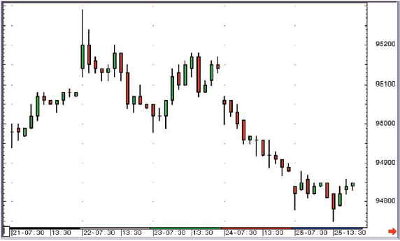
Figure 3-12: LIFFE June 2008 Short
Sterling futures; 60-minute candlestick chart; 21 January 2008 - 25 January
2008
This is a short-term chart showing direction of travel over the course of the Shooting Star week highlighted in Figure 3-11.
Another example
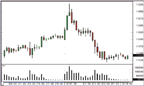
Figure 3-13: Eurex September 2008 Bund
futures; 30-minute candlestick chart; 6 and 9 June 2008
The
move in the first few hours of this particular morning came as something of a
surprise at the time, but the market was in a downtrend overall, so many
traders were looking for a chance to sell any strength. The up move ended with
a high volume Shooting Star on the 30-minute candle chart. A severe sell off
followed.
The colour of the real body
As with
the Hammer we are relatively unconcerned by the colour of the real body for a
Shooting Star, although a red real body does show that the market sold off
through the opening price towards the end of the candle’s life, and therefore
it may carry slightly more significance. It’s not essential for the pattern
though, and Shooting Stars are generally credited with being a powerful
reversal pattern, whatever the colour of the real body.
Shooting Star summary
You can
see that the Shooting Star is the exact opposite to the Hammer. The
construction and psychology are exactly the same but in reverse.
It is a
single candlestick in a rising market with a long upper shadow and a small real
body at the bottom end of the candle’s range.
In
summing up the Hammer I said that it was one of my favourites, so it follows
that its bearish opposite number will also be high on my list. It is indeed.
These patterns are so simple yet so effective. Just the sort of technical
analysis I like!
As with
the Hammer it’s also worth highlighting that these are generally great patterns
to look out for on short-term charts (10 to 30-minute) for futures contracts or
equities that trade with a combination of good volume and volatility.
Now we’re
going to look at two familiar looking patterns, and work out why they are given
different names to those we’ve come across already.
Inverted Hammer
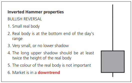
Getting inside the pattern
Does this
shape of candlestick look familiar? It should do, because it’s exactly the same
shape as a Shooting Star, in fact conditions 1, 2, 3, 4, and 5 are all the
same. The only difference is the last condition, ie, what the trend is when we
see a pattern of this shape.
If
you see a candlestick shaped like a Shooting Star during a downtrending market,
you’re looking at an Inverted Hammer, which is a bullish reversal pattern.
It’s not
the strongest of patterns, and if we once again go through the steps of
thinking about the price action, we’ll soon see why. We are in a downtrending
market, so the bears are dominating. On this day we see a strong rally followed
by a sell-off, which gives us the long upper shadow. As with the Shooting Star
the market moves in an arc shaped direction of travel, moving higher then
lower.
So why
could this possibly be a reversal? After all, by the end of the day we’re back
on the lows and the bears are dominating.
A note about backtesting
Backtesting
involves going back over historical data on your chart, whatever the time
frame, to test a trading strategy. It is a useful (arguably essential)
exercise, except that most people aren’t honest with themselves about the
reality of their entries or exits.
I always
suggest a “worst case scenario” approach to this. Say for example you get a buy
signal after a candle with a close at 1.10, and the next candle sees the market
trade up from an open at 1.12 to a close at 1.20. Do you say you bought at
1.10, 1.12 or 1.20?
My answer
would be 1.20, because in reality you wouldn’t pay 1.10 because you don’t know
until after the close on that first day that you’ve got a buy signal. You may
pay 1.12, as you would attempt to enter the market early on the second day, but
what happens if the market traded a tiny amount at 1.12 then immediately jumped
to 1.20? Here is a fact: unless you have access to the intra-day data you would
be making baseless and dangerous assumptions about where you entered the trade.
Why not
work on a “worst case scenario” and if your trading strategy still makes money,
then it should do even better when the slippage is taken out. One more thing to
think about regarding backtesting: you have to pay your broker’s commission, or
your trading fees, so this also needs to be in the equation. I’ve seen so many
trading systems presented where the results exclude commission costs. I would
like their broker’s name, as I too would like to trade with zero commission!
Finally,
you also might want to add a little word called reality into the equation when
you’re backtesting strategies. For example once a month, on the first Friday,
we get the US Employment Report, and the world’s debt markets go berserk. Are
you happy to take a signal from your system two minutes before this regularly
market-moving event? A release that you know could move the market
significantly up or down? Or would you want to put on a trade hours before a
big interest rate announcement, or a company’s results, or a crop report? Some
would say yes, and I’m not going to argue with them. We all have our own
different risk parameters. All I’m pointing out is that if you are
uncomfortable with this sort of trading then you can’t include these pre¬event
signals in your test results, even if most of the trades worked well. If in
reality you’d never have put the trades on, then you’re kidding yourself!
Psychology
Well,
here’s the thing. The bulls did give us that move higher in the early part of
the session, so they can make a difference. They showed an ability to move the
market higher, even if on this particular occasion they couldn’t sustain the
push to the upside. The selling in the second half of the day saw the market
move back down to where it started, more or less.
So
possibly this is more of a warning signal, rather than a strong reversal signal
per se.
In my
experience these do not make strong reversal patterns, but can appear in the
run up to a bottom, so can serve a purpose in warning us that things may be
changing.
But don’t
take my word for it: if you have a favoured market that you trade, and a
favoured time frame for your trading, you should fire up a chart that suits
your needs and look back to find the candlestick patterns that have done a good
job historically. We can make the assumption that the participants in the
market you’re viewing don’t change dramatically over time, so patterns of
behaviour can and will be repeated, and the candlestick chart is merely a
representation of the behaviour of the market in any instrument. So if Inverted
Hammers work beautifully on your chart, then place more importance on the next
one you see.
This is
why I shy away from giving candlestick reversal patterns a star rating on their
potency: it’s because some patterns work better in certain markets than others,
and the only way to decide what provides the strongest signal is to do the
leg-work and backtest to find what worked best in the past for your market on
your chart.
Examples
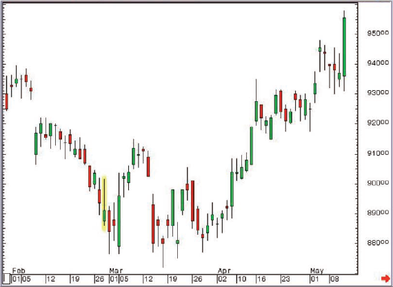
Figure 3-14: HSBC pic; daily
candlestick chart; 31 January 2007 - 11 May 2007, showing 28 February 2007
Inverted Hammer
This
Inverted Hammer didn’t signal an end to the trend, but if you had allowed
yourself to consider the idea of a reversal after you’d seen it, you wouldn’t
have been so surprised when the market bottomed out a few weeks later.
The
bottom, as you can see, was a Hammer day with a lower shadow that had breached
the previous support. Even then, there were a few more small bodied candlesticks
seen after that before the bulls finally got their act together.
The
following chart is interesting, as it has a plethora of Inverted Hammers, as
highlighted. This once again proves the importance of confirmation for any
candlestick pattern. If your trading strategy in this instance was “if we see
an Inverted Hammer then buy” you wouldn’t have any money left after the first
three to take advantage of the fourth pattern, the one that did actually give
us a reversal.
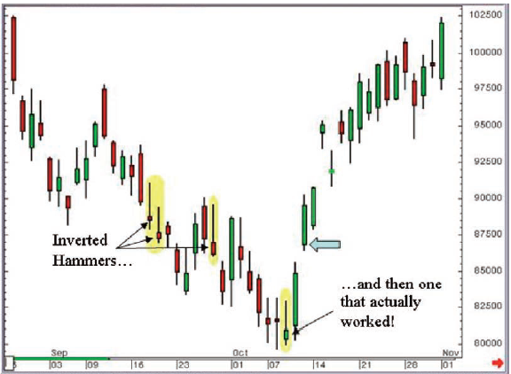
Figure 3-15: CME NASDAQ futures
(unadjusted active continuation); daily candlestick chart; 27 August 2002 - 1
November 2002, showing Inverted Hammers on 18 September, 19 September, 27
September and 9 October
But if
you’d simply asked to see a green candlestick following the Inverted Hammer you
would have stayed out of the first three and jumped in after the fourth one,
when the market gapped higher two days later (as highlighted by the light blue
arrow). Even though you would be buying 68 ticks off the lows, you still wouldn’t
be complaining. Also you could have placed your initial stop below gap support
at 856. Nice. Incidentally this was the absolute low of this index after the
dotcom bubble had burst.
Inverted Hammer summary
The
Inverted Hammer isn’t generally the strongest of reversal patterns. However, it
can be a good warning of an impending reversal because it’s a candle that
illustrates that the bulls aren’t completely dead and buried; they’re starting
to make noises, even if on this occasion it came to nothing because the bears
stepped back in to sell into the gains towards the end of the formation of the
candle.
One
reason I wanted to cover this pattern was to complete the picture and
differentiate it from the similarly shaped Shooting Star.
Hanging Man
The last candlestick in this family is the Hanging Man, and what a marvellously descriptive name it has! Does anyone think this might be a bullish pattern? No, I didn’t think so! There can’t be much upside to being strung up on the gallows, I’ve always felt.
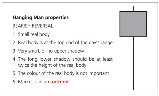
Getting inside the pattern
We’ve
established, just by hearing the name, that this is a bearish pattern. As we
can see from the properties panel it’s the same shape as the Hammer, except
this time it’s seen during a rising market. Our first five rules are exactly
the same, it’s just the last one, the “where” rule, that changes.
A Hanging
Man is formed during an uptrend on a day when the market sells off then rallies
to take back most or all of the losses seen earlier in the session. It
represents a “V” shaped direction of travel over the course of the life of the
candle.
As with
the Inverted Hammer the idea of this being a reversal is a little tough to
grasp at first as we’re talking about a candlestick that’s formed by a market
that sold off early on, but was rising neatly again by the time the session
ended.
Psychology
The
reasoning behind this pattern is akin to the Inverted Hammer, but in reverse:
the long lower shadow shows that the bears managed to push things lower, even
if they couldn’t sustain the push over the course of the whole day. The point
is they gave it a go, so they’re not completely dead in the water. It’s
possible they’re waking up and may in the near future be capable of mounting
something a little more sustainable.
Examples
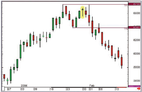
Figure 3-16: ICE Brent Crude Oil
futures (unadjusted active continuation); daily candlestick chart; 27 December
2005 - 15 February 2006, showing Hanging Man on 30 January 2006
On this
chart a Hanging Man sandwiched in between two similar highs was posted. Once
the low between these highs was broken a Western chart pattern called a Double
Top had been completed. The Hanging Man wasn’t really the main driver of any
change of trend at this time, however it would have added a bit of weight to
one’s conviction once the sell signal given by the Double Top was seen a few
days later.
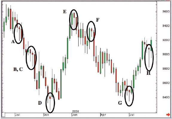
Figure 3-17: Euro vs US Dollar Forex
Cross; weekly candlestick chart; 29 May 2000 - 10 September 2001 with
annotations
We’ve seen
this chart already: we used it when we were looking at the Hammer pattern
(Figure 3-4). We came to the conclusion that Candles B, C, D and G were the
Hammers, and that the others didn’t qualify.
We can
now embellish on this and say that E and F qualify as Hanging Man candlesticks,
as they’re both Hammer-shaped, but seen in a rising market. We can also safely
say that while Hanging Man candlesticks don’t generally provide strong signals,
in this case they did.
What
about A and H? Argue amongst yourselves! If anything they’re Hanging Man
candles, as they’re seen just off the highs.
Hanging Man summary
A Hanging
Man candlestick is the same shape as a Hammer, but is seen during a rising
market.
I’m sure
you’ll agree with me that after finding out all about this pattern it’s a bit
of an anticlimax. What a great name, summoning up the most bearish of bear
thoughts! In reality it can be a good warning signal that the sellers are
stirring after a period of domination by the bulls, but it’s not often the
horrid disaster that its name might suggest!
Uses of Candlestick Charts : Chapter 3. Single Reversal Patterns : Tag: Candlestick Trading, Forex : Single candlestick patterns, Types of candlesticks, Powerful candlestick patterns, Types of candlesticks, Candlestick chart analysis, Bearish candlestick patterns - Single Candle Patterns