Patterns of Moving Average Convergence/Divergence (Macd) - How to USE it?
patterns of macd indicator, patterns of macd chart, What is MACD
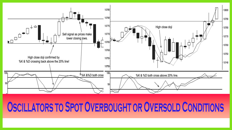
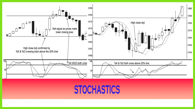
Course: [ The Candlestick and Pivot Point Trading Triggers : Chapter 3. Using Read Oscillators to Spot Overbought ]

The MACD has the same principles as far as a sell signal with what is known as bearish divergence. This is where the market price itself makes a higher high from a previous high, but the underlying MACD crossover lines make a lower high. This indicates that the second high is a “weak” high and can resort to a turnaround for a lower price reversal.
RELY ON THE PATTERNS
Another
method useful with the MACD indicator, and one that is more reliable for
determining a trend reversal, is to identify the pattern called bullish
convergence. This is where the market price itself makes a lower low from a
previous low, but the underlying MACD pattern makes a higher low, as shown in
Figure 3.10. This indicates that the second low is a weak, or “false,” bottom
and can resort in a turnaround for a sharp price reversal. This is similar to
stochastics; however, since it is developed from moving averages, the timing of
the shorter-term versus the longer-term moving averages can delay such a
signal. There is a high probability that MACD and stochastics work more so than
other indicators with this pattern.
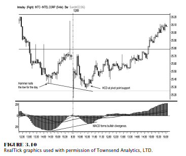
As you
can see in Figure 3.10, which is a five-minute chart on Intel, the market made
a lower low in the next trading session where the MACD histogram makes a higher
low. Notice the HCD signal. Then as the price starts to appreciate, the MACD
histogram triggers or confirms a long position with a zero-line crossover, and
the progressively higher histogram bars confirm the positive momentum right
into the close of the day. The MACD is a very useful tool as a confirming
indicator once you have entered in a position, especially by following the
histogram readings.
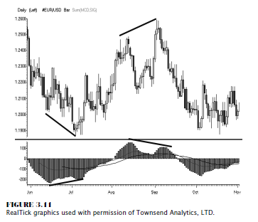
The MACD
has the same principles as far as a sell signal with what is known as bearish
divergence. This is where the market price itself makes a higher high from a
previous high, but the underlying MACD crossover lines make a lower high. This
indicates that the second high is a “weak” high and can resort to a turnaround
for a lower price reversal. In Figure 3.11, a daily chart in the FX spot euro
currency, the MACD histogram helps identify both bearish and bullish divergence
patterns.
One other
useful method in using MACD is to follow as stated the direction of the
histogram bars to help confirm a turn or a change in trend. Figure 3.12 shows
the price advance in the e-mini-S&P as the market closes in on a pivot
point resistance level, and the market moves from a bullish condition as prices
move higher or in an overbought state and the histogram readings start to
expand over 300.
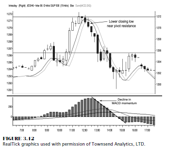
As the
market price conditions change, as the close is below the open, and as the
market makes the first lower closing low, especially near the pivot resistance
line, the histogram bars start rolling down or making lower highs as well. In a
weak or down-trending market, the bars should also be making lower highs; and
in this case, they are confirming a sell signal from the change in market
condition as well as the moving average crossover as prices trade under the
moving average lines. This last example is what we will be going over in later
chapters as we combine pivot point analysis with candle patterns.
SUMMARY
In
conclusion, all oscillators, indicators, and most moving average studies will
give confirmation when a market shifts direction; and knowing these signals
will help you identify a trading opportunity. They also will help give you a
clue when a market is in an extreme price condition, described as being
overbought and oversold. Therefore, as a trader, you need something that gives
you a better idea of entering a trade. The next few chapters will reveal ways
by which you will learn how to identify shifts in momentum before looking at an
indicator as confirmation. Impossible, you say? Well, there are certain
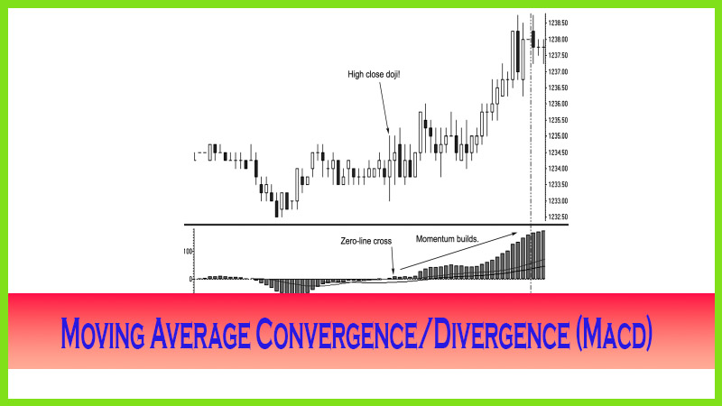
patterns such as the high close doji, the jackhammer candle pattern, a low
close doji, or the shooting star formation that, when up against a projected
pivot support or resistance line, will alert you to a trade entry faster than
using these traditional indicators. When I introduce you to the concept of
using a pivot point moving average component as was used in Figure 3.12, then
you will see how it is possible.
The Candlestick and Pivot Point Trading Triggers : Chapter 3. Using Read Oscillators to Spot Overbought : Tag: Candlestick Pattern Trading, Forex, Pivot Point : patterns of macd indicator, patterns of macd chart, What is MACD - Patterns of Moving Average Convergence/Divergence (Macd) - How to USE it?