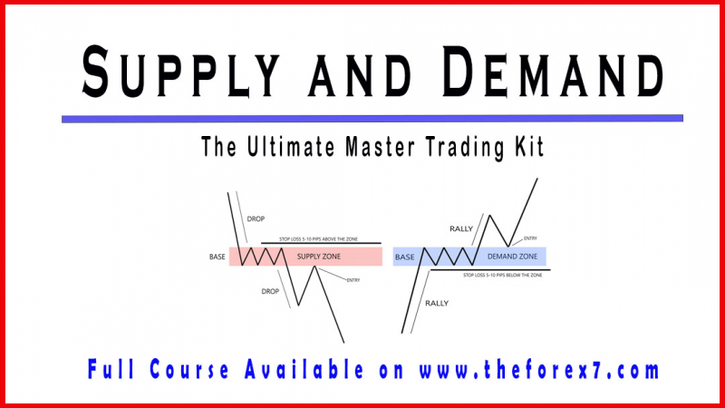
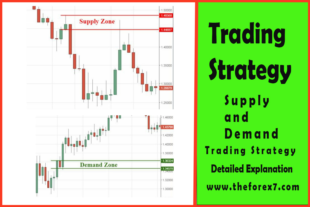
Advanced Supply and Demand Trading Strategy
How to trade Supply and Demand Zone, How to draw Supply and Demand Zone, Multiple time frame analysis
Course: [ Supply and Demand - Trade Like a Pro : Chapter 2. Executing the Strategy ]
A consistent Forex trading strategy provides advantageous entry signals, but it is also vital to consider: position sizing, risk management and when and where to exit a trade.
Trading Strategy
A
consistent Forex trading strategy provides advantageous entry signals, but it
is also vital to consider: position sizing, risk management and when and where
to exit a trade.
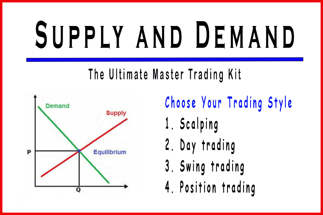
This
strategy is not exclusive to a specific trading style, and it does use two key
concepts:
·
multiple time frame analysis.
These
concepts give you two important things:
·
follow the bigger move,
·
better entry and exit points for
your trades.
These are
a selection of multiple time frames you can use in your trading analysis based
on your trading style:
·
Scalping trading: 15min/ 5min/
1min,
·
Day trading: 1h/ 15min/ 5min, or 4h/ 1h/ 15min,
·
Swing trading: Daily/ 4h/ 1h, or Weekly/Daily/ 4h,
·
Position trading: Monthly/
Weekly/ Daily,
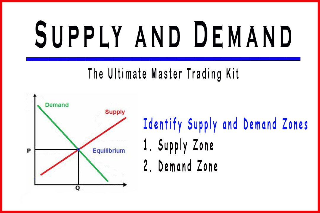
Step one: “Where is the price in the curve?”
The first
thing we need to do is to choose our multiple time frame selection. We are
going to use Monthly/Weekly/Daily selection to explain the strategy. Once we
choose the right selection that best suits our trading style, we start with the
higher time frame because it provides sufficient overview of the past price
action to help us:
1.
Identify whether the market is
trending (uptrend or downtrend), reversing or ranging,
2.
Locate major supply and demand
zones,
3.
Identify the big picture of the
market to see where the price is in the curve:
·
cup-like shape in case of a
supply zone (figure 35),
·
hat-like shape in case of demand
zone (figure 36),
In this
time frame we will assess how high or how low the price is in the curve. It
will tell us if we are too high to buy or too low to sell in the market. As a
general rule, if the price is near supply zone and high in the curve, we only
sell in the market. If the price is near demand zone and low in curve, we only
buy in the market. If the price is at equilibrium (in the middle of the curve),
we wait for either bullish evidence to go long or bearish evidence to go short
in the market. Otherwise, we do nothing and we wait for the price to be either
high or low in the curve.


Let’s go
over some examples to better understand these concepts. In the next chart
(figure 37):
·
Higher Time Frame: Monthly Chart,
·
Big Picture: Cup-like shape
structure,
·
Price in the curve: Price is low
in the curve,
·
Trend: Uptrend.
As we can
see, the price is low in the curve which means we only buy in this market. We
have enough room to go long because the price is still far enough from the
supply zone.

The next
chart (figure 38):
·
Higher Time Frame: Monthly Chart,
·
Big Picture: Hat-like shape
structure,
·
Price in the curve: Price is high
in the curve,
·
Trend: Downtrend.
As we can
see, the price is high in the curve which means we only sell in this market. We
have enough room to go short because price is still far enough from the demand
zone.

Step two: “The trend time frame”
Finding
the trend is one of the trickiest things a trader will have to deal with,
because every timeframe has its own trend. You may find an uptrend on H4, but
the daily timeframe is in a downtrend, and the weekly timeframe in an uptrend,
which is quite confusing for novice traders.
This is
why in this strategy we are using multiple time frame analysis to assign
specific task to each time frame so the trader won’t get lost.
We use
the intermediate time frame to find the trend. Since we have chosen the monthly
time frame to find the curve, now we are using the weekly time frame to find
the trend.
Step three: “The entry time frame”
This is
where we choose the entry where we will be drawing our entry supply and demand
levels.
·
Lower Time Frame: Daily
timeframe,
This is where we draw the supply and demand zones,
execute and manage our trades. If the daily timeframe is too wide, we can drill
it down by using H4 or H1 to fine tune our entry.
·
Stop loss and exit point: we
place our stop loss order below/above the supply or demand zones, and for the
exit point we could either use the reward-risk ration (3:1) to calculate your
exit point or use the opposite supply (when we enter a buy order) or demand
(when we enter a sell order) zone as an exit point.
Conclusion
·
Don’t Buy when price is high in
curve or near supply zone,
·
Don’t Sell when price is low in
curve or near demand zone,
·
If you missed a trade do not jump
into the market, instead wait for another chance to come,
Now let’s
take an example to understand how the strategy works:
Step one: “Where is the price in the curve?”
·
Multiple Time Frame Selection:
Daily/H4/H1,
·
Higher Time Frame: Daily Chart
(figure 39),
·
Big Picture: Cup-like shape
structure,
·
Price in the curve: Price is high
in the curve,
·
Trend: Uptrend.

Created
with
Step two: “The trend Time Frame”
·
Trend Time Frame: H4 Chart
(figure 40),
·
Trend: Uptrend.

Step Three: “The entry time frame”
·
Lower Time Frame: H1 Chart to
draw our supply zone (figure 41),
·
We place our pending order at the
lower line of the supply zone,
·
Price will continue up and hit
our order,
·
We use the opposing demand zone
as an exit point to close the trade.

Another
example:
Step one: “Where is the price in the curve?”
·
Multiple Time Frame Selection:
Weekly/Daily/H4 or H1,
·
Higher Time Frame: Weekly Chart
(figure 42),
·
Big Picture: Hat-like shape
structure,
·
Price in the curve: Price is low
in the curve,
·
Trend: Uptrend.
In this
example we have a previous demand zone that we have found by scrolling left of
the weekly chart (figure 43). We are going to use this demand level, because
the price has tested it as we can see, and in case the price retest it again we
will go long.

Step two: “The trend Time Frame”
·
Trend Time Frame: Daily Chart
(figure 44),
·
Trend: Uptrend.

Step Three: “The entry time frame”
This is
an interesting example because we have two trades to execute. Let’s begin with
the demand zone we identified, on daily timeframe we noticed that the price has
tested the zone, so we will place a limit order at this level in case the price
re-test this zone again.

On the
next chart (figure 45) we draw our demand zone on H4 timeframe and place our
limit order. The price pulled back and hit our buy order.

So part 1 of the step three is:
·
Lower Time Frame: H4 Chart to
draw our demand zone (figure 45),
·
We place our buy limit order at
the top line of the demand zone,
·
We place our stop loss order at
the bottom line of the demand zone,
·
We use the opposing supply zones
as the exit points to close the trade progressively as the market moves up
(figure 46),
Now that
the price is in an uptrend, let us locate a supply zone on H4 and find an
opportunity to short the market.

So part 2 of the step three is:
·
Lower Time Frame: H4 Chart to
draw our supply zone (figure 47),
·
We place our sell limit order at
the bottom line of the supply zone,
·
We place our stop loss order at
the top line of the supply zone,
·
We use the opposing demand zones
as the exit points to close the trade progressively as the market moves down,

Supply and Demand - Trade Like a Pro : Chapter 2. Executing the Strategy : Tag: Supply and Demand Trading, Forex : How to trade Supply and Demand Zone, How to draw Supply and Demand Zone, Multiple time frame analysis - Advanced Supply and Demand Trading Strategy