Fibonacci Number Calculations
Fibonacci Numbers, Fibo trading, Fibonacci Retracements, Fibonacci trading course
Course: [ Advanced Fibonacci Trading Concept : Fibonacci Trading Strategy ]
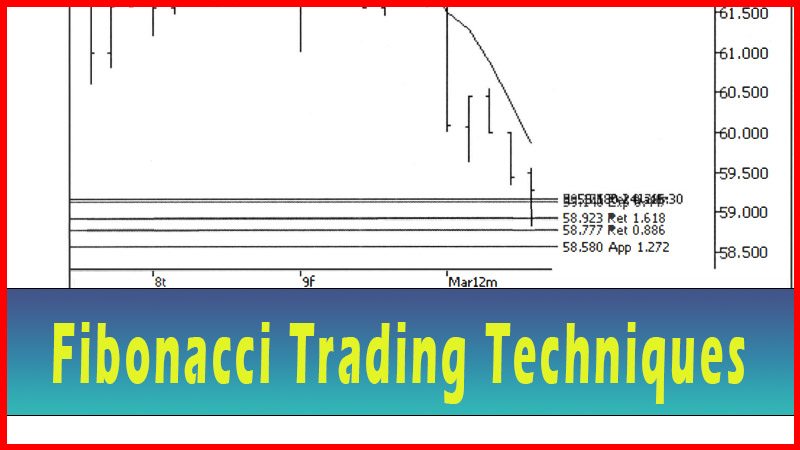
Fibonacci numbers is to show some single number areas of possible support or resistance. While these examples showed quite well what could happen at a Fibonacci number, I would be reluctant to trade based on one number alone. I want to know that the odds appear to be more in my favor. For that reason, I want to see multiple Fibonacci numbers stacking up in a fairly tight area. In other words, I want to see a group of numbers together in a small zone.
Fibonacci Number Calculations Trading Method
So far all we’ve done with the Fibonacci numbers is to show some single number areas of possible support or resistance. While these examples showed quite well what could happen at a Fibonacci number, I would be reluctant to trade based on one number alone. I want to know that the odds appear to be more in my favor. For that reason, I want to see multiple Fibonacci numbers stacking up in a fairly tight area. In other words, I want to see a group of numbers together in a small zone.
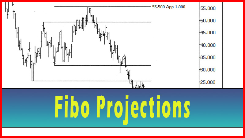
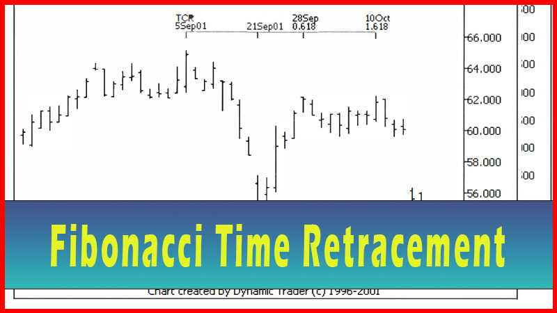
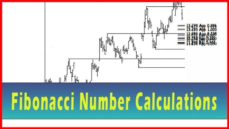
One of the things I discovered when I first started experimenting with the Fibonacci numbers was that each swing-high or low could be used as its own separate point for additional Fibonacci calculations. If a swing point is harmonically generated (i.e. is at a convergence of Fibonacci number calculations), then new calculations can be derived (from this additional swing point) that would overlap some of the previous calculations. Some of the current retracements, projections and expansions would land on top of some of the calculations from the previous swings. Let’s look at some simple examples and work our way up to more complex ones. See figures 9.1-9.7, with explanations.

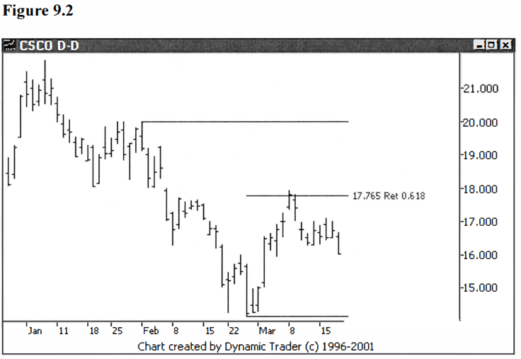
Here we have a
.486 retracement of a downtrend in CSCO. Let’s look at another retracement (by
itself first) on this same issue. See figure 9.2.
This time the
retracement was started from a lower swing point.
Let’s now look at
both of these retracements at the same time on the same chart and see if
anything interesting shows up. See figure 9.3.
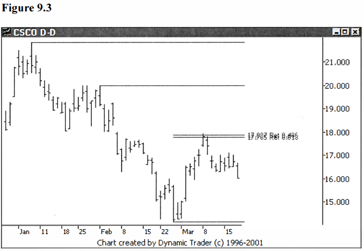
What we see, in
fact, is that these two retracement values are extremely close to each other,
only about ten cents apart. They are so close it’s difficult to read the labels
on the chart. This is something one has to get used to, since the tighter the
group is, the harder it becomes to read the labels.
Let’s add a few
more numbers to this example to fill out this grouping. First let’s back up the
chart in figure 9.3 a bit so we can see where this downtrend started. See
figure 9.4.
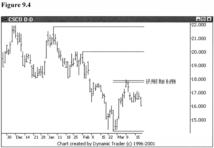
Now, if I were a
reader, the first question I would have at this point is, "That's just
about a double top, so what difference does that make to our calculations? The
starting point is just about the same." This is a good question, but it
misses something important in the chart, something that frequently is overlooked
when analyzing charts. Before the move finally continued down, the issue did a
'retest' of the high. What is important to me is how far the issue went down
before the retest.
This is important
to me because it sets up the first countertrend (pullback) to the new
downtrend. With this countertrend move I can calculate proportional moves to
add in for my groupings. Let’s add in a 1.000 move into our current grouping of
two numbers. In other words, let’s see where a move equal in size to the first pullback
would put us for this move. See figure 9.5.
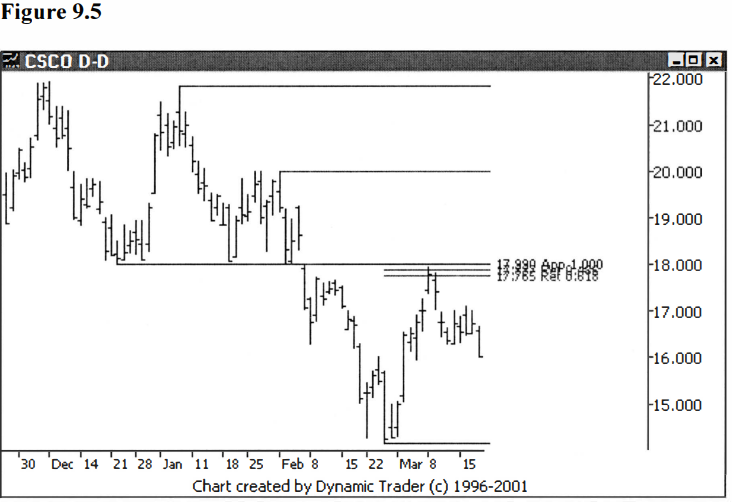
This equal
countertrend move put us right in the same area as our two previous numbers.
The concept of the grouping should be starting to become evident to you at this
point. Also worthy of note is how the new number also happened to fall exactly
on the same price point as the turning point of the first swing-low (which
occurred on December 24). Look at the chart and see how many times this area
was tested and how important this price zone is. In a classical sense this
would be a good example of previous support becoming resistance.
Let’s also add in
a proportional move of the next swing down from the first one that we just did,
which as you can see is a smaller swing. See Figure 9.6
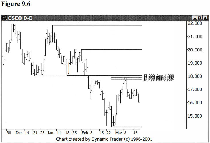
You are probably
asking, ‘What just happened?’ I added the 1.902 projection of the smaller
pullback (from January 22 to February 1) onto the low on February 27, to put
one more number into our grouping. This gives us four numbers in a very tight
group. It would be wise to consider the swing-low from December 24 for the
grouping (as previously mentioned). The line from the first projection
calculation on the chart shows this pretty clearly, right at $18.00. That,
then, makes five numbers for our grouping.
Let’s look at a
chart showing a bit more data. This will show how significant this area turned
out to be for CSCO. I’ll also remove all of the extra lines off the swing-highs
and lows that I used in constructing the groupings, for clarity. See figure
9.7.

This all may seem
a little bit confusing at first (a bit confusing??), but don’t worry. I had the
answers to this one before I started. This is not how I actually construct
these groupings from scratch. If i t were, the question would be ‘How in the
heck did he know to do a 1.902 projection on that one pullback’, and so on. You
can’t know that by looking, although you can get pretty good at ‘guesstimating’
when you do this a lot.
I laid this one
out step-by-step so you could see the tight grouping as it was formed, one
number at a time. In practice, you put all the projections on the chart at once
and it’s just loaded up. Then you look for the tight groupings and erase off
all the lone numbers. The idea is to find charts that have obvious groupings.
This concept of
the harmonics of multiple swings overlapping allows us to use any and all of
the swings we choose to use for our calculations, and most of the time some
fairly tight, clear groupings will appear. It wouldn’t be of much help if we
just got a spread-out mishmash of numbers. If that does happen, I generally
refer to that issue as ‘not very harmonic’ and simply look for issues that tend
to give tight groupings.
Let’s go ahead
and construct some various groupings. As just mentioned, I find the best way to
do this is to put everything sensible I can on the chart, and see if some areas
stand out. I then remove numbers that are not in a clear grouping, until I have
a few very distinct, tight groupings left. These are the zones where I will
dial down to a smaller time frame and look to consider a trade. The next
chapter will go into detail on trading techniques. For now, let’s just
concentrate on constructing groupings.
I hope the way I
present the construction process will be clear to the reader. I take the
approach of presenting lots of charts in sequence as I add more and more
retracements, projections and so on. At some point the chart may look like a
mess, but hopefully some groupings will stand out. I will then weed out the
loners and what is left should look pretty good. I will explain what I am doing
and why, step by step, as I proceed.
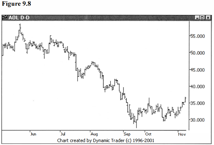
Let’s look at AOL
on a daily chart. The issue is in a strong downtrend and is making a correction
that is greater in size than the previous corrections in the downtrend. This
larger correction may imply the downtrend has ended, or it may be that a larger
correction is in order and the downtrend will resume once the correction has
run its course. See figure 9.8.
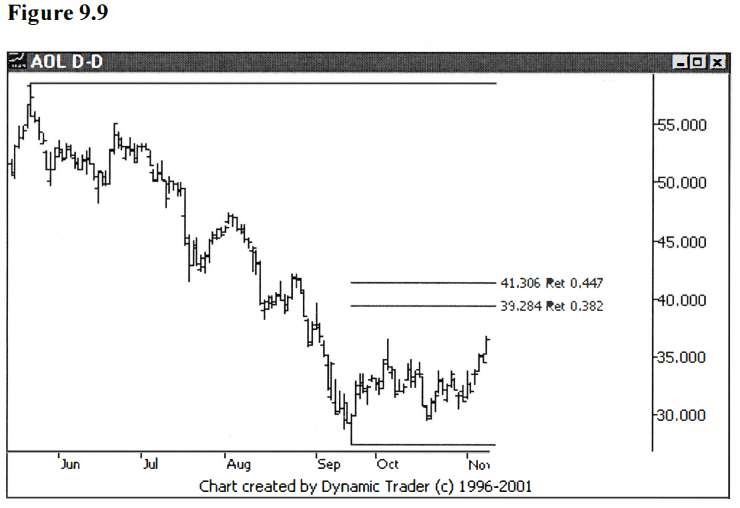
If we plan to
play for the downtrend continuation, we need to construct a grouping where the
countertrend correction may end. Let’s start with a few retracements off the
top. Personally, I prefer to take trades in strong trends when the pullback is
at least a .382, but not greater than a .447. This is not to say that I won’t take
trades where the pullback is .236 or even less, but my preference is in the
.382-.447 range. So, let’s put a .382 and a .447 on the chart. See figure 9.9.
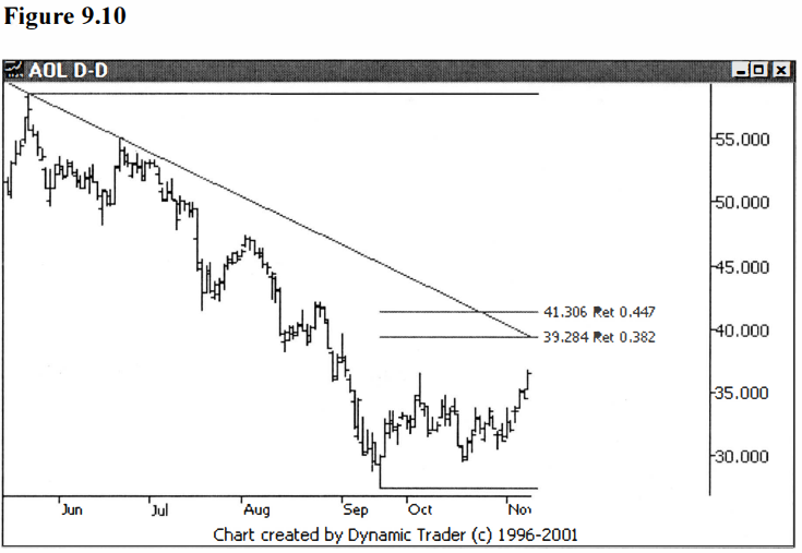
This is our core
area and any additional numbers should be somewhere in this general area. I
will try to avoid adding any numbers too far out of this area, to avoid making
a chart that is laden with information that I won’t be using. Also note that,
if a trendline is added in, it goes right through this general zone. This shows
me that if this area were exceeded to any great extent, I would consider the
trend to be either changed, or too uncertain to trade. See figure 9.10.
Now we move down
to the next swing-high (on June 21) for our next point to key off of. Since
this move down to the low on September 21 is less than the move down off the
top, we should choose retracements to add that are slightly greater than what
we used off the top, in order to keep us in the same area. Considering we
started with .382 and .447, let’s try .447 and .486 for this next addition. See
figure 9.11.
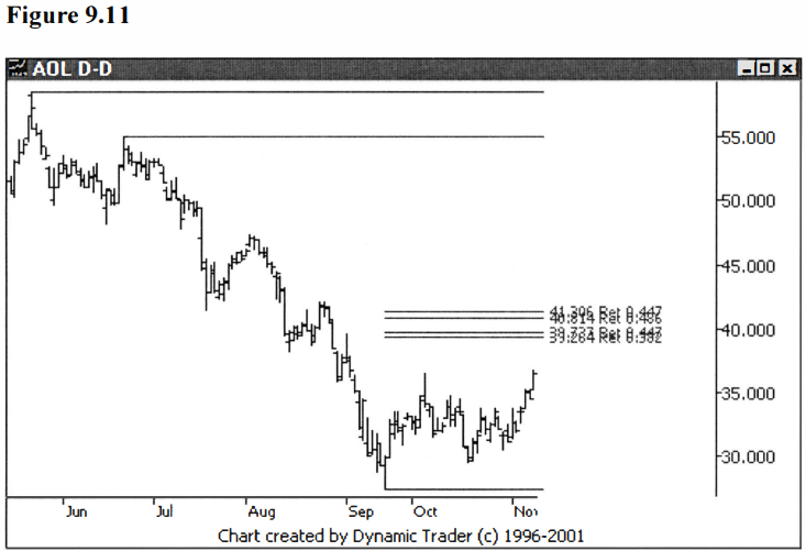
This choice of
retracements lines up quite well with the two retracements we already have on
the chart, so let’s continue on. Let’s add retracements off the next swing-high
as we work our way down the downtrend. Now my eye tells me that the groupings
so far are just about at a .618 retracement from this next swing-high on August
2. The ability for me to spot this right off has to do with the level of
experience I have constructing these types of groupings. Say your eye hasn’t
reached that point. Let’s just go ahead and add .486, .618 and .786, assuming
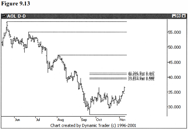
we aren’t sure what to do at this point. See figure 9.12.

What we see is
quite clear. The .486 is well below the area we are looking at, and the .786 is
quite a bit above. The .618 is almost impossible to see, as it overlays one of
the groupings so exactly. So, let’s erase off the .486 and .786. Sometimes it’s
easiest to just add things in, see what happens, and erase off the ones you
don’t need. See figure 9.13.
Now we have just
one more swing-high on August 27 on our way down the downtrend, so let’s add in
retracements from there. Again, based on my eyeing the chart and what we have
learned from doing the last retracements, I would look to add the .786 and .886
off this swing-high. You can see quite clearly the area we are looking at is
just below the swing-high, so these retracements make sense. See figure 9.14.
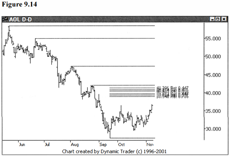
Now this looks
great. We have two very nice groupings forming and they are close together.
Note that the line off the August swing-high is not a part of the groupings
(it’s just there to show us that we have used that point for one of the
retracements).
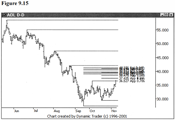
So far, all the
prices we have added are retracements. We can now look at some projections. Usually,
the projections that I use for an established trend are derived from all the
previous retracements. In this case, though, we are playing for the end of a
larger pullback than all the previous pullbacks. What this means is that we
won’t be adding in the 1.000 projections of all these previous pullbacks, since
they will be too small.
What does that
leave us? Well, we can add in other Fibonacci ratios of the previous pullbacks.
Or, we can look at the pullback we are creating the grouping for, and look for
clues there. The first thing that I see with this pullback is that it has a
familiar form, one of a simple abc correction. This is a correction where an
initial move is made, a pullback occurs, and then the correction finishes,
usually with a move equal, or close to equal, to the initial leg. If the c leg
doesn’t equal a leg, it is frequently a Fibonacci ratio of a leg, most commonly
a .786, .886, 1.13, or 1.272 ratio.
So, let’s add in
projections for all these Fibonacci ratios, as well as the 1.000. See figure
9.15.
This continues to
look good. The two smallest projections are below the groupings, so let’s erase
them. The three remaining projections (the 1.000, 1.13, and 1.272) fall right
in our two current groupings. I’ll also, for clarity, erase the lines showing
the swing-high points that the retracements were keyed off of. See figure 9.16.

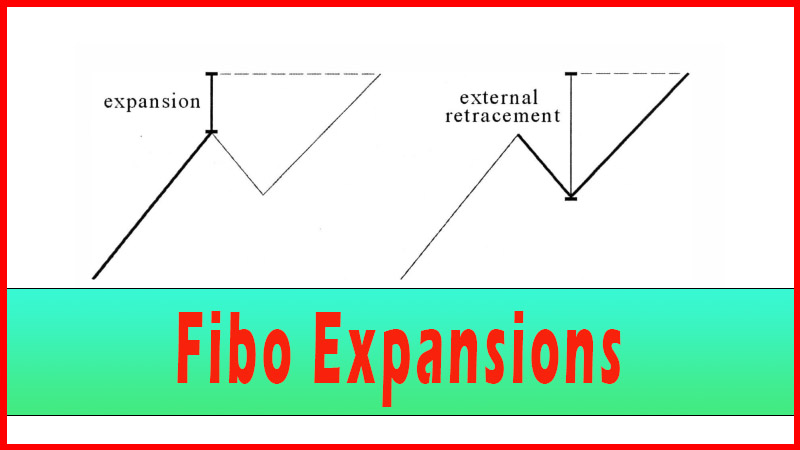
There’s another
thing we can do that we want to consider whenever we have an abc type pullback,
and that’s an external retracement of the pullback that forms the b leg. To
make this procedure less confusing to follow, first I’ll show just this
external retracement on the chart by itself, so you can see what I’m doing.
Then I’ll add it onto the chart with the groupings. See figure 9.17.
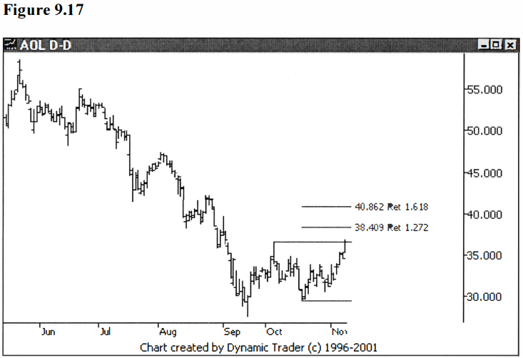
I used the most
common 1.272 and 1.618 external retracements in figure 9.17. Let’s put these on
the charts with the groupings and see how they fit in. See figure 9.18.
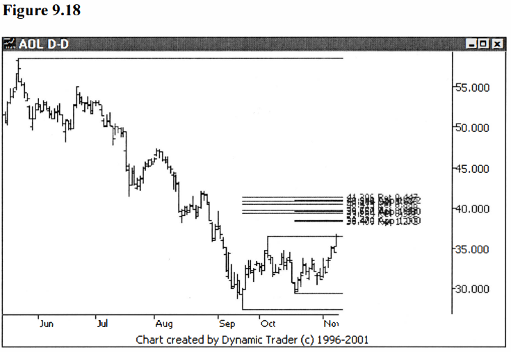
An interesting
thing has happened. We now have three very tight groupings forming. At this
point we could stop since we have quite a varied assortment of retracements and
projections, and very nice, tight zones. If I were going to trade this issue, I
would be satisfied at this point and now dial it down to a lower timeframe and
look for an entry trigger.
Since this is a
teaching example, I will add a few more things in, just to further drive home
the point of how the harmonics frequently overlap to a great degree. I will
skip a few steps here and just present the additions. I’m going to add in 1.618
and 1.902 projections of the first retracement (June 15 low to June 21 high)
and 2.058 and 2.236 projections of the second retracement (July 19 low to
August 2 high). See figure 9.19.

Notice what is
happening? They are just adding in right over the other prices. We have three
very distinct groupings, and a lot of evidence that the moves this issue makes
are in many ways depending on the previous moves it has already made. Now, this
is in no way a guarantee where the issue will trade in the future, but it seems
to point to areas we want to watch closely in our trading.
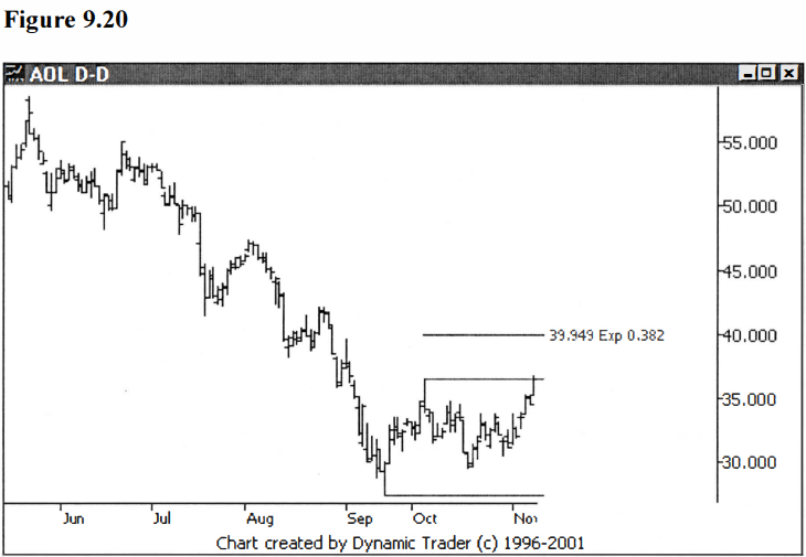
Now, as promised
in Chapter 5, I will add in an example of an expansion. I will add the .382
expansion in, but first let me present it on a chart by itself. How did I know
to try the .382 expansion? Partly experience and eyeing the chart, and partly,
I cheated and tried a few first to make the example easy on the reader. See
figure 9.20.
Let’s add it into
the mix and see how it fits. For clarity, I’ll also remove the lines on the
swing points used for the calculations. See figure 9.21.
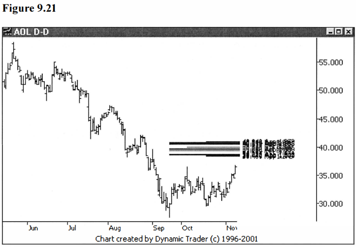
This is the final
version with three nice tight groupings, having almost endless overlapping
prices. If I were looking to trade this issue, as I mentioned before, I would
have stopped at figure 9.18, since it contained all I needed at that point.
Continuing on hasn’t provided me with anything additional that I really need to
consider a trade, but it has served as quite a good teaching example, and has
added in some reinforcement.
So, what happens
now? At this point I dial it down to a lower timeframe and look for an entry.
(I will cover this in more detail in the next chapter on trading techniques.)
Let’s finish this with a simple entry strategy on a lower timeframe, and see
how this one played out.
First, let’s dial
down to a 60-minute chart. If the daily chart were the traded timeframe, I
would normally look for a trigger on a chart that has three to five times the
data. For stocks that trade six and a half hours a day, that would be in the
range of the 78 to 130-minute bars. The most commonly used bars in that range
are the 90-minute and 120-minute bars, but the 60- minute is a very popular
chart.
You might be thinking, well, let’s pick the
90-minute because its use is perhaps less common than the 60-minute. That’s a
good line of reasoning. The choice of timeframes here is really a personal
preference based on experience to a great degree. I like to use the additional
information I get from the 60-minute chart, so I’ll choose the 60-minute for
this example. You should choose whatever you feel the most comfortable with.
See figure 9.22.

Here we have the
60-minute chart cut off at exactly the same position as the previous daily
charts in figures 9.8-9.21. The issue is headed into the zone and beginning to
uptrend quite nicely. Although I don’t show them on the 60-minute chart, the
groupings are in the area of approximately $38.40 up to just under $41.00. You
can go through the extra work of putting all the groupings on the lower time
frame chart if you wish, or just watch the larger, traded timeframe chart (in
this case the daily), to see where the issue is with respect to the groupings.
I usually do the latter.
Once the issue
enters the lower end of this zone, I will begin looking for an entry signal on
the 60-minute chart. In this case I’m going to look to enter on a trendline
violation. (Remember, as I stated before, I’m not trying to teach specific
entry techniques here. I picked the trendline violation to vary the technique
from the last example and because it’s a technique, which is, in my opinion,
well suited to the smooth trend that is developing in this issue. Traders
should decide, on an individual basis, what specific techniques they want to
use to trigger them into the trade.) Let’s look at the 60-minute as AOL enters
the first grouping, with a trendline drawn in. See figure 9.23.

The chart has a
bit too much data for clarity, but I wanted to show the overall perspective off
of the bottom. Let’s expand the chart out a bit and focus on the run into the
groupings. See figure 9.24.
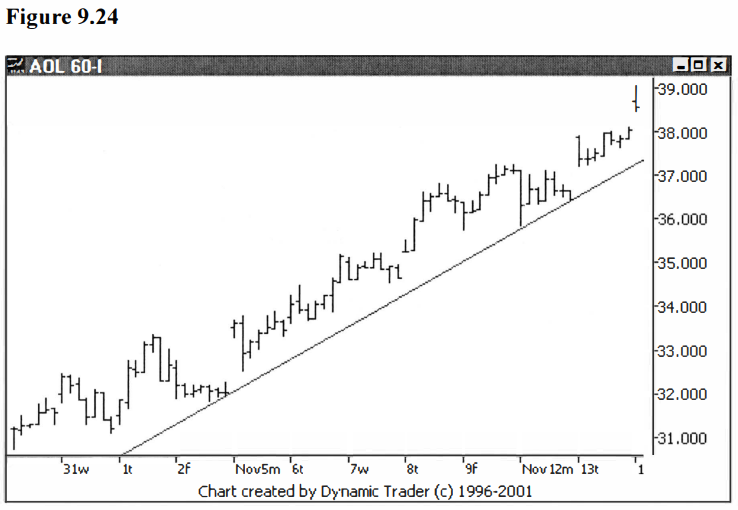
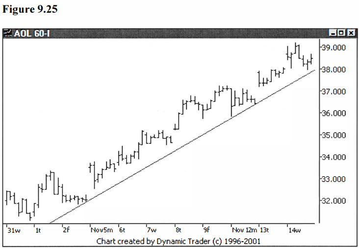
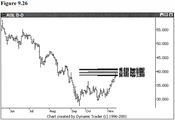
Keep in mind, the groupings are right in this area from approximately $38.40 up to just under $41.00. If the groupings are to hold and a reversal back to the downtrend is to take place, it should happen soon. Let’s move forward a few bars. See figures 9.25 and 9.26, showing the 60-minute and the daily charts.
At this point we
see the trendline still intact in figure 9.25. The price came down to test the
line and appears to be reversing back up. We are entering right into the middle
grouping as seen on the daily chart, figure 9.26. Let’s go forward one more bar
on the 60-minute chart. See figure 9.27.
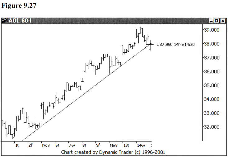
At this point we
have a trendline violation and a violation at the same time of a minor
swing-low. This would trigger the trade. As the bar completes, we see a
relatively strong close. Stops would be set, the trade is now in progress, and
all we can do is see how it plays out. I won’t mention possible stop placement
or trade management, as they are entire topics unto themselves, as are specific
entry techniques. I will likely write a book on this very topic, but now isn’t
the time for that type of discussion. My purpose here is to show you how to
construct places where you might decide to take a trade. Let’s see how this one
plays out. See figure 9.28.
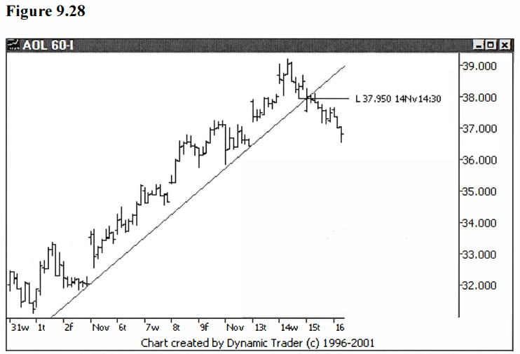
It turns out that
the bar that broke the trendline and then closed strong was only a temporary
show of strength, as AOL then continued to sell off. Take a look at the daily
chart, though, and look at what happened longer term. The chart is quite
compressed to include all of the pertinent action that was to follow. The three
groupings can be clearly seen on the chart. See figure 9.29.

Although this
construction took quite a while to work our way through, it clearly
demonstrates the major concepts in a step-by-step fashion. As you gain
experience and your eye becomes trained as to approximate price levels for
retracements and projections, the process will go much faster.
It’s good to look
at examples that don’t quite fit the mold so well. Let’s try another example,
one that doesn’t work out quite as easily as the last example, and requires
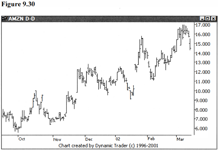
some judgment at many of the steps. We’ll start with a daily chart of AMZN.
Note right off
how choppy AMZN is trading. At this point AMZN has been in a strong oscillating
uptrend, and I’d like to find a trade to get in on the trend. I want to find an
area where a pullback might end. Here’s the chart of what I’m looking at as a
pullback starts. See figure 9.30.
I will first add
in some retracements starting from the low that marks the beginning of the
uptrend. As mentioned in the last example, I prefer to take trades in strong
trends when the pullback is at least a .382 retracement, but not greater than a
.447 retracement. In this case I won’t use any retracements larger than .447
off the bottom, since this is a strong uptrend, and anything larger than .447
would violate a trendline, giving me cause to wonder if the trend has changed.
I also like to use a regression channel (not shown) on a stock in an oscillating
trend such as this, to get an idea of the deepest retracement I would consider.
See figure 9.31.

Next, I’ll add
some retracements off the October 30 swing-low. I’ll move up to .447 and .486
after making a good estimate, eyeing the chart, and knowing I want to use
larger retracement levels than those I have just used. Then I’ll see how they
look. See Figure 9.32.
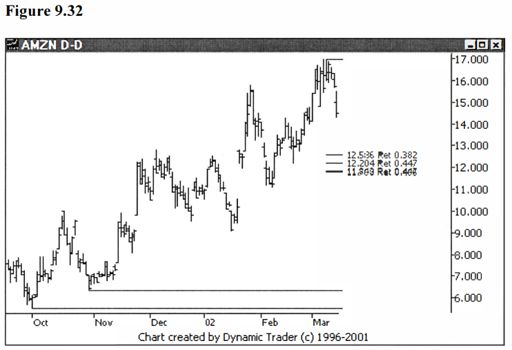
This addition
fits quite well with the existing retracements, so I chose well. Let’s move up
to the next swing-low. Here’s where some judgment comes in, or at least what
looks like a decision to be made. Do we use the low on December 24 or the low
on January 16?
Since the January
16 low was at a lower price, I consider the low set on December 24 to be part
of a correction. In this case quite a nice, uniform abc correction. Let’s,
therefore, key off the January 16 low. Now, what retracements should we add?
Remember, we can add all of them if we want to, and erase off the ones that are
outside the area we want to look at, or we can make an educated guess and see
if we are in the zone.
How do we know we
didn’t miss any, if we use the educated guess method? The answer is experience.
I can see where they fit in the groupings and tell if any nearby retracement
choices would be in the zone. If I feel they would be in the zone, I add them,
and see. Until you gain that level of ‘feel’, just add in the ones that are
close and see where they fall. I can see the only retracement we will need here
is the .618. But let’s say you aren’t quite as sure at this point. Let’s add in
the .618, plus the closest retracement below and above. That would be the .486
and the .786. We can always just erase off what we don’t need. See figure 9.33.

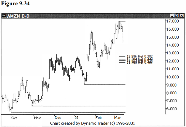
As I expected,
the .486 and .786 fall obviously outside our working area, so let’s erase them
off. This was good practice, though, to see how you can quite easily determine
what numbers are reasonable. See figure 9.34.
At this point, we
have some nice-looking areas forming. I won’t draw any conclusions, yet, as to
whether we have the start of three groupings forming. Let’s first add some more
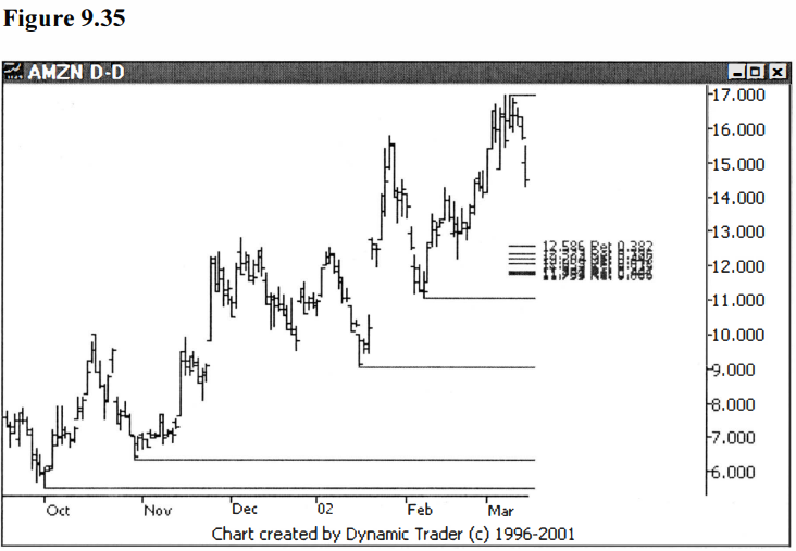
into the mix. We have one more significant swing- low on February 7 we can key off
of. Our groupings are pretty deep with respect to this swing-low, so I would
guess the .786 and .886 retracements are the ones to add. See figure 9.35.
So far, this is
shaping up very nicely. Now we are getting to the point where I really start to
have fun. As I look at the pullbacks up to this point, I see they are generally
quite uniform (as far as how much they are pulling back). I like to look for
this when I scan charts looking for trading candidates. I will still consider
charts that don’t show this characteristic, but when I see it, I usually
explore that chart in detail.
Next, I do
projections of these pullbacks, creating Fibonacci ratios of each pullback to
see what kinds of areas this would put me in off of the last high. What I’m trying
to determine is, if the issue has a pullback now that is similar to the
previous pullbacks in the trend, where would that put the price? Since I see
such uniformity in the previous pullbacks, I’m going to do this next step all
in one shot.
I’m going to add
the projections keyed off of each of the three major pullbacks in the uptrend
so far. I have found that, if the pullbacks are uniform, I want to not only
look at the 1.000 projection (the pullback is equal in size to the one I am
comparing it to), but also at the .886 and the 1.13 projections. Let’s add each
of these three projections in, for each of the three pullbacks, giving us nine
new numbers in one shot. This could create a real mess on the chart, but we’ll
see. If it does create a mess, we’ll erase them off and go one by one. See
figure 9.36.

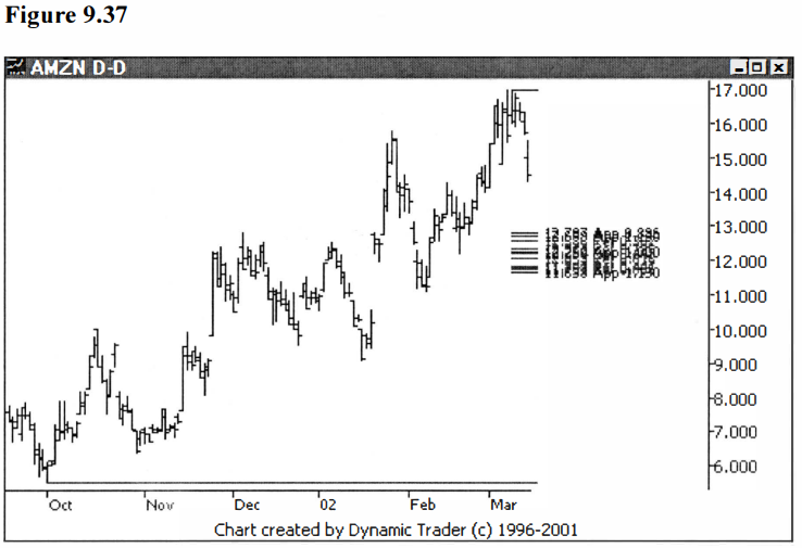
Now, that’s
amazing to say the least. Not only did we not create a mess, we have some
beautiful groupings. Three distinct groupings are now clear in our area of
interest, and two new groupings are starting to form up higher. I will leave it
as an exercise for the readers to go back, if they want, and see that some of
the smaller retracements would in fact land on these new, upper groupings. As
nice as these two new beginning groupings look, though, they are above our area
of interest, so I will erase them off the chart. For clarity, I will also
remove the lines that show the pullbacks used to create the projections. See
figure 9.37.
At this point we
have three very tight groupings formed, and I only see one other item that I
would add in from the data we are looking at right now. There is a minor
swing-low on February 20, and that looks to confirm the middle grouping, so I
will add that 1.000 retracement in. See figure 9.38.

If you remember
back to the last example in AOL, we were able to use quite a bit of information
from the pullback itself. I’m hoping we will be able to do the same in this
example. Let’s allow some time to pass and see if AMZN continues toward the
groupings, and if so, does the pullback allow us to add in a few more numbers?
See figure 9.39.
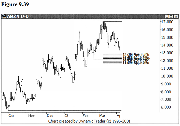
Well, as hoped,
the pullback is giving us a chance to use the additional data to make some more
calculations. We have what looks like an abc correction shaping up, and
one that looks like it could terminate in the area we are looking at. Let’s do
external retracements of 1.272 and 1.618, and projections of .886, 1.000, 1.13,
and 1.272, and see if that makes a mess, or supports our three nice, tight
groupings. See figure 9.40.

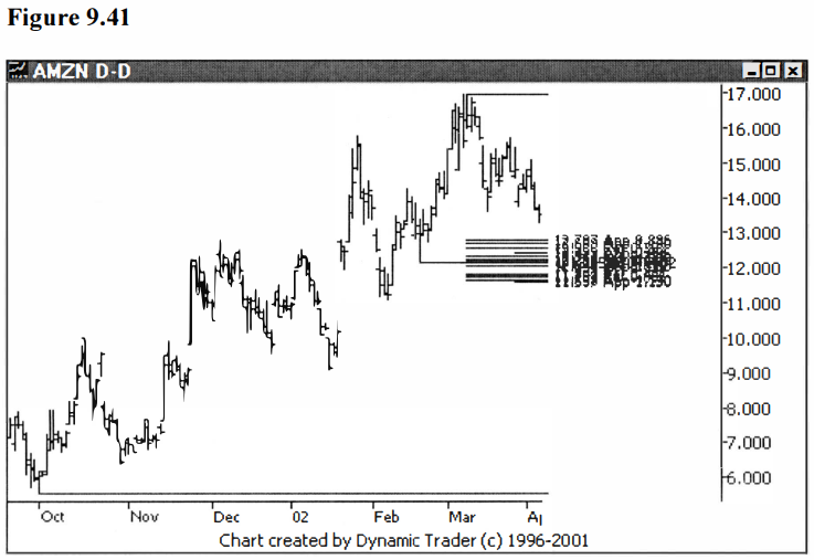
Not bad,
considering we just added six lines at once to an already loaded chart. The
1.272 external retracement line is above our highest grouping, so I’ll remove
that. One projection is on the high end of the middle grouping; you can choose
to remove that, or leave it. At this point we are splitting hairs. In reality,
although we have three groupings here, what I see is a broad area about a
dollar-thirty wide that AMZN is going to have to fight through (if it is going
to go down from here). Once I know we are in this area, I will be focusing on
lower timeframe action more than whether we are actually in grouping one, two
or three. Let’s look at the cleaned-up chart. See figure 9.41.
Now would you
actually do this many calculations in preparing your charts? Probably not,
since we are seeing repetition ad nauseam. My point here is educational, to
show you what you can do with the swings and how incredible it is that the
prices wind up hitting the same spots with surprising frequency. Generally, once
the groupings become clear, you might consider stopping at that point.
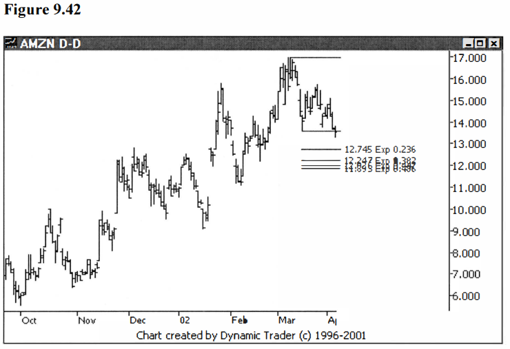
As promised, I
said I would do one more expansion example, so let’s add this to the mix. We’ll
do the expansion off of the end of the leg in the pullback that is headed into
our groupings. By eye, I can see it’s a fairly small expansion, so I’m going to
throw in everything on the small end of the scale. I’ll do .236, .382, .447,
and .486, and see how they lie. I’ll show a chart first with just these
expansions, and then the expansions on the chart with all the groupings. I
would expect chaos adding all these in, in one shot, but since this hasn’t
happened yet, maybe it won’t happen this time. See figures 9.42 and 9.43.

Again, all the
expansions are overlaying the three existing groupings. This continues to point
out how important all the previous moves seem to be to the current action. Does
this mean we can predict the future, or know what the issue will do next? Of
course not. What we are trying to do is determine areas of importance where we
may consider taking a trade. Let’s dial this one down to the 60-minute chart
and look for a trigger. See figure 9.44.
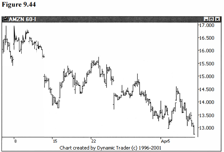
The first thing I
want to note is where my groupings begin. What is the high end? I see from
figure 9.43 that the top is at approximately $12.80. So whatever trigger method
I choose, I won’t initiate a trade until the price has at the least hit the top
of the highest grouping. I don’t want to jump the gun. If I miss a trade
because the issue reversed before the groupings were even hit, so be it.
Sometimes an
issue will start to reverse on the first grouping, roll over and go to the next
grouping, and then make the final reversal. It could do this multiple times as
it works its way through the groupings. If you choose a very sensitive trigger
technique you may see this happen while you are in the trade. You can sometimes
avoid this by choosing an entry technique that requires quite a bit of
confirmation, such as breaking a trendline, or taking out a minor swing-high or
low. Of course, there are trade-offs to this approach, such as the stop being
larger, perhaps. You will have to make your own choice, but this is something
to be aware of.
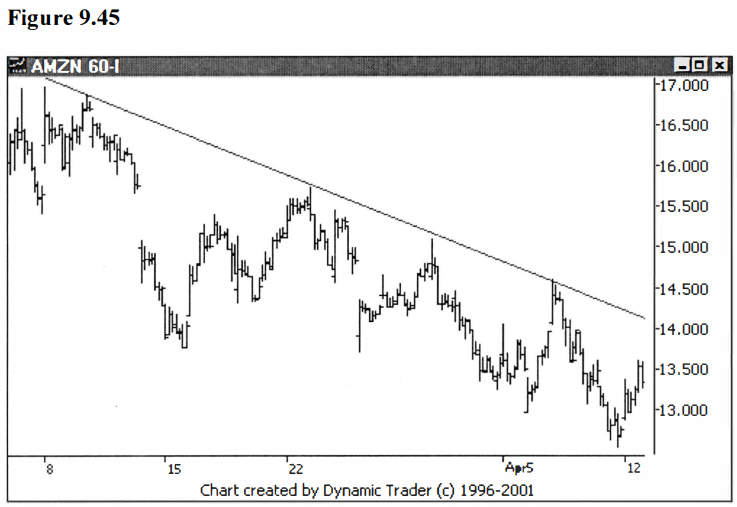
Again, I will
choose a trendline violation on the 60-minute to trigger entry for this example
(once AMZN has traded into the area of the groupings). See figure 9.45.
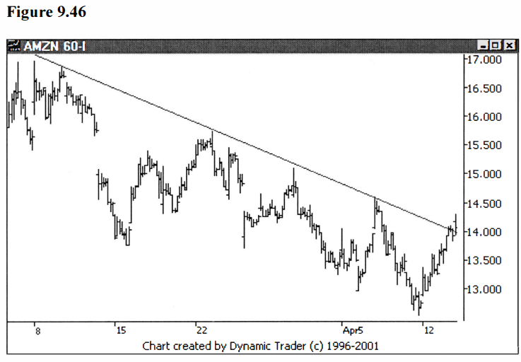
Let’s see what
happens as more time passes on this 60-minute chart, and see if we get a
trigger. See figure 9.46.
Using the trendline
violation trigger, this trade would now be triggered at just over $14.00. Let’s
go ahead in time just a bit, and see what happened. See figure 9.47.
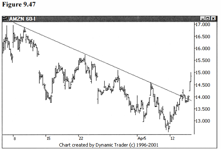
AMZN does appear
to have reversed at this point. Let’s look at the daily chart to see what
happened here. See figure 9.48.

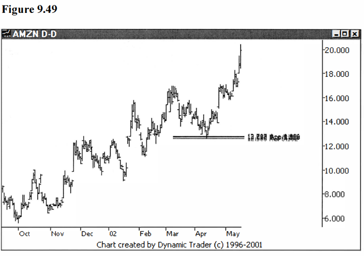
Let’s take a look
at the same chart as in figure 9.48, but let’s look at it showing only the
uppermost grouping, the one AMZN actually reversed off of. See figure 9.49.
These techniques
may take some practice to learn, but as you practice you will better your
chances of developing the proper feel. This is real hands-on stuff; you learn
by constructing the groupings. As you develop the mechanical skills to put the
lines on the charts, you will also be drinking in the relationships these lines
represent. Don’t expect to be an expert overnight. Expect to put a lot of lines
on the chart that are all over the place. When you start constructing groupings
that are fairly tight right off, with few erasures, and when you pick very few
charts that you later decide aren’t very harmonic, you’ll be on your way.
Advanced Fibonacci Trading Concept : Fibonacci Trading Strategy : Tag: Fibonacci Trading, Forex : Fibonacci Numbers, Fibo trading, Fibonacci Retracements, Fibonacci trading course - Fibonacci Number Calculations