Define Moving Average Convergence-Divergence(MACD)
MACD BUY OR SELL SIGNAL | MACD CHART STRENGTH | MACD SETTINGS | MACD FULL FORM
Course: [ Top Trading Strategy ]
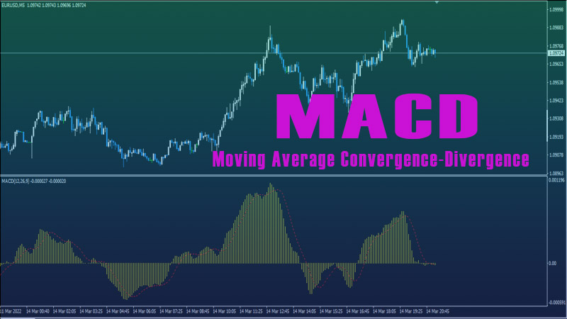
Moving Average Convergence-Divergence (MACD) is used either as a trend-following or momentum ndicator. It consists of two lines - the MACD line and the Signal line. The MACD line is made up of two exponential moving averages (EMA). It is obtained by subtracting a 26-day EMA of a currency price from a 12-day EMA of the price. This fast MACD line responds to changes in prices quite quickly.
Moving Average
Convergence-Divergence(MACD)
What is MACD?
Moving
Average Convergence-Divergence (MACD) is used either as a trend-following or
momentum indicator. It consists of two lines - the MACD line and the Signal
line. The MACD line is made up of two exponential moving averages (EMA). It is
obtained by subtracting a 26-day EMA of a currency price from a 12-day EMA of
the price. This fast MACD line responds to changes in prices quite quickly.
When
the MACD is above zero, it is a bullish signal for the currency as it means
that current expectations (i.e., the 12-day EMA) are more bullish than previous
expectations (i.e., the 26-day EMA). When the MACD goes below zero, it is a
bearish signal for the currency as it shows that current expectations (i.e, the
12-day EMA) are more bearish than previously (i.e, the 26-day EMA). The signal
line is a 9-day EMA of MACD itself, and it responds to changes in prices more
slowly.
MACD
generates a bullish signal when the MACD line is above the signal line, and a
bearish signal when the MACD line is below the signal line.
MACD Histogram
I
find MACD Histogram to a more useful tool than MACD itself because not only
does it show you the trend direction, it also illustrates the strength of the
price movement. It displays a very good visual representation of the difference
between MACD and its 9-day EMA. By looking at the Histogram, you can tell 2
things:
1.
Trend direction
If the Histogram is
above zero (i.e, the MACD line is above the signal line), it means the trend is
bullish. If the Histogram is below zero (i.e, the MACD line is below the signal
line), it means that the trend is bearish.
2.
Momentum of price
movement
The higher the slope of the
Histogram turns up (expands larger) above zero, the stronger the price
momentum, and hence, the more bullish the signal is. The more the slope of the
Histogram turns down (expands larger) below zero, the stronger the price momentum,
and hence, the more bearish the signal is. The MACD Histogram does not generate
any buy or sell signal when the Histogram is at zero.
Figure 1 below shows a daily chart of EUR/USD, with the MACD Histogram below the price chart. As you can see, when the price falls, the Histogram slopes downward more and more into the negative territory, signaling trend bearishness and increasing bearish momentum. When the price rallies, the Histogram slopes upward more and more into the positive territory, signaling trend bullishness and increasing bullish momentum.
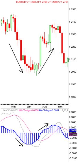
Figure
1
In
technical analysis, a key principle is that momentum precedes price action.
Thus, the MACD Histogram is particularly useful in telling us when the momentum
is gaining strength and when it is waning. When the momentum is waning, it
signals that the trend may be about to reverse.
How to Use MACD Histogram in Forex Charts
The
most useful application of the MACD Histogram is its divergence signals. A
bearish divergence occurs when the currency price rallies to a new swing high
or back to approximately the same level, but MACD Histogram traces a lower top.
This means that bulls are running out of steam to keep bidding higher. Weakness
is thus identified at market tops.
A
bullish divergence occurs when the currency price falls to a new swing low, but
MACD Histogram traces a more shallow low. This means that the bears are weaker
than they seem. Strength is thus identified at market bottoms.
Real Chart Example of Divergence
Figure
2 below shows a bullish divergence on the MACD Histogram (with the MACD line
and Signal line removed) on a daily chart of EUR/USD. As you can see, while the
price reaches a new swing low, the MACD Histogram traces a higher bottom than
its previous low. This bullish divergence signals an excellent buying
opportunity because it shows that the Euro bulls are ready to take control from
the exhausted bears. You may wish to enter long when the price exceeds the high
of the last red candle, or when the Histogram emerges into the positive territory.
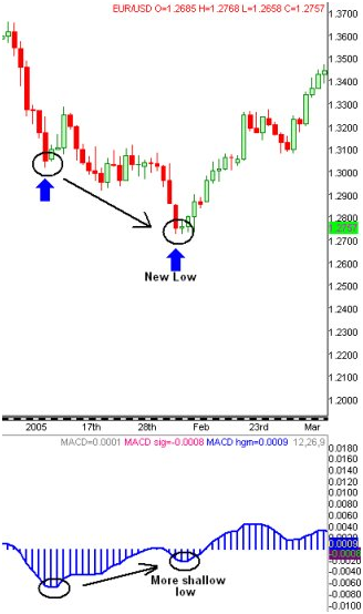
Figure 2
Trading Tips for MACD Histogram
·
If you
get stopped out from, say, a bullish divergence signal, and the price falls to
a new low, continue to monitor the MACD Histogram. If this third new swing low
is again corresponded by a higher third bottom of the Histogram, you have a
triple bullish divergence signal, which is a particularly strong buy signal.
The reverse applies to a triple bearish divergence signal.
·
Use MACD
Histogram on your hourly or daily currency charts for better results as signals
in longer time-frames lead to greater price moves.
Top Trading Strategy : Tag: Top Trading Strategy, Forex : MACD BUY OR SELL SIGNAL | MACD CHART STRENGTH | MACD SETTINGS | MACD FULL FORM - Define Moving Average Convergence-Divergence(MACD)