Moving Average - Blue Ice Failure
Moving Average Crossover, trendlines, swing trade entry points, pivotal points, three-wave pattern
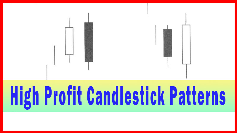
Course: [ How To make High Profit In Candlestick Patterns : Chapter 2. Moving Averages ]
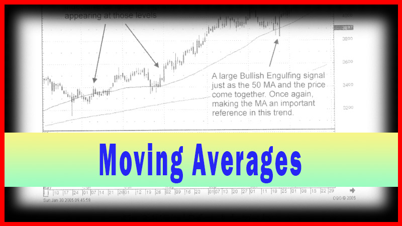
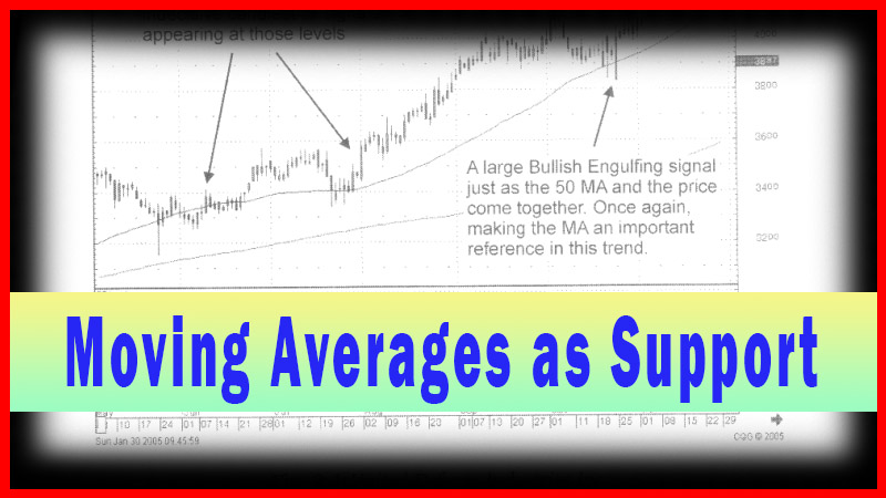
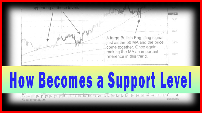
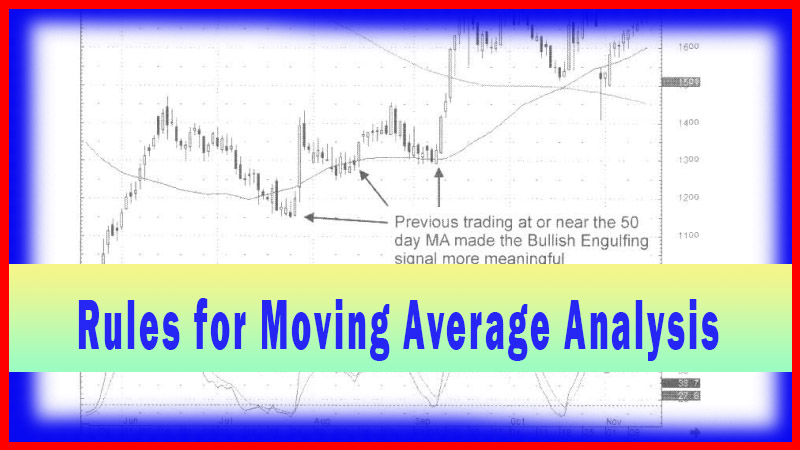
Prices move in patterns. Recognizing simple patterns, where moving averages act as pivotal points, is an easy mental process. The three-wave pattern: first wave breaches a moving average to the downside. The second-wave bounces back to the moving average.
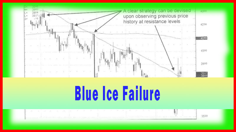
Blue Ice Failure
“It is impossible for a man to learn what he thinks he already
knows.”
Prices
move in patterns. Recognizing simple patterns, where moving averages act as
pivotal points, is an easy mental process. The three-wave pattern: first wave
breaches a moving average to the downside. The second-wave bounces back to the
moving average. The third-wave fails and moves down below the previous low.
This three-wave pattern has been aptly named, by David Elliott of
WallStreetteachers.com as the “Blue Ice Failure.” His description is that of
somebody falling through the ice, bobbing back up to find the hole they fell
through, cannot locate it, (thus failing the moving average), and then sinking
to lower depths.
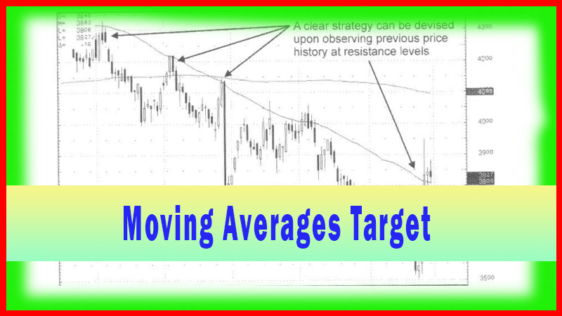
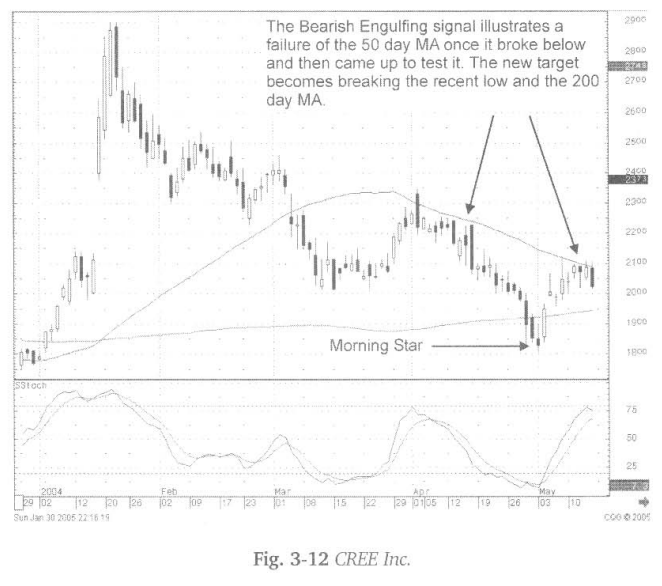
Fig.
3-12, The Cree Inc. chart illustrates a three-wave pattern, the Blue Ice
Failure. The decline from the January peak down to the mid-March low came
through the 50-day moving average. A bounce or the uptrend failed the first
time it approached the 50-day moving average. Upon that failure, it should be
anticipated that it will head for a new low.
The
first target is below the mid-March bottom. The next target is probably a test
of the 200-day moving average. Notice how the engulfing signal confirmed the
failure of the wave-two uptrend at the 1st of April. The Morning Star signal,
with the stochastics in the oversold area in the proximity of the 200-day
moving average, ended down trend. Does this pattern materialize often? Often
enough that it should be registered in the minds of investors to anticipate the
Blue Ice Failure possibility.
The
same pattern is illustrated at the beginning of 2004 in Fig. 3-13 (opposite),
the Micrel Inc. chart. The downtrend beginning in January broke through the
50-day moving average on the 1st of February. The candle formation definitely
revealed no “buying” presence at that level.
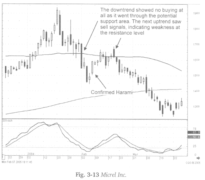
The
confirmed Harami brought the trend back up to the 50-day moving average where
a Dark Cloud signal indicated the sellers had taken over again. The target now becomes
a new low, below the $14.50 early February low, and probably at least targeting
the 200-day moving average.
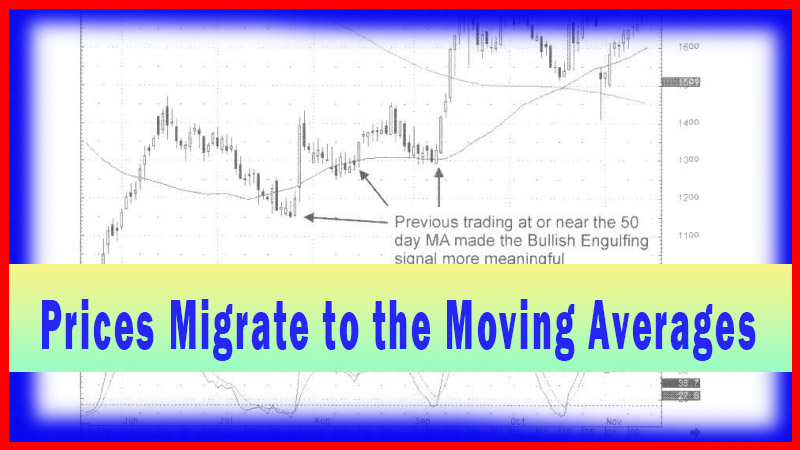
Fig.
3-14 The Ventiv Health Inc. chart provides a simple illustration for this
analysis. Where the 50-day moving average acted as support during the past few
months of this chart’s uptrend: in late June, the moving average did not act as
support. The pullback continued until a bullish engulfing signal appeared at a
price in the $14 area. Stochastics indicate that this is a time to buy. But
what should the target be? Obviously, what had been a support level for months
now might become a resistance area.
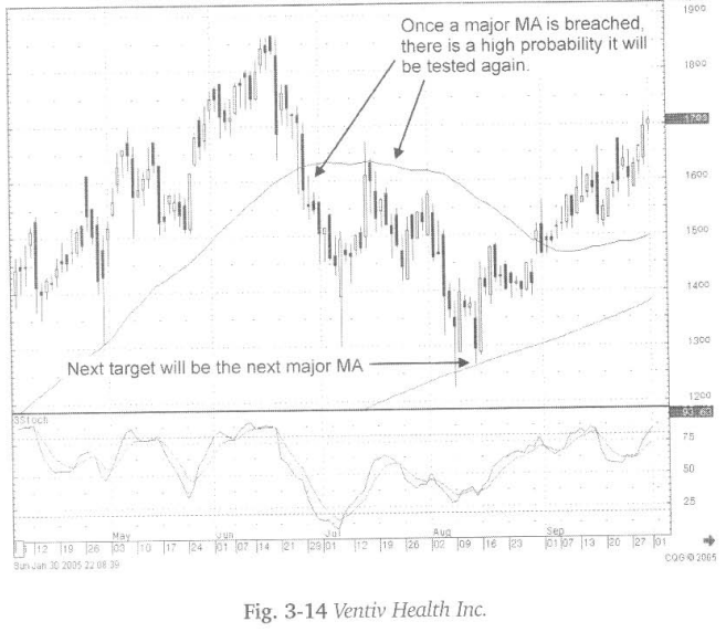
Should
that deter an investor from making this made? Probably not! A purchase at
approximately $14.00 with the potential move to $16.50 still represents a
reasonable profit. With that in mind, at least the investor realizes what the
first potential target should be and be prepared for expecting some resistance
to occur at that level.
Seeing
candlestick “sell’7 signals occurring at that level makes a selling decision at
the optimal time that much easier.
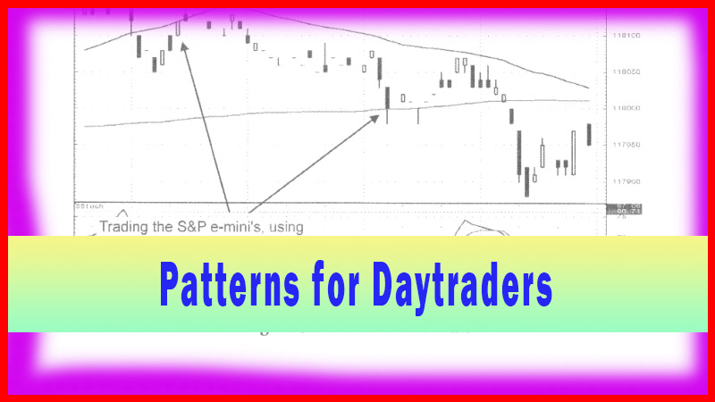
As
the price moves up to the 50-day moving average, the Hanging Man signal
illustrated that the 50-day moving average was not going to be breached. Upon
the failure of going up through that moving average, two assumptions can be
made. The downtrend will continue and breach the recent low and/or test the
200-day moving average. In this illustration, both of those parameters could be
accomplished at approximately the same level. Being able to visualize where to
sell and when to buy provides a format for shorting stocks or buying Puts,
inducing an investor to open and close trades at the optimal points.
Fig.
3-15, The Aspect Telecommunication Inc. chart illustrates a clear Blue Ice
Failure pattern. It also demonstrates the effectiveness of being able to analyze
what is happening to a trend based on the results of candlestick signals.
Notice how the price traded relatively flat through February and the first few
days of March. The Doji, appearing right at the 50-day moving average, becomes
an alert, especially for the candlestick analyst. A period of indecision, as
the Doji indicate, provides the “alert” of the possibility of something major
happening to the price movement at this important juncture.
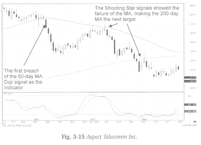
This
is the state of investor sentiment after two months of indecisive action. The
first wave of the downtrend becomes obvious. The wave two tends to move up,
stall out exactly where the candlestick “sell” signals appear. The overbought
stochastics and the 50-day moving average would indicate the probable end of
that move. The failure at that level provides us with two likely assumptions,
the lows of mid-March should be breached. The 200-day moving average becomes
the potential target.
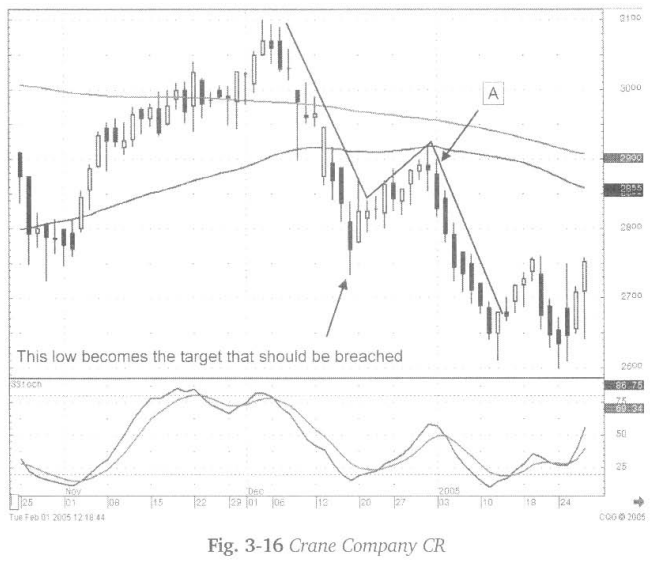
Familiarity
of a Blue Ice Failure allows a candlestick investor to pinpoint targets for
putting on or taking off trades. Fig. 3-16, The Crane Co. chart illustrates the
Long-legged Doji at Point A as a high probability' trade for shorting the stock
or buying the puts. The first target becomes the recent low. In this case, the
200- day moving average is above the 50-day moving average. A candlestick buy
signal should be the expected termination of the downtrend. The first major
candlestick buy signal appears when the stochastics are in the oversold area
becomes a signal to cover the short trade.
How To make High Profit In Candlestick Patterns : Chapter 2. Moving Averages : Tag: Candlestick Pattern Trading, Forex : Moving Average Crossover, trendlines, swing trade entry points, pivotal points, three-wave pattern - Moving Average - Blue Ice Failure