Moving Averages as Support
Price trend, Candlestick reversal signal, Candlestick analysis, Support and resistance
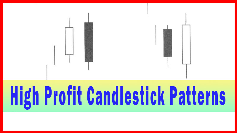
Course: [ How To make High Profit In Candlestick Patterns : Chapter 2. Moving Averages ]
Utilizing the 50-day moving average and the 200-day moving average as important support/resistance areas, a target can be established. Being able to evaluate the potential target makes analysis preparation easier. It prepares the investor to anticipate candlestick formations.
Moving Averages as Support
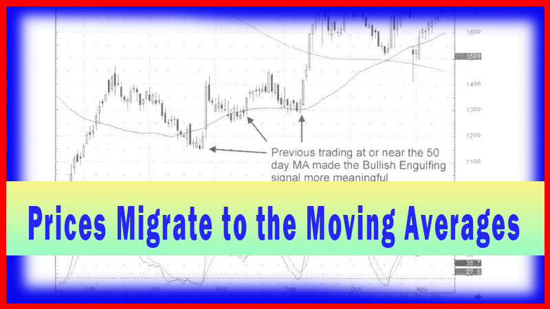
When
witnessing a downtrend, how do we tell when a bottom is getting nearby? As
described in other chapters of this book, it could be witnessing the panic
selling coming into a price trend, as the stochastics are getting toward the
oversold area. That is a helpful alert but does not give us a roadmap to where
panic selling might end. Utilizing the 50-day moving average and the 200-day
moving average as important support/resistance areas, a target can be established.
Being able to evaluate the potential target makes analysis preparation easier.
It prepares the investor to anticipate candlestick formations. For example, if
a sustained downtrend is now showing large dark candles and is approaching one
of the major moving averages, it is evidently indicating the panic bottom may
be near. Panic selling with stochastics approaching the oversold area, at or
near a major moving average, has a probability of a candlestick reversal
signal. This pattern alerts the trader to prepare for a candlestick “buy”
signal.
Do
all charts work well with moving averages? Definitely not! However, a large
majority appear to. The purpose of candlestick analysis is to provide an
advantage for the investor to see what is happening at important technical
levels. The candlestick signals provide that clarity. If a chart is not
providing clear patterns for indicating price movement, then move onto another
chart. There are many from which to choose, especially with the availability of
easy- to-use computer scanning programs.
Combining
technical methods with candlestick signals puts the probabilities in favor of
the investor. How do you discover whether the major moving averages are a
positive correlation when anticipating price moves? Easy! Investigate what has
happened at those moving averages previously in the price trend. This can be
done very quickly. Expand the chart. Take a quick visual analysis of what
happened in the past.
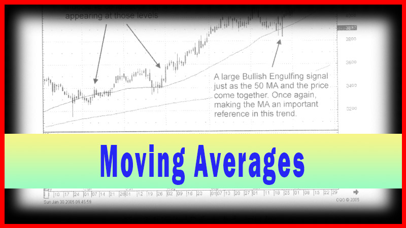
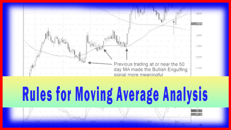
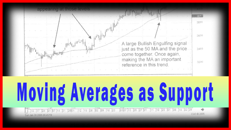
Fig.
3-1, The United Defense Industries Inc. chart illustrates an example of using
past trading patterns to anticipate what might happen. As seen in the chart
illustration, the 50-day moving average seems to have importance during May and
June.
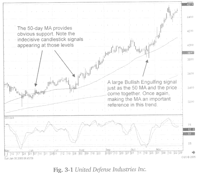
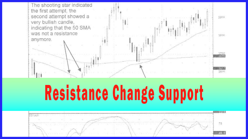
In
addition, the pullback in late July stopped right on the 50-day moving average
with a Meeting Line signal (a secondary candlestick signal), a couple of Doji,
then a Bullish Engulfing Signal that came up off the 50-day moving average.
That started the next strong run up. As it consolidated through September and
October, the 50-day moving average came up to meet the price. Stochastics are
back in the oversold area when a very strong bullish engulfing signal forms
again right on the 50-day moving average.
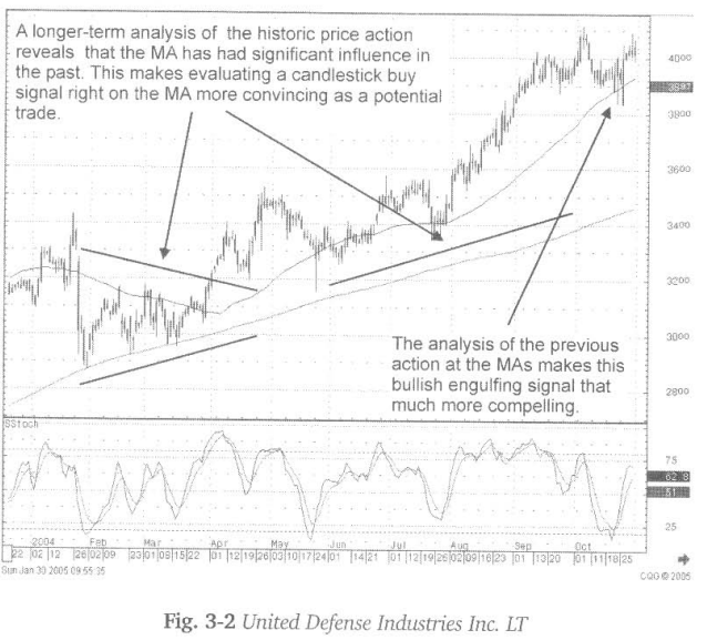
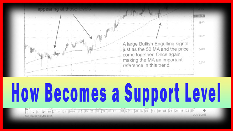
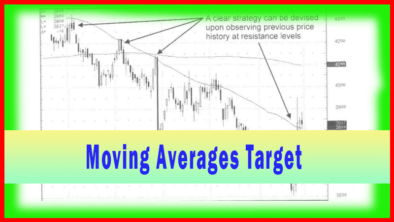
To
further analyze whether the moving averages are important in this stock price
move, the charts can be taken back further. It can be clearly seen that back in
February and March, the 50-day moving average acted as resistance while the
200-day moving average acted as support. Once the price broke out of the
pennant formation from that timeframe, it moved out away from the 50- day
moving average before coming back and finding support on it. Bottom line, even
without all the verbal description of what happened, it only takes an instant
to visually analyze that the price of this stock is greatly influenced by the
major moving averages.
The
decision to buy, upon seeing the Bullish Engulfing pattern, is that much easier
when the signal occurs at the 50-day moving average. This analysis is putting
as many factors as possible into making a trade decision. A Bullish Engulfing
Signal occurring when the stochastics are in the oversold area, starting to
curl up, and doing so right on the 50-day moving average, make a compelling
reason to be buying on strength.
How To make High Profit In Candlestick Patterns : Chapter 2. Moving Averages : Tag: Candlestick Pattern Trading, Forex : Price trend, Candlestick reversal signal, Candlestick analysis, Support and resistance - Moving Averages as Support