Regression Channels Techniques
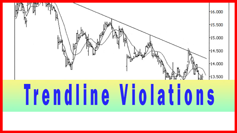
Trendline Violation Technique, Regression channel Strategy, Trendline, Best Trading Strategy,
Course: [ Best Trading Entry Techniques : Trade Entry Techniques ]
A regression channel is simply a straight-line channel around a linear regression line. In review, a linear regression line is simply a mathematically determined ‘best fit’ line for a series of data points, in this case prices.
Regression Channels
My use of regression
channels as an entry technique is really a variation, of sorts, on the
trendline violation technique. Although there are many possible uses
for regression channels that relate very little to trendlines per se, my
coverage in this book will be limited to this one application, which, as
stated, is a variation on the trendline violation technique. In practicality, I
see very little difference between the two techniques, and in my trading, I
actually use a hybrid technique (which I will present later in this chapter)
quite frequently.
A regression channel is simply a straight-line
channel around a linear regression line. In review, a linear regression line is
simply a mathematically determined ‘best fit’ line for a series of data points,
in this case prices. The channel lines are a given number of standard
deviations above and below this linear regression line, with the default on
most programs being two standard deviations. All these calculations can be done
‘behind the scenes’ with just about any modem charting software.
I use the basic, default setting of two
standard deviations for just about all my trading, only deviating from that
setting if I find a very special set of circumstances that I feel warrant it.
How do I determine if it is warranted? As I’ve said many times, I experiment,
and if I find something that works better, I may use it. Generally, though,
this is one where I rarely make a change. To add to the educational value for
the reader, I will choose the example for this chapter to be one where I might
play with the setting.
I find that, like the trendline violation
technique, I like to use this technique best when the issue is oscillating into
the potential trade area in a fairly orderly manner. The advantage, which
you’ll soon see, is that you can use the regression channel even if you can’t
find a nice, clean way to draw a trendline. It’s almost like creating a ‘statistically determined’ trendline, in the event the points to draw a more
‘normal’ trendline just aren’t lining up.
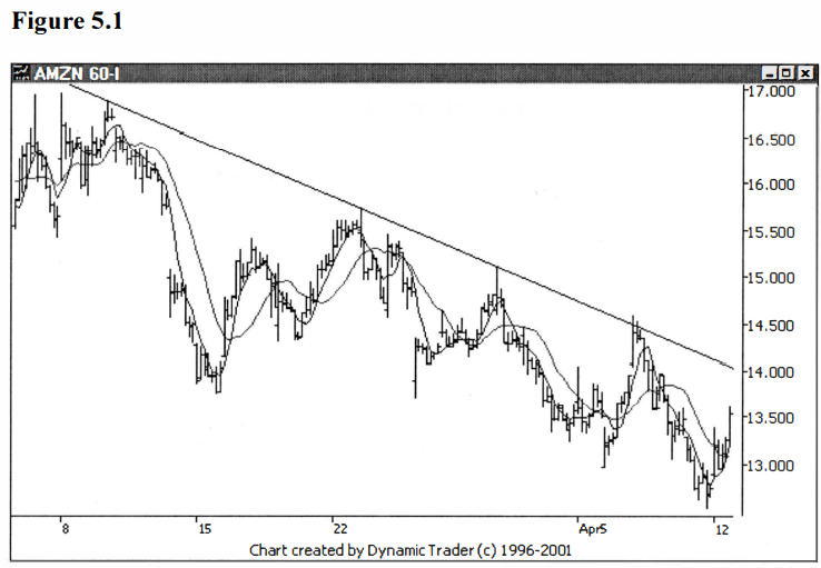
Let’s go back to the AMZN example from the
previous chapter and have another look at the 60-minute trigger timeframe
chart, with the trendline drawn on the chart. See figure 5.1.
Let’s now look at the same chart, but with a
regression channel drawn on the chart. See figure 5.2.
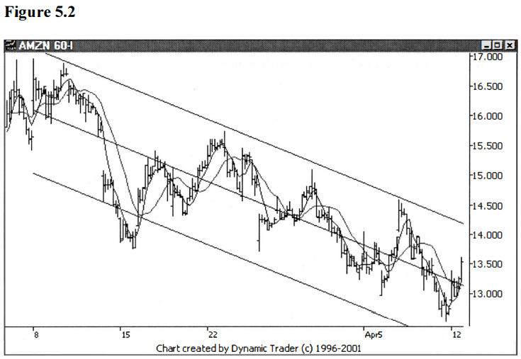
Let me make a few comments on what we see
here. By definition, for those of you who can’t recall their statistics right
off the top of their heads (that’s a joke, in case you haven’t gotten my sense
of humor yet), two standard deviations will encompass 95% of the data points.
As you can see from the channel, that looks about right. There is one major
spike outside of the channel.
That spike is kind of ‘outlying data’, where the gap and drop were
just a bit overblown. This will have the effect of creating a wider channel
than the rest of the data may indicate. It is common in statistics to drop the
high and low value from a data set before doing calculations. Although none of
the trading programs I have seen allow any adjustments besides how many
standard deviation units the channels are, it would be interesting to calculate
the channel with that outlier ‘smoothed out’ a bit.
Although I didn’t intend to go into too much
detail on alternate standard deviation settings, I did choose this example
because it is one that may lend itself to such an adjustment. Why would I think
that? I notice that when AMZN peaks, it reverses just shy of the top channel
line. When it falls and reverses, it reverses quite a bit shy of the bottom
channel line.
This tells me the channel perhaps isn’t
representing the price action as well as it could. If I made a slight decrease
to the channel width by decreasing the amount of standard deviation used for
the channel calculation, the channel may do a better job for me of representing
the price action. You might ask, isn’t this ‘curve
fitting’?
I would say yes, but it is ‘curve fitting’ on
relatively current data (by current, I mean with respect to this trade, as I
would be watching it unfold in real time and having what we have on the
previous chart at our disposal), with the objective to get the tools at hand to
guide me as best they can. To me this is no different than varying the period
of a moving average to find the length that best represents the current price
action in the issue.
Before I do any ‘tinkering’ with the channel width, let’s look at the channel
with the old trendline on the chart at the same time. See figure 5.3.

You can clearly see just how close these
really are. It is a matter, for all intents and purposes, of splitting hairs at
this point. The triggers likely will be different, but it isn’t going to be by
much. And if the trigger bar happens to be an expansion bar, they may trigger
on the same bar. Let’s skip ahead to the trigger bar for the channel, which
will be the first close above the channel. See figure 5.4.
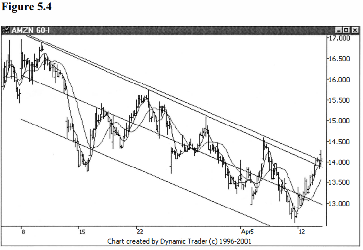
AMZN didn’t trigger until two bars later in
this case. The close of the regression channel trigger bar is $14.07. Recalling
back to the last chapter, the close on the trigger bar for the trendline
violation trigger was $14.05. As I suspected, the difference is nominal. This
is a case where either technique would work equally well.
The trendline was quite clear, so that
technique was a good way to go. The channel represented AMZN quite well, too,
but the one outlying data group perhaps widened the channel more than that
which would represent AMZN under more normal circumstances. Let’s spend just a
little time exploring a better setting on the regression channel, to see how
that affects the trigger.
Keep in mind: this isn’t ‘after poker’. We would be looking at the data
in figure 5.3 as we waited for the trade to unfold, just the same as if I t was
in real time. It is this data, and only this data, that is used for the
calculation of the channel, and for making the decision we have that it does or
doesn’t represent the price action like we would want it to.
Let’s drop the standard deviation down to 1.8
instead of 2.0. The value doesn’t have to be in whole numbers, it can be any
decimal value you choose. Why choose 1.8 as a first choice? I am just guessing
at a ten percent drop, as that sounds like a good starting place. I’ll leave
the old channel lines on and add the new ones to the same chart. See figure 5.5.

Well, that just about does it. Nice
representation along the top (remember, it is the
top that I am going to trade the break of, so that’s where my focus is),
and I bet it’s close to the old trendline. I’ll add that old trendline in for
comparative purposes, and remove the 2.0 channel lines. See figure 5.6.
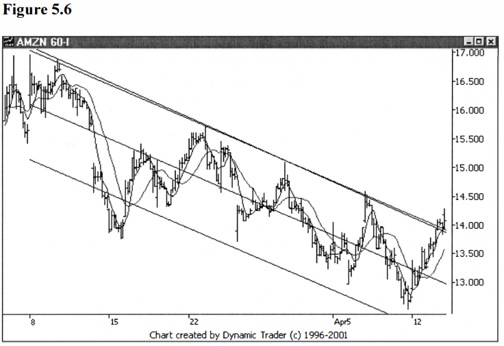
Well, the difference is what I would call ‘statistically insignificant’. As you can see,
the entry is going to be pretty much the same. I find it very interesting how,
more often than not, many of my entry techniques point to just about the same
spots. In my experience, when you get your trigger narrowed down to this small
of an area, it’s not worth the effort to try and haggle over the small
difference between possible entry points.
Keep in mind, too, that we have dialed down to
a lower timeframe, and hence a small difference on this timeframe becomes even
smaller (relatively), perhaps imperceptible, on the traded timeframe. Don’t try
to be too perfect and go beyond the point of ‘diminishing returns’ for all the
added effort.
Let’s move on to a little ‘trick’ I
frequently do, to blend all of the above into a hybrid technique that can often
be better than any of the individual approaches. The hub of the regression
channel is the regression line itself. As I explained, this is nothing more
than a ‘best fit’ line, mathematically determined using the data
points we have to work with. There will always be a line that, mathematically,
is the best that can be done with the data.
The regression channel then adds two parallel
lines a given number of standard deviations away from the regression line, one
line above and one line below the regression line. The user is free to set the
standard deviation to any amount he or she wants, including decimal amounts
(assuming the program allows for this). The usual default setting is two
standard deviations, and by definition, this will encompass 95% of the data
points.
For most work this 2.0 standard deviation
setting is going to work just fine. But instead of using the default, or even
adjusting the default for the behavior of the issue, let’s look at a totally
different approach. Let’s erase the channels lines altogether, and just start
with the regression line itself.
Some programs have this feature as a
stand-alone option, and some require you to delete the channel lines off once
you add the whole channel on to the chart. Additionally, some programs have a
box you can uncheck to not show the channel lines, leaving just the regression
line. Once you discover how your program works, it should be quite easy to get
just the regression line on your chart.
Let’s look at the previous example, showing
just the regression line. Note that this is the exact same regression line as
shown in the previous charts, it’s just that the additional lines have been
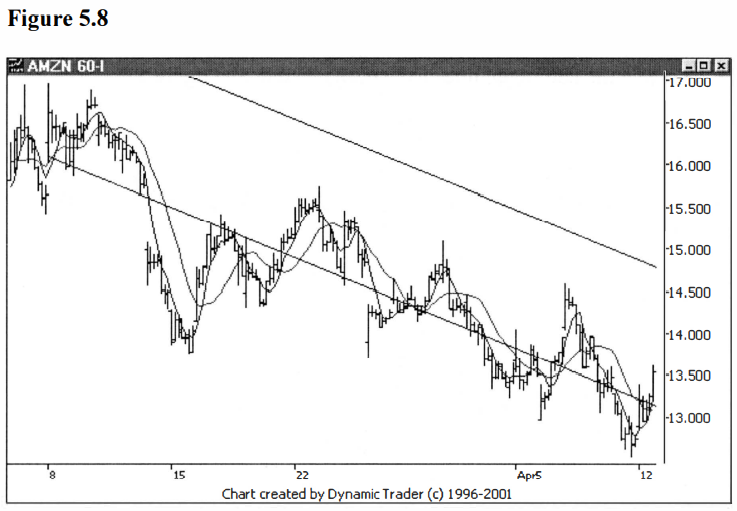
deleted. See figure 5.7.

Notice how the data is oscillating above and
below the line in a fairly regular manner. As an aside, imagine the regression
line as running left to right, parallel with the ground (in other words, rotate the chart in your mind counterclockwise a
little bit), and imagine how the price would look then. Looks a lot like
an oscillator indicator (such as stochastics), doesn’t
it?
Now I am going to clone this regression line.
Most programs have a feature to allow you to clone any line. Even better, you
can usually move this cloned line all over the screen, dropping it wherever you
like. You can usually pick it back up and slide it all over, looking for
something to jump out at you. I’ll start by just dropping this cloned line well
above the ‘action’ on the chart, to show what I’ve done. See figure 5.8.
I’m not sure how your eyes will be seeing
this, but my eyes are creating an ‘optical illusion’ that these lines aren’t
parallel. I see the lines closer together at the right than at the left. I can
assure you, though, that they are parallel. What I am going to do now is slide
that higher line down, all the while with the program maintaining the parallel
aspects of the line. I will then drop the line when I see something that looks
to be representing the price action.
For the sake of this example, I will leave the
first drop of the line (above the price action, as shown in figure 5.8), on the
chart, and show that line and the drop that I think represents the price
action, on the next chart. Hopefully, it will be clear, then, that all I’ve
done is to slide this line down until I liked what I saw, and then I fixed the
line at that point. See figure 5.9.

Now that looks absolutely great to me, from a
trading perspective. That line is representing the price action with near
perfection. And that line is perfectly parallel with the regression line that
takes into account all the price action of this part of the downtrend. This
would be my preferred method for setting up the line I would use as my trigger.
And one more time, just to show how close these methods can sometime be, let’s
add back in the old trendline, for comparison. See figure 5.10.

Again, you can see just how close these
different lines are. But that may not always be the case. Every so often you
may see a chart that you want to trade where the trendline just isn’t that easy
to draw. Perhaps the tops don’t line up real nice, or the trend angle changes
during the move. I like the freedom to move a parallel line around and make a
judgment call as to where I want the trigger line to be, if I feel the
situation warrants it.
The next chapter will change gears
significantly, moving from techniques that use lines drawn on the chart that
represent some aspect of the trend, to a technique that uses violations of
previous prices to signal a trigger.
Best Trading Entry Techniques : Trade Entry Techniques : Tag: Trade Entry Techniques, Forex : Trendline Violation Technique, Regression channel Strategy, Trendline, Best Trading Strategy, - Regression Channels Techniques