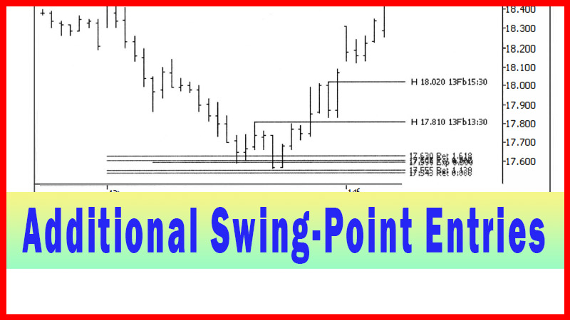
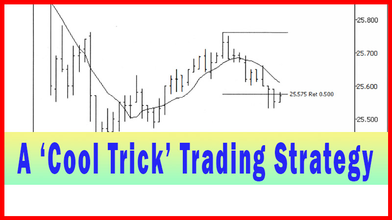
Cool Trick Trading Startegy
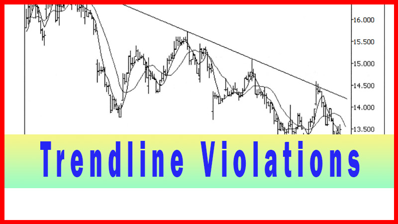
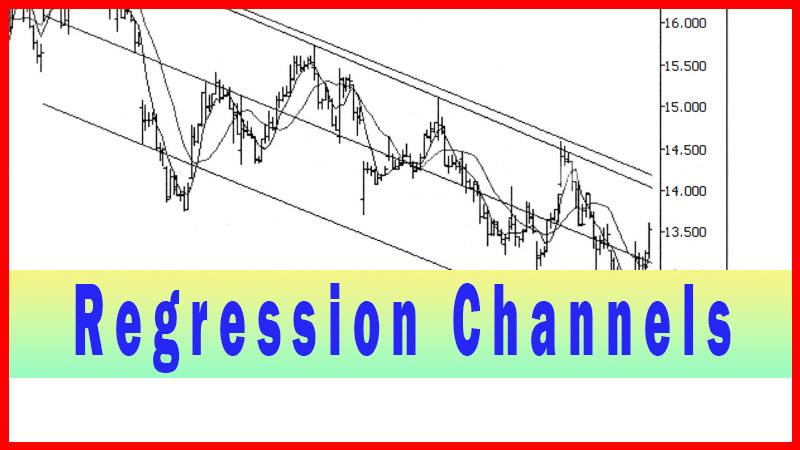
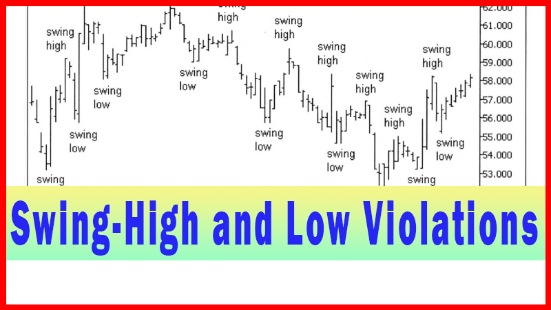
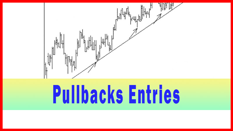
Moving Average Crossover, trendlines, Regression Channels, Swing low, Swing high, swing trade entry points
Course: [ Best Trading Entry Techniques : Trade Entry Techniques ]
The ‘middle’ timeframe is the traded timeframe, the longer timeframe is used for context, and the shorter timeframe is used to fine-tune an entry into the trade. What I will be presenting here amounts to dropping down yet one more timeframe, to fine- tune the entry even more. This is not a ‘trick’ whose use I take lightly, however.
A ‘Cool Trick’ Trading Strategy
The ‘cool trick’ is a favorite variation of
mine that I apply on pullback entries. I am only presenting it here in the
context of the pullbacks, as described in chapter 7. I apply it to other
pullback situations, but for now I am presenting it only as I apply it to
pullback situations like those shown in chapter 7. As always, I encourage
experimentation with the techniques, and their use and application in any
situation that works for the individual trader.
One of my main methodologies, one I’m sure the
reader is by now quite familiar with, is the use of three timeframes. The ‘middle’ timeframe
is the traded timeframe, the longer timeframe is used for context, and
the shorter timeframe is used to fine-tune an entry into the trade. What I will
be presenting here amounts to dropping down yet one more timeframe, to fine-
tune the entry even more. This is not a ‘trick’ whose use I take lightly,
however.
What I mean by that is, I have to be careful
not to indiscriminately start going down to a lower timeframe than my entry
trigger timeframe. To do so may introduce a timeframe that is way too small
with respect to the traded timeframe to have any real meaning. The ‘sensitivity’ is simply far too great.
What I am doing with this technique is different, though. I am looking at the
entry chart like it is a trading problem in its own right, and looking to solve
that entry problem.
The entry problem on the entry chart, though,
is just the same as the original entry problem. Confused? You shouldn’t be. If
we have a traded timeframe chart and we drop down to a lower timeframe for
entry once we
have penetrated the potential trade area,
and we find that the entry chart has a potential trade area (the 50%
retracement), why not apply the very same technique again? That’s the premise
here, and for my trading it’s a valid premise.
I am only applying this technique to pullbacks
that are part of an acceptable swing-point formation, and only once the
pullback has penetrated the minimum 50% retracement. I generally don’t apply it
in other circumstances. I have exceptions, but only because I’ve experimented
extensively with the technique and found other ways to apply it. As with any
technique, whether it is one if my techniques or one from any other source,
each trader should experiment and decide if it will work for him or her, and
under what circumstances.
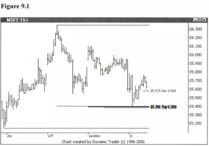
Let’s look at that MSFT example from chapter
7. The following chart is from figure 7.9. Recall that MSFT has penetrated the
potential trade area around $25.40 and reversed. MSFT then began to form a
swing-high point and pullback that met my criteria. The chart is the lower
(trigger) timeframe. The 50% minimum retracement I look for is labeled. See
figure 9.1.
MSFT hasn’t yet hit the 50% minimum
retracement, so let’s advance forward one more bar. See figure 9.2.
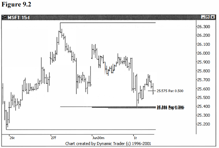
MSFT has now penetrated the 50% minimum
retracement area, and I can now consider a trigger. Here’s where I see the
similarity with the initial trade process. What if I presented this chart and
said I have a potential trade area at the 50% retracement. Now I want to dial
down to a lower timeframe and look for an entry. Likely, you would see that as
a valid plan.
The only difference I can see is that the 50%
retracement is just one number, not a grouping of numbers. Normally, I trade
areas I think have a preponderance of reasons for significance, at least as far
as my experience tells me. (They don’t necessarily have to be Fibonacci
groupings, just solid potential trading areas.) That’s why I am confident to
consider it as a potential trade area.
Remember the ‘Plan for a Trade’. It includes
an area to trade, an area you have decided you think gives you an edge, an area
you think something is likely to happen. This trade, redone as a standalone,
simply doesn’t have that. That’s why I say I don’t want to just apply the
technique at random, so to speak. I have found the technique works for me
because it is a refinement of a valid trade premise I have laid out.
As long as I apply it in this context, I think
it is useful to me. What I am trying to convey is, don’t just apply it whenever
you want to any situation you want. It then becomes out of context, and as I
have pointed out so many times, without context, I find very little value in
any technique, regardless of at what stage of the trading plan it is applied.
Let’s now drop down to an even lower
timeframe, this time the 5-minute chart, as MSFT penetrates the 50% retracement
area. See figure 9.3.
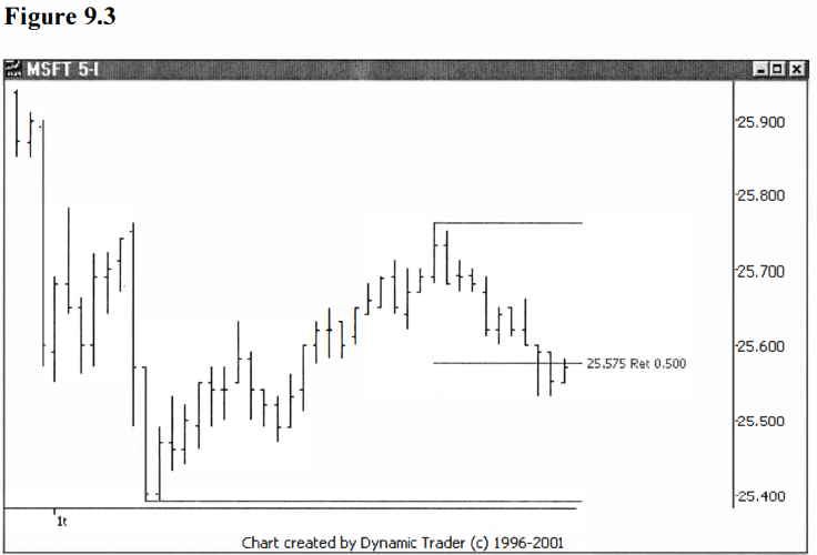
MSFT is in the area where I would consider a
trigger. Down on this 5- minute timeframe, I have more detail to examine. I
want to look at the pullback, and decide when I think that pullback may be
ending. I have a few preferred techniques I usually choose from to help me
decide. I can see that this pullback is very orderly and it appears that it would
lend itself very well to a trendline violation entry. Sound familiar? I am just
using techniques and concepts I already have to address this trading situation.
Let’s draw in a trendline and see what that shows us. See figure 9.4.
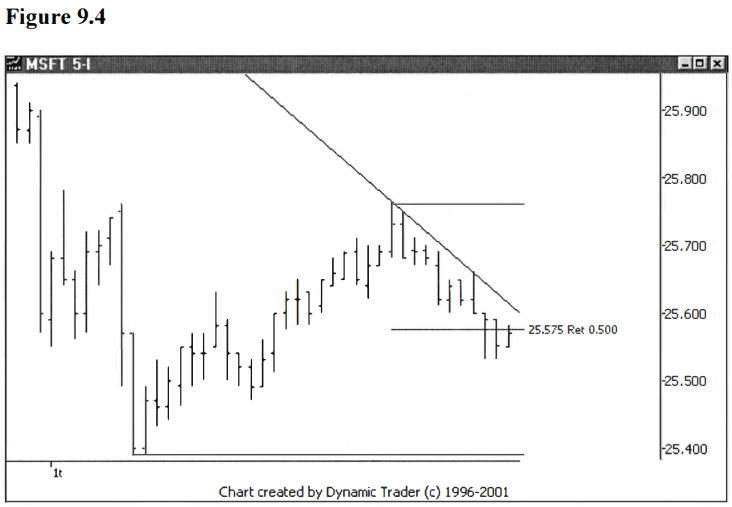
The trendline represents the price action very
well. Understand, when you use a trendline for such a small trend i.e., so few
price bars, it frequently will not have multiple contact points. That doesn’t
matter to me, since I’m only using the trendline to indicate to me that the
price direction has changed right at that instant. I’m not trying to determine
how solid of a trend I feel is in place, or anything else. Let’s move two bars
ahead and assess the situation. See figure 9.5.
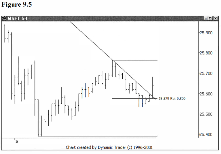
The trade would be triggered at this point,
with a close above the trendline. Let’s note the closing trigger bar price for
comparative purposes, which is $25.64. If you’ll recall, the entry over the
high of the 15-minute bar was at $25.67, as shown in figure 7.11. This entry
was a slight bit lower, but in the same general area.
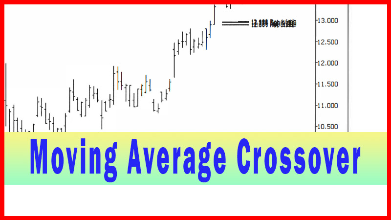
When I see such a nice, orderly pullback, I
also look at a moving average cross entry, as covered in chapter 2. I use a
fairly short period moving average, usually a 5-period or an 8-period, when I
do this ‘trick’. I will try a few variations and see which one looks like it
best represents the price action that I have available once the 50% retracement
area has been penetrated. In this case I went with an 8-period simple moving
average. Let’s look at the chart with this average added on. See figure 9.6.
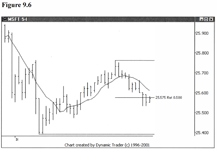
This looks very similar to what we just did
with the trendline. Let’s move two bars ahead, again, and do another
assessment. See figure 9.7.
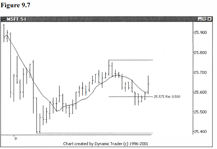
The trade is again triggered at this same
point, and we’ll note the same price of $25.64 as the closing bar trigger price
for this variation of the technique. To show just how similar the two
variations are, on the next chart I’ll show both the trendline and the 8-period
simple moving average together. See figure 9.8.
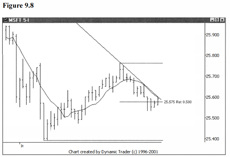
Now, to me, that’s amazing. The two just about
converge right at the breakout point. It just goes to show how these techniques
can frequently point you to very specific areas if you choose the parameters to
represent the price action well. Let’s move ahead one more bar, and look at the
trigger bar with both the triggers on the same chart. See figure 9.9.
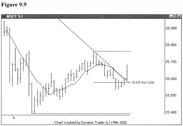
Either technique variation would have been a
good choice within the guidelines of my trading plan. As we have seen, when the
technique is chosen well and applied correctly, the entry areas are, many
times, very similar to each other.
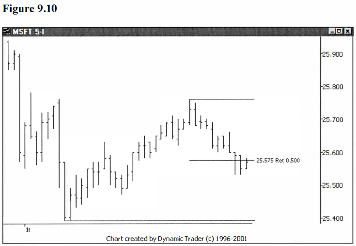
A third variation I really like is using the
bars to trigger me into the trade. This is really a fine-tuned variation on
taking out the bar high (low for shorts), just applied to the lower timeframe.
I prefer to use some judgment in this regard, and not just automatically take
the first signal from the first trade over any bar high once the 50%
retracement area is penetrated. I look at the other two entry variations we
just covered on the same chart, and I look at the last few bars. Let’s look at
the chart for now without anything else on it, as the decision point is
approaching. See figure 9.10.
How would I assess the bars here? Normally,
it’s common to use the high of an inside bar for a long trigger. It’s even
somewhat common to use the high of yet another successive inside bar as a
trigger. If I were in the ‘regular’ lower timeframe, I would likely use those
criteria for my trigger.
In this case, though, since I’m in an even
lower timeframe, which I consider more ‘sensitive’ that usual (with respect to my traded timeframe), I want to
be a little less quick to trigger. So, in this case, I would use the high of
the bar that set the low, which is just a bit higher than the inside bar that
followed it. Let’s see what that looks like by drawing in a horizontal trigger
line on the chart. See figure 9.11.
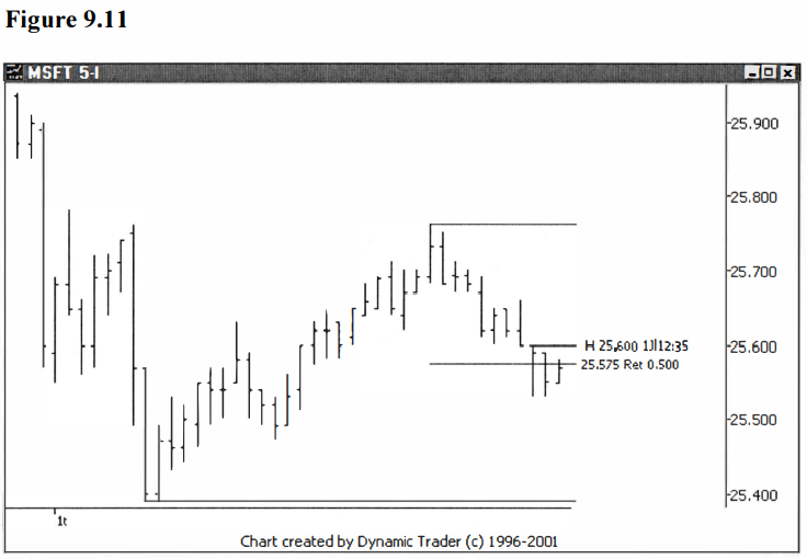
It is interesting to note that the 15-minute
chart bar trigger is actually the high of the bar just before the trigger bar
on this chart. You can see, then, that this choice of triggers would be at a
lower price. That is the reason behind doing all this extra work, to attempt to
get in at a better price with a smaller protective stop loss, and to not lose
all that advantage by greatly increasing the chance of a ‘false start’. Let’s move two bars ahead and
assess the situation. See figure 9.12.
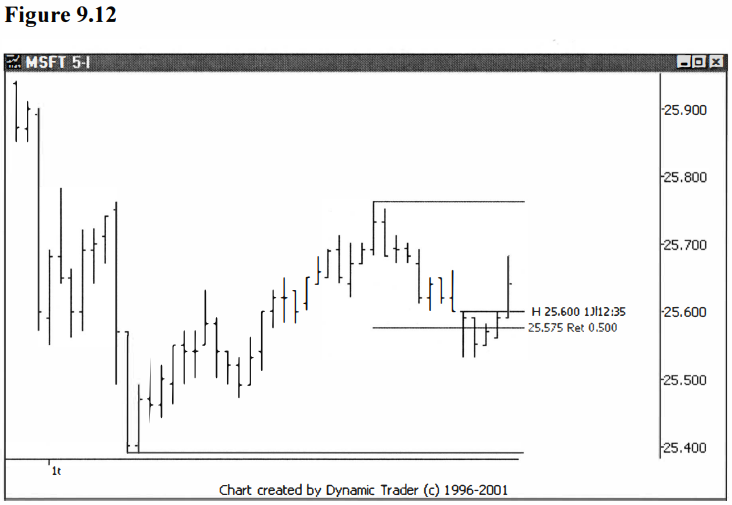
Well, this is getting repetitive, isn’t it?
MSFT didn’t trigger on the next bar, as that bar traded to the same high as the
trigger bar, but not above it. It did trigger on the following bar after that,
though. But since the trigger is the first trade above that bar high at $25.60,
we’ll record the trigger price at $25.61. That’s not to say that anyone could
have gotten filled at that exact price, of course, but we need some prices for
general comparison. This price is better than the previous two variations at
$25.64.
Let’s finish this example by adding one more
bar to the chart, and putting all three of the trigger variations on the chart
at the same time. See figure 9.13
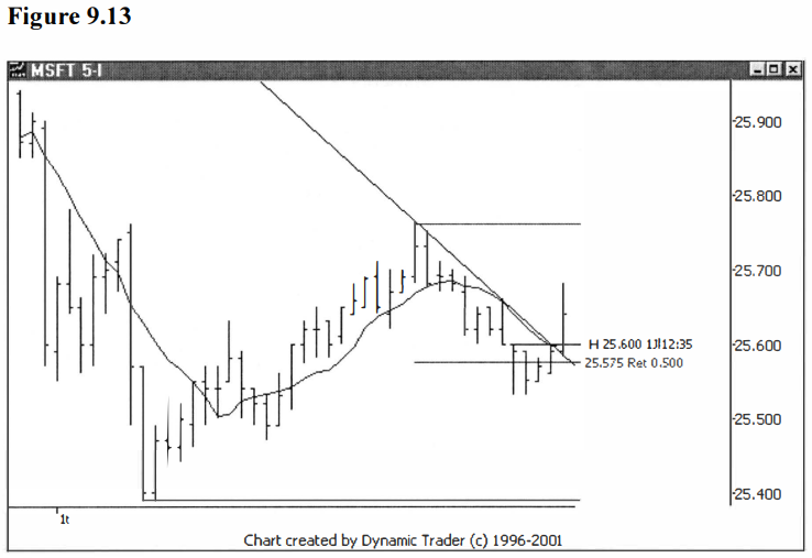
In a case such as this one, I would certainly
note that the three techniques all converge on pretty much the exact same
point, right at $25.60 on the second from the last bar on this chart. Given
this, I would seriously consider a trigger on any trade above this point. This
is a great example of why I actually like to use multiple techniques at the
same time to guide my decision-making process. In a situation like this I would
be very unlikely to wait for the close on that last bar to initiate the trade.
This is a subjective call based on experience, and all I can do is pass on the
reasoning behind my potential decisions.
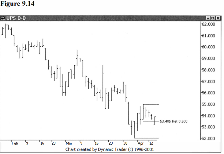
I’d like to present one more example on this
‘trick’. Let’s go back to the UPS example, which was triggered on the daily
timeframe. 1’d like to dial down to a lower still timeframe of 60-minutes and
go through the ‘trick’ on this one. Let’s go back to the daily trigger
timeframe chart of UPS and look again at the swing-point and pullback, as the
50% minimum retracement is penetrated. This chart was previously shown as
figure 7.14. See figure 9.14.
The ‘regular’ way to look for an entry would
be to utilize this chart and one of the previously described techniques.
Instead, we will attempt to use the ‘cool trick’, and go down to an even lower
timeframe; in this case I’ll choose the 60-minute. Let’s look at the same
pullback on UPS shown in figure 9.14, this time on the lower timeframe. See
figure 9.15.
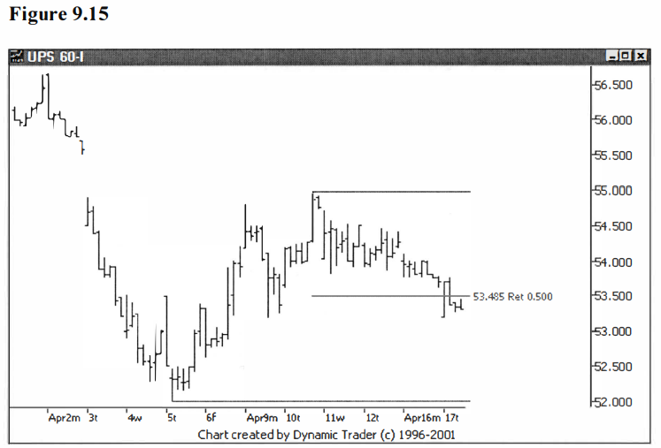
At this point UPS has penetrated the 50%
retracement area and I have to make a decision on what trigger I might
consider. I like to put all three triggers that we have covered for this
‘trick’ on the chart at the same time and make a more ‘holistic’ decision, but
it’s up to the reader to decide if he or she wants to try them all at the same
time, or to pick a particular one and just use that. First, I’ll add a simple
moving average to the chart. See figure 9.16.
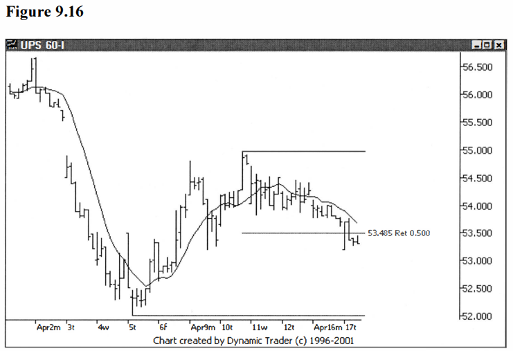
In this case I opted to use a 10-period simple
moving average. I tried an 8- period, but felt the 10-period did just a
slightly better job at representing the price action. In reality, the
difference is extremely minor and likely of no trading significance at all. UPS
is not all that smooth or orderly as it trends into the trigger area, and that
will usually have me using a slightly longer period moving average. I suggest
you experiment with varying period lengths and see what works best for you and
your particular trading plan. I’ll now add in a trendline and see what that
shows me. See figure 9.17.
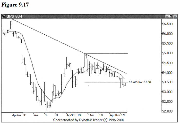
The first thing I notice now that the
trendline is on the chart is that the trendline is tracking a bit above the
moving average. This might give me a later signal if I use the trendline. If I
am feeling a great deal of confidence in this setup, I might opt for the moving
average cross trigger, and if I’m not quite as confident I may opt for the
trendline violation.
This level of confidence is not something I
can quantify for the reader, it is a matter of my ‘gut feeling’, based on
having seen a vast quantity of similar setups over a long period of time. All
in all, I don’t feel the difference is very great between these triggers, and
all I’m trying to do is increase my perceived edge by just an additional
fraction, if I can.
I’ll now add a bar high trigger to the chart.
See if you can guess which bar I am going to choose as my trigger bar. Look at
the bars as UPS heads into the trigger area and see if anything jumps out as
potentially more significant than anything else you might use. I see the bar I
want to use right off. I’ll add a horizontal trigger line to the high of that
bar. See figure 9.18.
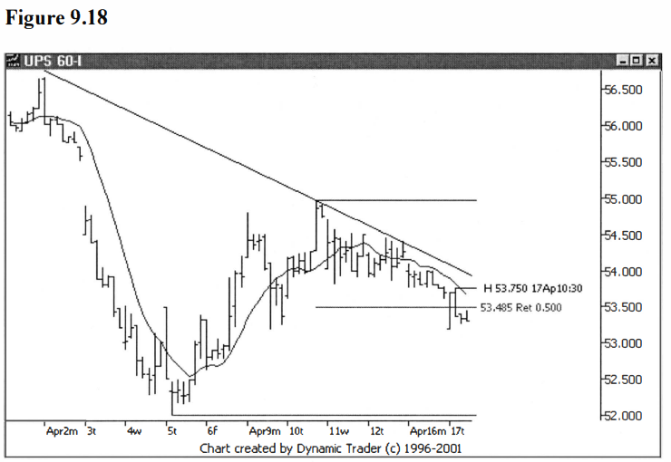
When I choose a high of a bar trigger and
highlight it with my horizontal trigger line, I am doing that in the context of
the chart, as it exists when I do the labeling. If the chart changes before the
trigger is hit in such a way that I no longer like my choice, I will change it.
The bar trigger is based on the assumption that the trigger will be hit with no
unusual price action, and with a tum towards the trigger happening fairly soon.
I re-evaluate the choice with every additional bar that’s added to the chart.
Let’s move two bars ahead and assess the situation. See figure 9.19.
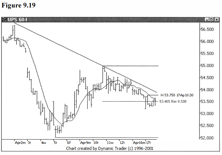
At this point UPS hasn’t triggered any of the
variations. The price has penetrated the moving average, but has still closed
below it. If you were opting to trigger on any price action above the moving
average, you would have been triggered at this point. Let’s add one more bar
and see if any triggers have been set off. See figure 9.20.
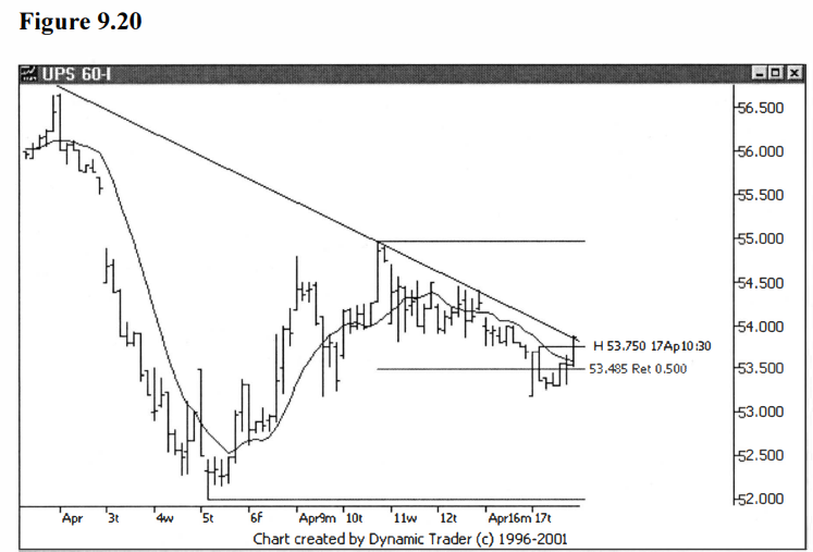
Wow, that’s pretty interesting. One bar has
triggered all three variations at the same time. The close of this trigger bar
is $53.87, and I’ll use that price for comparison for the moving average cross
trigger and for the trendline violation trigger. The trade above the high of
the bar trigger I’ll record as one cent over the bar’s high, so that one would
be $53.76. Recall back to the example using the daily bar high trigger, that
the trigger price using that method was $53.90.
In a similar way as we have seen in the other
examples, we see that some potential price improvement may be gained using the
‘trick’. It’s up to each individual trader to decide if this potential
improvement is worth the additional effort, or even if the technique will work
at all for his or her trading plan. Myself, I have found real benefits from
this technique.
Let’s look at UPS right after this trigger, to
see if it appears as though this area was important, or if many traders seem to
have been watching this area. See figure 9.21.
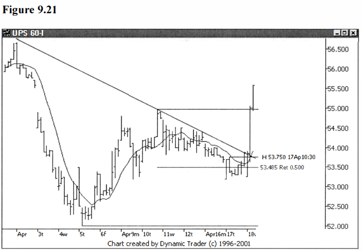
It does appear that this area was of some
significance. Can I guarantee that this ‘explosion’ in price action had anything
to do with what I have outlined on the chart? Absolutely not. It may have had
nothing to do with the technical features I’ve outlined. All I can say is that
in my experience, I’ve come to conclude that I see these areas of activity most
often in areas that seem to have technical aspects that lead me to believe
something might happen in that area. It just seems like too great of a
coincidence to me.
Perhaps it’s a self-fulfilling prophecy, in
that if enough traders and fund managers all see the same thing and then
dog-pile in at roughly the same time, the move will occur for that very reason.
As a trader I’m not that concerned why a move happens. I’m concerned with
finding areas where I think a move might occur, and then trying to find a place
to get into a trade where I feel the reward to risk ratio gives me the
potential to profit over the long run. That’s what I’m trying to accomplish
with my methods.
Let’s take one last look at UPS with a little
bit more data added after the trigger. See figure 9.22.
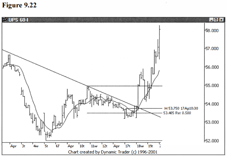
It turns out that the trigger area was quite
significant. UPS did a strong pullback almost to the trigger area after its
first thrust up. Perhaps a few readers are thinking that a pullback like that
would shake them out. Keep in mind, this is not only a lower trigger timeframe,
it’s a ‘twice-lower’ timeframe, a ‘trigger for the trigger’ timeframe. Remember
I said that as soon as I’m triggered, I switch back to my traded timeframe?
Best Trading Entry Techniques : Trade Entry Techniques : Tag: Trade Entry Techniques, Forex : Moving Average Crossover, trendlines, Regression Channels, Swing low, Swing high, swing trade entry points - Cool Trick Trading Startegy