Identify Supply & Demand Zones
How to find supply and demand zone, what are supply and demand zones, how to spot supply and demand zone, how to find institutional supply and demand zones
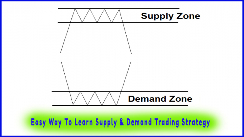
Course: [ Easy Way To Learn Supply & Demand Trading Strategy : Supply and Demand Trading Strategy ]
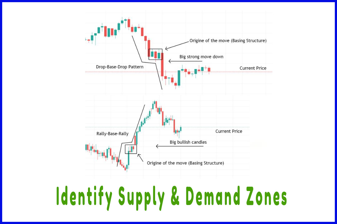
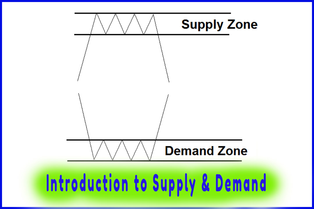
To identify supply and demand zones on a price chart, we look for big explosive moves that are represented by large bearish or bullish candles.
How to Identify Supply & Demand Zones?
To
identify supply and demand zones on a price chart, we look for big explosive
moves that are represented by large bearish or bullish candles.
As we can
see on the chart below:
-
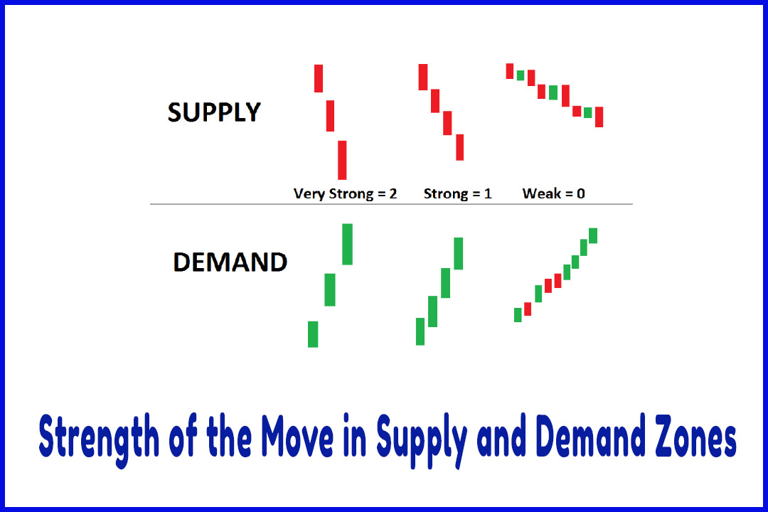
When demand exceeds supply, price rallies creating big green candles.
-
When supply exceeds demand, price drops down with big red candles.
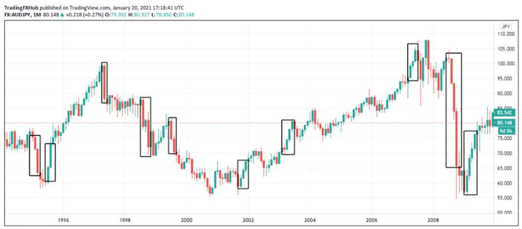
These
price movements are telling us where the imbalance is located on the chart.
These explosive price candles are known as ERC (Extended Range Candle).
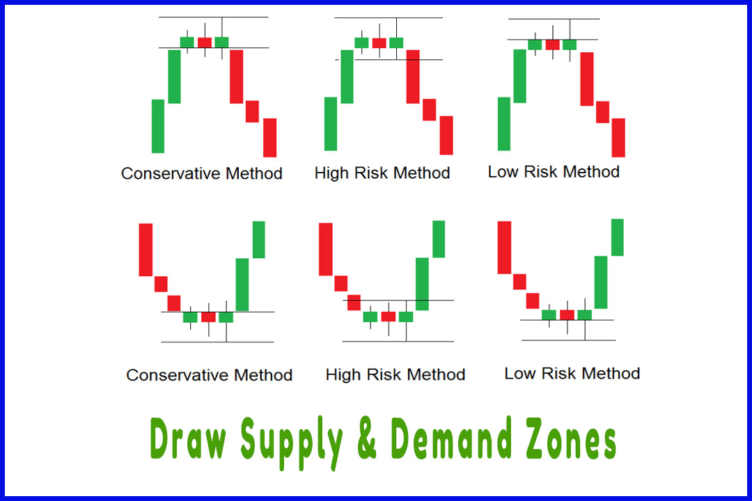
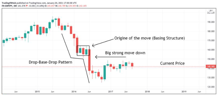
There are
3 steps to properly identify supply and demand zones:
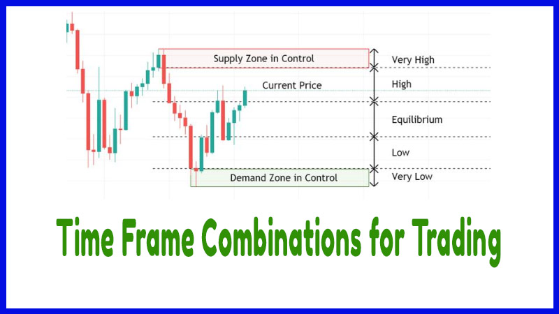
Step 1: Identify Current Price
We start
at the current price then we look to the left until we find a big strong move
up (for supply zones) or down (for demand zones).
Step 2: Look to the Left to find ERCs
In the
second step, we look left from the current price to find ERCs. These candles have
a large body with small or no wicks. The size of the body represents more than
half of the candle’s range.
If the
body’s length equals the length of the wicks, it is not an ERC.
Step 3: Origin of the Move
The third
and last step consists of identifying the origin of the big move in price. This
origin will form the base of the supply zone. The base is what we need to draw
the zone.
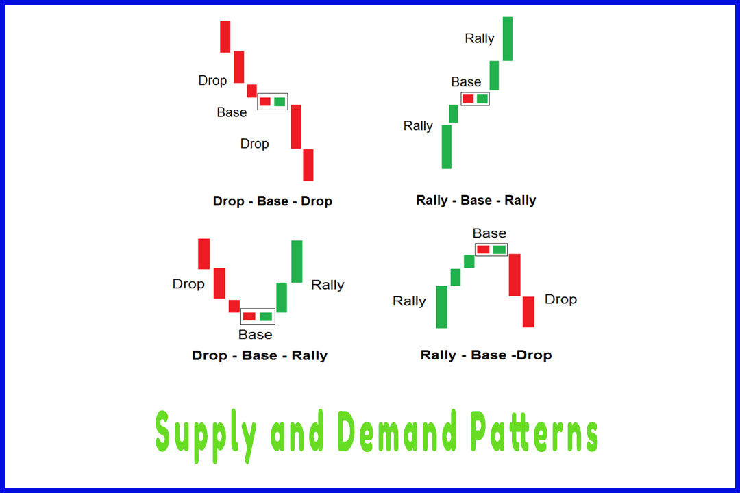
In this
example, we start at the current price and we look left to identify an
explosive move either up or down. The explosive move on this chart is
represented by the big bearish candles (ERCs) forming a drop-base-drop pattern.
Then we
identify the origin of this bearish move to draw our supply zone around the
basing structure.
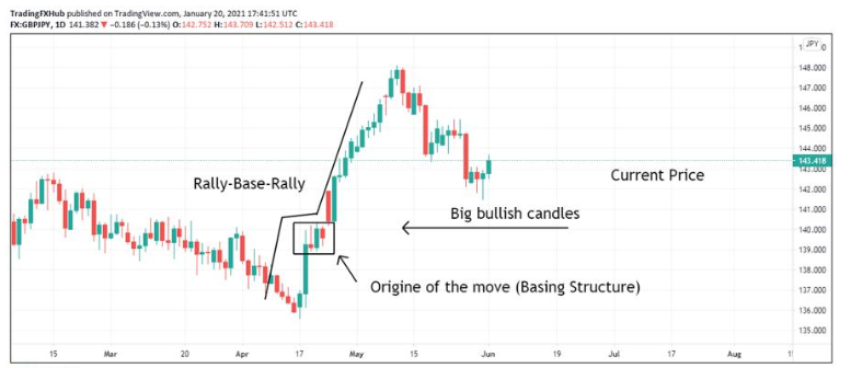
Same
thing for the demand zone. We start at the current price and look left to
identify ERC candles. The next step is to identify the origin of the move to
draw our demand zone around the basing structure.
Easy Way To Learn Supply & Demand Trading Strategy : Supply and Demand Trading Strategy : Tag: Supply and Demand Trading, Forex : How to find supply and demand zone, what are supply and demand zones, how to spot supply and demand zone, how to find institutional supply and demand zones - Identify Supply & Demand Zones